Unexplained Color in histogram

when I fill the histogram by group I always get a colored part which I couldn't match it with the chart after I split it by using facet .

i have the below data.frame :

mysales <- data.frame(season=c(rep("s1",10000),rep("s2",6000),rep("s3",9000),rep("s4",3000)),
sales=c(rnorm(10000,mean=0.2,sd=0.1),rnorm(6000,mean=0.6,sd=0.1),rnorm(9000, 1,sd=0.1),rnorm(3000,mean =1.5,sd=0.1 )))

look at the circled part in the graph before splitting it :
ggplot(mysales, aes(x=sales, fill=season)) +geom_histogram(alpha=0.6)

by faceting the groups :
ggplot(mysales, aes(x=sales, fill=season)) +geom_histogram(alpha=0.6)+facet_wrap(~season)

the question :

why the circled part is showing in the first chart , is it an error in plotting .. is their a way to correct it ?

thank you

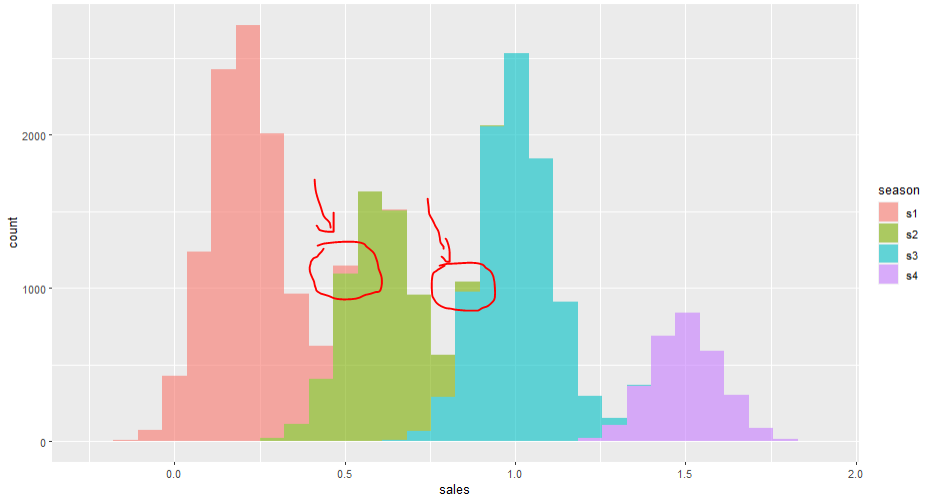
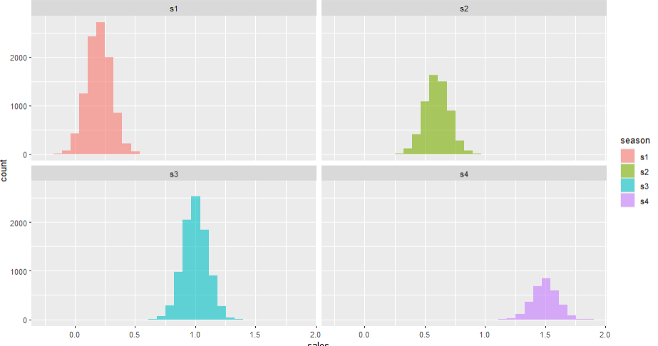
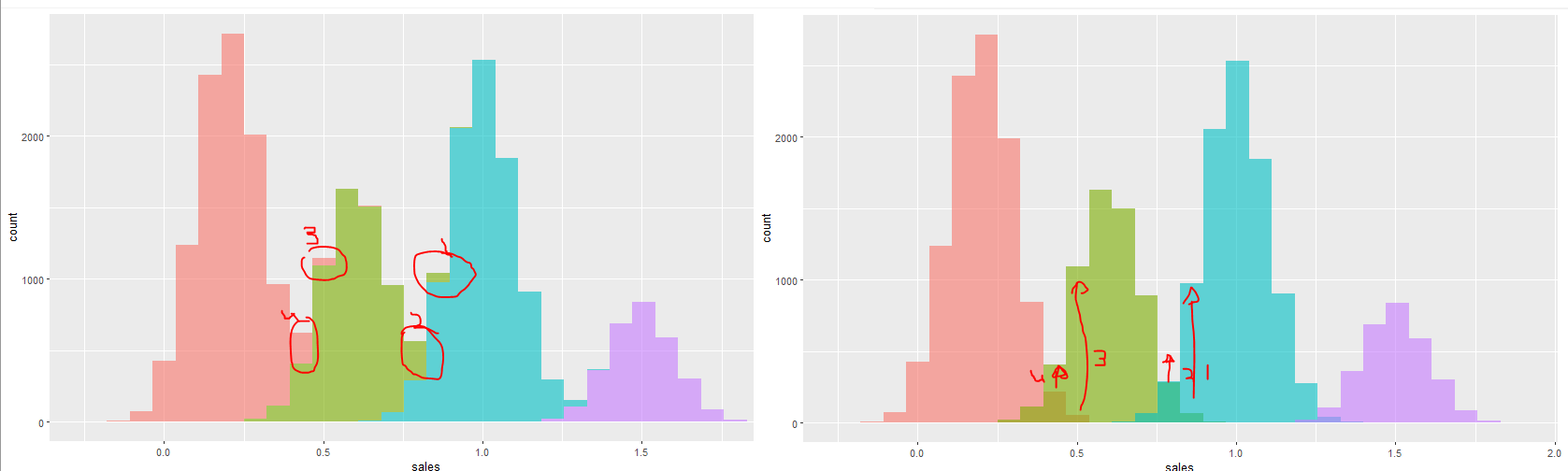
I disagree that there is a discrepancy between the plots. Looking at the s1 facet plot, at an x value of 0.5, where there is a grid line, there is a small bar that represents about 100 counts. That is the small s1 feature that appears on your first, stacked, plot. Perhaps you are being confused by the stacked layout of the bars. Once the s1 and s2 bars overlap, the s1 bars are drawn on top of the s2 bars. You can see this in the bin that is just below the bin at 0.5. In the facet plot, s1 has about 200 counts at that value. In the stacked plot, the s1 bar is the same size but it is displayed with its base at about 400 counts and its top near 600 counts. You might think that there is more to the bar hidden behind the s2 bar but that is not true.

1 Like

What happen if you add position = 'identity' ?

Show overlap of data.

ggplot(mysales, aes(x=sales, fill=season)) +
  geom_histogram(alpha=0.6, position = 'identity'

ggplot(mysales, aes(x=sales, fill=season)) + 
  geom_histogram(alpha=0.6, position = 'identity') +
  facet_wrap(~season)

2 Likes

thank you both for your replay I got the idea why now their is this different between this two charts

it seems when we don't use position ="identity" , the overlapped parts will shift to the top of each bar .

now the picture is clear to me , i always get confused with these parts .
facet will show you the grap similarly like position=identity and will not shift the overlapped parts to the top of the bars .

thank you

This topic was automatically closed 7 days after the last reply. New replies are no longer allowed.

If you have a query related to it or one of the replies, start a new topic and refer back with a link.