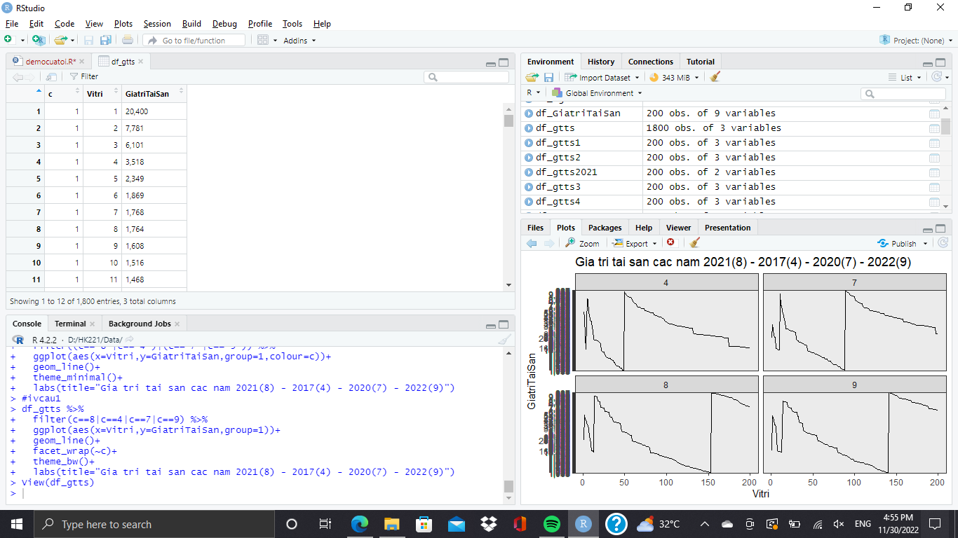
The problem is not so much in your charting code, as it is a problem of your data that you send to chart; you need to further modify your data before you ggplot;
you need to convert (mutate) GiatriTaiSan from being a character string that shows numbers with a comma format, to an actual number; you can use readr's readr::parse_number("54,321") for that sort of thing
it seems the data that should go on the y-axis are formated as character, not number.
Depending on where you got the data from, you may adjust the import step (maybe save it as excel and import the excel file) or adjust the encoding.
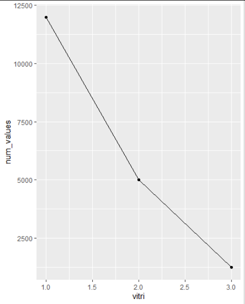
Alternatively you can convert it back to numbers, e.g. by removing the comma (as thousend separator) and then define it as numeric:
# some dummy data
df = data.frame(values = c("12,000", "5,000", "1,234"),
                vitri = c(1,2,3))

ggplot(df, aes (x = vitri,
                y = values)) +
  geom_point() +
  geom_line(group = 1)
# this isn't working properly!

# convert to numbers
library(stringr)
df$num_values = as.numeric(str_remove(df$values, ","))

# check result
str(df)
'data.frame':	3 obs. of  3 variables:
 $ values    : chr  "12,000" "5,000" "1,234"
 $ vitri     : num  1 2 3
 $ num_values: num  12000 5000 1234
# values are character (chr)
# num_values are numeric (num)

ggplot(df, aes (x = vitri,
                y = num_values)) +
  geom_point() +
  geom_line(group = 1)
You can check your columns either with str(nameofyourdataframe)
or by hovering the mouse over the column name when looking at the dataframe.