Your bar chart reveals the locations that produce the highest rated chocolate bars. To get a better idea of the specific rating for each location, you’d like to highlight each bar.
Assume that you are working with the code chunk:
ggplot(data = best_trimmed_flavors_df) +
geom_bar(mapping = aes(x = Company.Location))
Add a code chunk to the second line of code to map the aesthetic color to the variable Rating**.**
NOTE: the three dots (...) indicate where to add the code chunk.
my code :- geom_bar(mapping = aes(x = Company.Location, color = Company.Location))
Result from geom_bar
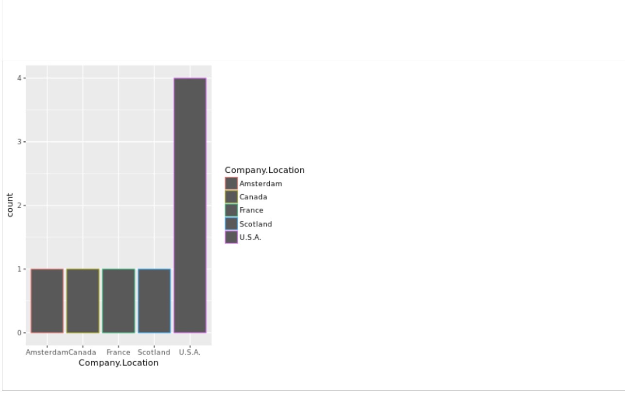
According to your bar chart, which two company locations produce the highest-rated chocolate bars?
Scotland and France
Amsterdam and U.S.A.
Canada and France
Canada and U.S.A.