Why can't i use my checkboxGroupInput to select different categories for my ggplot in Shiny ?

Hello , am a beginner in R especially in shiny. Am working on a simple Shiny app that allows you to select any csv file from your machine, shows you the table format of the dataset and allows you to plot a simple correlation using ggplot.

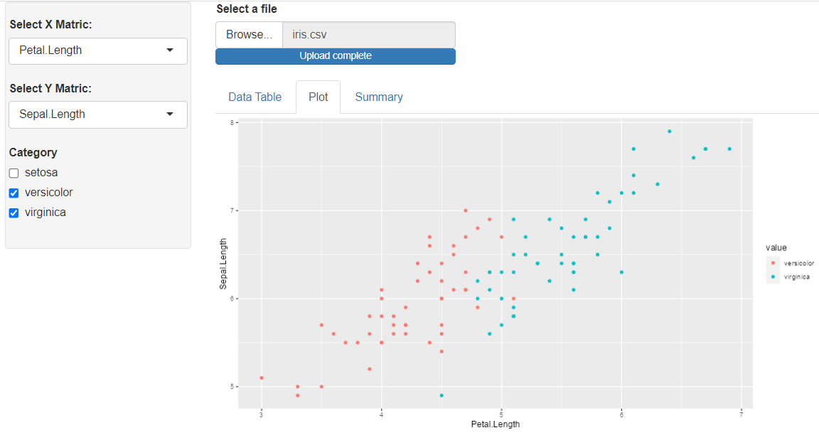
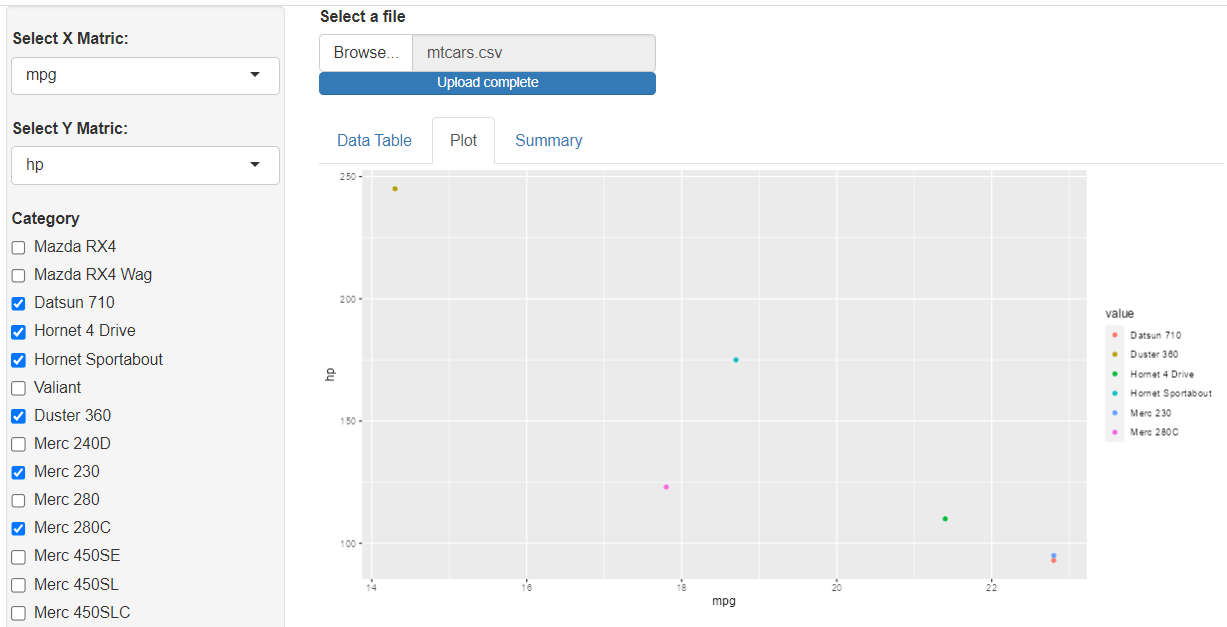
The problem am facing now is i want to create a filter function or any function to take the categorical values from the dataset, e.g in the iris dataset, the Specie names and use it to plot the points for that category on my ggplot. When i click the CHECKBOX for that category it should plot or remove the values on the ggplot. I want to make it general so it can work for any dataset, that's my problem.

Here is the code

 library(shiny)
library(shinydashboard)
library(tidyverse)
library(DT)
library(highcharter)
library(eply)
library(broom)
library(plotly)

shinyServer(function(input, output) {

  options(shiny.maxRequestSize = 30*1024^4)
  
   data = reactive({
     
     file <- input$Files   
     if( is.null (file) ){ return() }   
      else { read.csv (file =  file$datapath) }
 
   })
   
   output$data_table = renderDataTable({ data() })
   
   output$plot_graph = renderMenu({
     
     if( is.null( data() ) ){return()}
     else{
             numeric_df = as.data.frame(data()) [ sapply (as.data.frame(data()), is.numeric)]
             species =  as.vector( unique (as.data.frame(data()) [!sapply (as.data.frame(data()), is.numeric)]))
               species =  as.vector(unlist(species))
             
             
          sidebarMenu(
                       menuItem( text = "Linear Model",
                                 icon = icon("th"),
                                 selectInput( inputId = "xvalue",
                                              label = "Select X Matric:",
                                              choices = names(numeric_df),
                                              selected = names(numeric_df)[1]),
                                       
                                 selectInput( inputId = "yvalue",
                                              label = "Select Y Matric:",
                                              choices = names(numeric_df),
                                              selected = names(numeric_df)[2]),

                                 checkboxGroupInput( inputId = "CheckB", 
                                  label = "Category",
                                  choices = species )

                             )
                  )
     }
     
   })
   
   output$scatter_plot = renderPlot({

      plotting_df = species %>% filter( species %in% as.vector( input$CheckB))
        col = unquote(names(data() [!sapply (data(), is.numeric)]))
        ggplot(data = plotting_df, aes_string( x=input$xvalue, y=input$yvalue, color = col)) +
        geom_point()
      
        })
   
   output$summary <- renderPrint({
     
     summary(data())
   })
   
   output$main_grid = renderUI({
     
     tabsetPanel( tabPanel( "Data Table",dataTableOutput("data_table")),
                   tabPanel("Plot", plotOutput("scatter_plot")),
                   tabPanel("Summary", verbatimTextOutput("summary")))
                   
   })

})

The plotting_df is where am trying to write a code that can work generally for any dataset on the ggplot.

Please Help !!

Assuming data() is the iris dataset, then the following change should work (capital 'S' on Species).

plotting_df = data() %>% filter( Species %in% as.vector( input$CheckB))

Yes It would, thanks. I got it running for the iris dataset with that before, but now i want to generalize it so it can work for any dataset I upload. Like the mtcars dataset, where we have the different car brands. If I was to name the column with brands in mtcars to Brands and put Brands in place of Specie it will work. The issue is i want a code that can work for any dataset, unless the dataset doesn't have a column with characters i can use to filter the ggplot.

My apologies for tackling the wrong question. Below is an example I believe provides a way to achieve the desired output. In the renderPlot() section, the non-numeric columns are identified, and data() is reshaped using pivot_longer() to move these non-numeric column values into a single column. Then, the reshaped data frame is filtered to values specified in input$CheckB (Note: the sidebarMenu was not working for me, so I commented it out).

library(shiny)
library(shinydashboard)
library(tidyverse)
library(DT)
library(highcharter)
library(eply)
library(broom)
library(plotly)

ui <- fluidPage(
  sidebarLayout(
    sidebarPanel(width = 3,
                 uiOutput('plot_graph')),
    mainPanel(width = 9,
              fileInput('Files', 'Select a file'),
              uiOutput('main_grid'))
  )
)

server = function(input, output) {
  
  options(shiny.maxRequestSize = 30*1024^4)
  
  data = reactive({
    file <- input$Files
    if( is.null (file) ){ return() }
    else { read.csv (file =  file$datapath) }
  })
  
  output$data_table = renderDataTable({ data() })
  
  output$plot_graph = renderUI({
    
    if( is.null( data() ) ){
      return()
      }
    else{
      numeric_df = as.data.frame(data()) [ sapply (as.data.frame(data()), is.numeric)]
      species =  as.vector( unique (as.data.frame(data()) [!sapply (as.data.frame(data()), is.numeric)]))
      species =  as.vector(unique(unlist(species)))
      
      fluidRow(
      # sidebarMenu(
      #   menuItem( text = "Linear Model",
      #             icon = icon("th"),
                  selectInput( inputId = "xvalue",
                               label = "Select X Matric:",
                               choices = names(numeric_df),
                               selected = names(numeric_df)[1]),
                  
                  selectInput( inputId = "yvalue",
                               label = "Select Y Matric:",
                               choices = names(numeric_df),
                               selected = names(numeric_df)[2]),
                  
                  checkboxGroupInput( inputId = "CheckB", 
                                      label = "Category",
                                      choices = species )
        # )
      )
    }
    
  })
  
  output$scatter_plot = renderPlot({
    
    req(input$CheckB)
    
    col = unquote(names(data() [!sapply (data(), is.numeric)]))
    
    plotting_df = data() %>% 
      pivot_longer(cols = all_of(col), names_to = 'column', values_to = 'value') %>%
      filter(value %in% as.vector( input$CheckB))
    
    ggplot(plotting_df, aes_string( x=input$xvalue, y=input$yvalue, color = 'value')) +
      geom_point()
    
  })
  
  output$summary <- renderPrint({
    
    summary(data())
  })
  
  output$main_grid = renderUI({
    
    tabsetPanel( tabPanel( "Data Table",
                           dataTableOutput("data_table")),
                 tabPanel("Plot", 
                          plotOutput("scatter_plot")),
                 tabPanel("Summary", 
                          verbatimTextOutput("summary")))
    
  })
  
}

shinyApp(ui = ui, server = server)

Here is the output when iris is uploaded.

Here is the output when mtcars is uploaded. The image is truncated due to the long list of car brands. Depending on the type of data you plan to use, you may want to explore multiple selections with pickerInput() from the {shinyWidgets} package (https://dreamrs.github.io/shinyWidgets/reference/pickerInput.html).

Thanks bro, sorry for the late reply thou. I managed to make it work with this code but yours works even better.

data= data()
          names(data)[!sapply (data, is.numeric)] = "fac"
          plotting_df = data %>% filter( fac %in% as.vector( input$CheckB))
 col = unquote(names(data [!sapply (data, is.numeric)]))
          name = unquote(names(data() [!sapply (data(), is.numeric)]))
ggplot(data = plotting_df, aes_string( x=input$xvalue, y=input$yvalue, color = col))
          

One more question. If i wanted to to select a dataset that doesn't have a factor column like for species and mtcars, take for example the cars dataset with just speed and dist as it's variables and plot it, it'll give me an error cus they don't have any character variable i can use to filter the plot. I was think of a function, maybe an if statement that will scan the dataset uploaded check if it has factor columns, if so plot them allowing to filter with the checkbox but if not, still just plot the graph allowing to select just from the x and y variable. Also what if my dataset has more than one factor columns, how will i write a code a smart code that will check for all this dependencies and still give you your plot. Thank you.

Below are some updates to server tot handle the case where only numeric columns exist. If that's the case, "CheckB" is forced to have only one option, "All". For the other scenario, where multiple factor/character columns exist, all factor/character values are currently stacked into one column with the ability to select any one of them. If that's not desirable, then another selection input is probably needed to force the user to select the one factor/character column they want to see.

server = function(input, output) {
  
  options(shiny.maxRequestSize = 30*1024^4)
  
  data = reactive({
    file <- input$Files
    if( is.null (file) ){ return() }
    else { read.csv (file =  file$datapath) }
  })
  
  output$data_table = renderDataTable({ data() })
  
  output$plot_graph = renderUI({
    
    if( is.null( data() ) ){
      return()
      }
    else{
      numeric_df = as.data.frame(data()) [ sapply (as.data.frame(data()), is.numeric)]
      species =  as.vector( unique (as.data.frame(data()) [!sapply (as.data.frame(data()), is.numeric)]))
      if(length(species) == 0) {species = c('All')} else {species =  as.vector(unique(unlist(species)))}
      
      fluidRow(
      # sidebarMenu(
      #   menuItem( text = "Linear Model",
      #             icon = icon("th"),
                  selectInput( inputId = "xvalue",
                               label = "Select X Matric:",
                               choices = names(numeric_df),
                               selected = names(numeric_df)[1]),
                  
                  selectInput( inputId = "yvalue",
                               label = "Select Y Matric:",
                               choices = names(numeric_df),
                               selected = names(numeric_df)[2]),
                  
                  checkboxGroupInput( inputId = "CheckB", 
                                      label = "Category",
                                      choices = species )
        # )
      )
    }
    
  })
  
  output$scatter_plot = renderPlot({
    
    req(input$CheckB)
    
    col = unquote(names(data() [!sapply (data(), is.numeric)]))
    
    plotting_df = data() %>%
      mutate(value = 'All')
    
    if( identical(col, character(0)) == F ) {
      plotting_df = plotting_df %>%
        select(-value) %>%
        pivot_longer(cols = all_of(col), names_to = 'column', values_to = 'value') %>%
        filter(value %in% as.vector( input$CheckB))
    }
    
    ggplot(plotting_df, aes_string( x=input$xvalue, y=input$yvalue, color = 'value')) +
      geom_point()
    
  })
  
  output$summary <- renderPrint({
    
    summary(data())
  })
  
  output$main_grid = renderUI({
    
    tabsetPanel( tabPanel( "Data Table",
                           dataTableOutput("data_table")),
                 tabPanel("Plot", 
                          plotOutput("scatter_plot")),
                 tabPanel("Summary", 
                          verbatimTextOutput("summary")))
    
  })
  
}

shinyApp(ui = ui, server = server)

Thanks soo much bro everything is working smoothly now thanks to your tweaks.
I wanted to add a smooth and jitter button for the scatter and box plot instead of just putting all at once with the code but my logic is not working, something like this...

G <- ggplot(data = plotting_df, mapping = aes_string( x=input$xvalue, y=input$yvalue, color = col)) +
geom_point()+labs(col =name)

    print(G)
 
 if (input$smooth){
 G <- G +  geom_smooth(method = "lm") 
 print(G) }

Any help will be much appreciated but soo far am still pretty happy with what i have now.
Thanks again.
This is my final code.

output$plot_graph = renderMenu({
     
     if( is.null( data() ) ){return()}
     else{
             numeric_df = as.data.frame(data()) [ sapply (as.data.frame(data()), is.numeric)]
             species =  as.vector( unique (as.data.frame(data()) [!sapply (as.data.frame(data()), is.numeric)]))
             if(length(species) == 0) {species = c('All')} else {species =  as.vector(unique(unlist(species)))}
             
          sidebarMenu(
                       menuItem( text = "Plotter",
                                 icon = icon("th"),                               
                               
                                 checkboxGroupInput( inputId = "PlotB",
                                                     label = "Type of Plot",
                                                     choices = c("Bar Plot","Box Plot","Correlation plot" )), 
                                 
                                 selectInput( inputId = "xvalue",
                                              label = "Select X Cor:",
                                              choices = names(numeric_df),
                                              selected = names(numeric_df)[1]),
                                       
                                 selectInput( inputId = "yvalue",
                                              label = "Select Y Cor:",
                                              choices = names(numeric_df),
                                              selected = names(numeric_df)[2]),
                                 
                                 # checkboxInput(inputId = "smooth",
                                 #               label = "Add Smooth"),
                                 
                                 selectInput( inputId = "bvalue",
                                              label = "Select X BarPlot:",
                                              choices = names(numeric_df),
                                              selected = names(numeric_df)[3]),
                                 
                                 pickerInput( inputId = "picker",
                                              label = "Category",
                                              choices = species,
                                              multiple = TRUE,
                                              options = list(
                                             `actions-box` = TRUE,
                                             `deselect-all-text` = "None",
                                             `select-all-text` = " All ",
                                             `none-selected-text` = "select category to plot",
                                             `live-search` = TRUE,
                                             `virtual-scroll` = 10,
                                             `multiple-separator` = "\n",
                                             size = 10
                                             ))
                                  )
                     )
           } 
   })
   
   output$All_plot = renderPlot({
  
          req(input$picker)
          
          col = unquote(names(data() [!sapply (data(), is.numeric)]))
          name = unquote(names(data() [!sapply (data(), is.numeric)])) 

          plotting_df = data() %>%
            mutate(value = 'All')
          
          if( identical(col, character(0)) == F ) {
            plotting_df = plotting_df %>%
              select(-value) %>%
              pivot_longer(cols = all_of(col), names_to = 'column', values_to = 'value') %>%
              filter(value %in% as.vector( input$picker))
          }
              
          if("Correlation plot" %in% input$PlotB ){
              
                ggplot(data = plotting_df, mapping = aes_string( x=input$xvalue, y=input$yvalue, color = 'value')) +
                geom_point() +
                geom_smooth(method = "lm") +
                labs(col =name)
               
          }else{
            if("Box Plot" %in% input$PlotB){ 
              
               ggplot(data= plotting_df, mapping = aes_string(x=input$xvalue,y=input$yvalue,color='value')) +
               geom_boxplot() +
               geom_jitter(alpha = 0.5) +
               labs(col =name)
            
           }else{
            
             if ("Bar Plot" %in% input$PlotB){
              
                ggplot(data= plotting_df, mapping = aes_string(x=input$bvalue, color='value' )) +
                geom_bar()  +
                labs(col =name)        
             
            }          
           }  
       }           
    })
```r

This topic was automatically closed 7 days after the last reply. New replies are no longer allowed.

If you have a query related to it or one of the replies, start a new topic and refer back with a link.