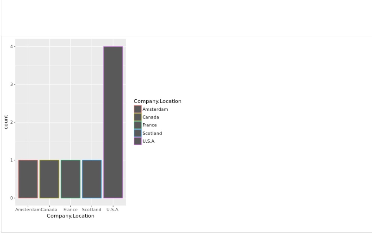
Your bar chart reveals the locations that produce the highest rated chocolate bars. To get a better idea of the specific rating for each location, you’d like to highlight each bar.
Assume that you are working with the code chunk:
ggplot(data = best_trimmed_flavors_df) +
geom_bar(mapping = aes(x = Company.Location))
Add a code chunk to the second line of code to map the aestheticcolorto the variableRating**.**
NOTE: the three dots (...) indicate where to add the code chunk.
my code :-geom_bar(mapping = aes(x = Company.Location, color = Company.Location))
Umm.. Are you sure these are the instructions? I find it weird that your professor asked you to map color, rather than fill. and I would suspect that the y axis should be mapped to the mean rating for each location, not the color..
I changed a little bit the code your professor asked.
The fct_reorder() simply makes sure that the X axis categories are sorted by their value in y, you can remove it and see what happens. stat = 'identity' is instead of using geom_col which i actualy prefer. .by = in summarise is a new thing R guys are experimenting and I think its great. Usualy you would have to have a group_by before, and then you'd have grouped data. this is explicit and simple