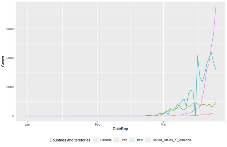
Hello I am using some data from Here to create a plot of United States, Italy, Canada, & Iran so I can see how the cases have grown over the 3 months. I've subset the data by country by doing
#--------------------------------- Canada Subset
Canada_Subset <- data[grep("Canada", data$`Countries and territories`), ]
Canada_Subset_2 <- data[grep("CANADA", data$`Countries and territories`), ]

#--------------------------------- United States Subset
US_Subset <- data[grep("United_States_of_America", data$`Countries and territories`), ]

#--------------------------------- Iran Subset
Iran_Subset <- data[grep("Iran", data$`Countries and territories`), ]

#--------------------------------- Italy Subset
Italy_Subset <- data[grep("Italy", data$`Countries and territories`), ]
I've tried mapping out the data in to a plot already, however I am running into an error. Here is what I've got so far
ggplot(data, aes(x=DateRep)) +
  geom_line(aes(y = Canada_Subset), color = "Red") +
  geom_line(aes(y = US_Subset), color = "Blue") +
  geom_line(aes(y = Iran_Subset), color = "Green") +
  geom_line(aes(y = Italy_Subset), color = "Yellow") +
  geom_line()
How can I get all of 4 subsets onto 1 graph where I can have the bottom axis as date and top axis as case count. I would want to have different lines on the graph to indicate the different countries.