Here's an idea
library(tidyverse)
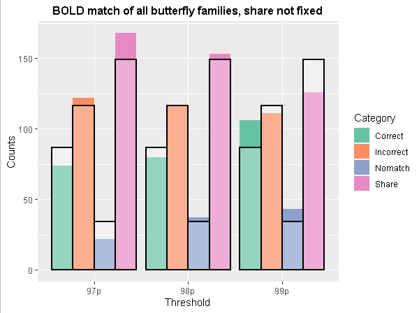
d1 <- data.frame(
stringsAsFactors = FALSE,
Threshold = c("99p","99p","99p","99p",
"98p","98p","98p","98p","97p","97p","97p","97p"),
Category = c("Correct","Incorrect",
"Nomatch","Share","Correct","Incorrect","Nomatch","Share",
"Correct","Incorrect","Nomatch","Share"),
Counts = c(106, 111, 43, 126, 80, 116, 37, 153, 74, 122, 22, 168)
) %>% mutate(facet_cat = "Actual")
d2 <- data.frame(
check.names = FALSE,
row.names = c("Correct", "Incorrect", "Nomatch", "Share"),
`99p` = c(86.6666666666667, 116.333333333333, 34, 149),
`98p` = c(86.6666666666667, 116.333333333333, 34, 149),
`97p` = c(86.6666666666667, 116.333333333333, 34, 149)
)
d3 <- d2%>% rownames_to_column() %>% pivot_longer(cols=-rowname) %>%
rename(Category=rowname ,
Threshold=name,
Counts = value) %>%
mutate(facet_cat = "Expected")
ggplot(mapping=aes(fill=Category,y=Counts, x=Threshold,group=Category))+
geom_col(data = d1,position="dodge") +
geom_col(data = d3,position="dodge",fill="white",color="black",size=1,alpha=.3)+
scale_fill_brewer(palette="Set2") +
labs(title="BOLD match of all butterfly families, share not fixed")+
theme(plot.title = element_text(color = "black", size = 12,
face = "bold", hjust = 0.5))
p.s.  it might be helpful for you to know how to properly format code and console output that you post here. Using proper code formatting makes the site easier to read, prevents confusion (unformatted code can get garbled by the forum software :anguished:), and is generally considered the polite thing to do. Check out this FAQ to find out how — it's as easy as the click of a button! :grinning::
https://forum.posit.co/t/faq-how-to-make-your-code-look-nice-markdown-formatting/6246