Hi,
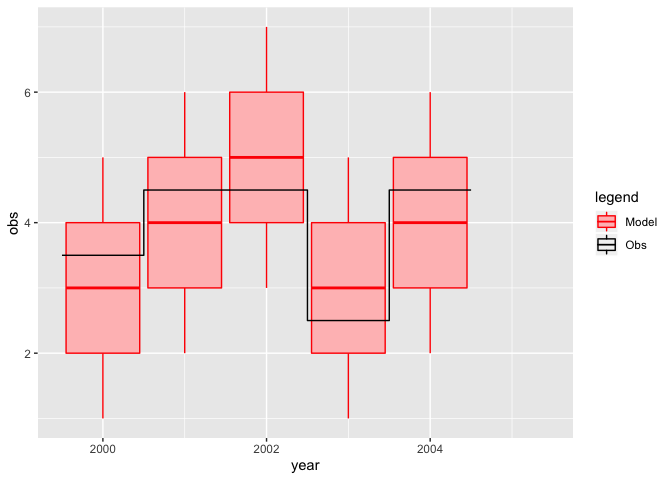
If you look at the following reprex, you will see that I have a graph with boxplots and an overlaid line.
I am not hapy with the legend produced, as it shows a boxplot to illustrate the colour of the data for which a line was used. Ideally I would like a boxplot in the legend for 'Model', and a black line for 'Obs'.
I can't work out how to do this.
Any suggestions?
Thanks,
Ron.
library(tidyverse)

tbl <- tibble(year = 2000:2005,
              q025 = c(1,2,3,1,2,NA),
              q250 = c(2,3,4,2,3,NA),
              q500 = c(3,4,5,3,4,NA),
              q750 = c(4,5,6,4,5,NA),
              q975 = c(5,6,7,5,6,NA),
              obs  = c(3.5,4.5,4.5,2.5,4.5,4.5))


pp <- ggplot(tbl) +
      geom_boxplot(aes(x = year,
                       ymin = q025,
                       lower = q250,
                       middle = q500,
                       upper = q750,
                       ymax = q975,
                       group = year,
                       colour = 'Model',
                       fill = 'Model'),
                   stat = 'identity') +
      geom_step(aes(x = year-0.5,
                    y = obs,
                    colour = 'Obs', fill = 'Obs')) +
      scale_fill_manual(name = 'legend',
                        values=c(Model = "#ffbfbf",
                                 Obs = NA),
                        drop = FALSE) +
      scale_colour_manual(name = 'legend', values = c(Model = 'red', Obs = 'black'))
#> Warning: Ignoring unknown aesthetics: fill

print(pp)
#> Warning: Removed 1 rows containing missing values (geom_boxplot).
Created on 2020-02-12 by the reprex package (v0.3.0)