I finally succeeded by forcing the y-axis to 0 when all values are positive or negative.
I also added a margin to the x-axis labels to avoid overlapping
if(lim_ecart_max<0){lim_ecart_max=0}
if(lim_ecart_min>0){lim_ecart_min=0}
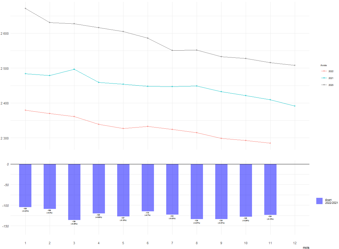
g2 <- df_prod_ecart_mensuel %>%
ggplot()+
aes(x=mois,y=ecart, fill="ecart", label=ecart)+
geom_text(aes(x=mois,
y=ecart,
label=pct_ecart,
vjust = 0.5 - sign(ecart)/2, hjust=0.5),
size=1.5,
color="black",
fontface="bold")+
geom_col(width = .5, alpha=0.5)+
scale_fill_manual(breaks = c("ecart"),
values = c("blue"),
labels= c(paste0("écart","\n",N,"/",N_1))) +
scale_y_continuous(labels = function (x) format(x,big.mark=" ", scientific = F))+
scale_x_discrete(limits =as.factor(c(1:12)))+
labs(y="Nb producteurs")+
geom_hline(yintercept=0)+
coord_cartesian(xlim =c(1, 12),
ylim = c(lim_ecart_min, lim_ecart_max),
clip = "off")+
theme_minimal()+
theme(axis.text.y = element_text(size=8, face = "italic"),
axis.title.y = element_text(size=8,face = "italic"),
axis.text.x = element_text(size=8),
axis.title.x = element_text(size = 8, hjust = 1),
legend.text = element_text(size=7),
legend.title = element_text(color="transparent")
)