Authors: Milos Vilotic - Twitter - Github
View the Table - Repo
Image 1: Visual response to user’s column click.
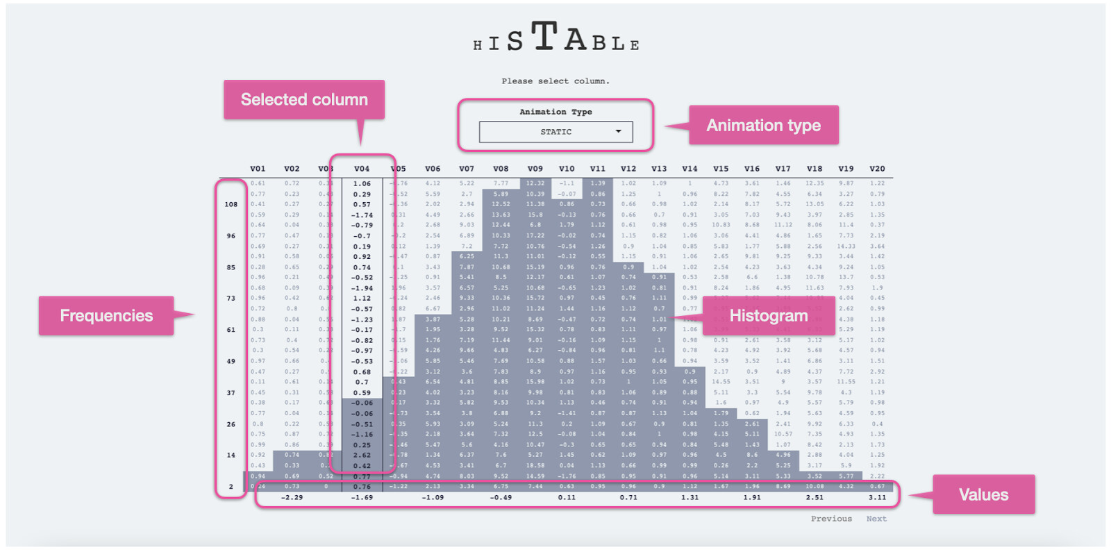
Image 2: Examples of Histogram visualization responses to selected columns.
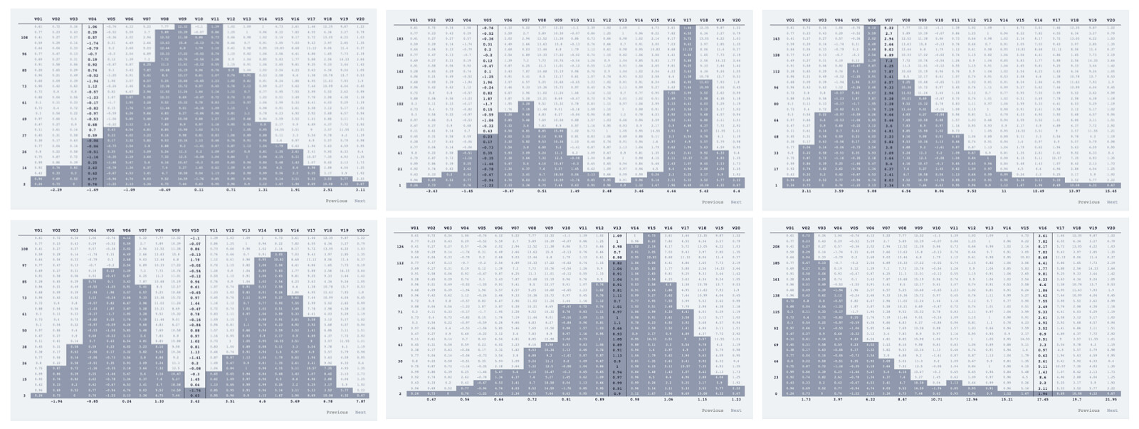
The Histable is a Shiny app with an interactive DT table. When a user clicks on a column, the table styles cells to show a histogram of the selected values. Histable allows users to quickly visualize the distribution of a data series across table data.
Data source:
Randomly generated values used to fill Table with 20 columns.
High-level implementation steps:
- Randomly generated “main” table.
- Create a table with the same number of columns as the “main” table with all zeros (“target data”). Purpose of the “target” data is for styling the “main” table.
- Bind “main”, and “target” data into one table.
- Hide “target” columns in the app.
- When a user selects a column, the selection is used to calculate the histogram results.
- The histogram results are used to fill in the “target” columns with values used for styling the “main” table.
- Users can turn the histogram off by clicking the column once again. This resets the “target” data and removes it from the “main” table.