Multiple scatterplot in one graph & multiple Facet_wrap plots

Hi Jcblum,

sensor_data <- sensor_data %>% 
  group_by(dataid) %>% 
  arrange(localminute, .by_group = TRUE) %>% 
  mutate(interval = localminute - lag(localminute))

My understanding for this code above is that, we group dataid by arranging minimal interval to maximum.
original localminute YYYY-MM-DD HH:MM:SS-timezone, will convert to "second"

for: "localminute - lag(localminute),
how much lag, and how much interval will create?

the "Intervals between readings for meter 6685" graph, means that, how much meter_value has plotted in each interval?

Hi Jonspring,
I have some doubts, please correct me, if I m wrong.

sensor_data <- data.table::fread("org_data.csv") %>%   
  # convert localminute to datetime (fread imports it as character)
   mutate(localminute = lubridate::as_datetime(localminute)) %>%
  group_by(dataid) %>% 
  arrange(localminute, .by_group = TRUE) %>% 
 mutate(interval_hr = (localminute - lag(localminute)) / lubridate::dhours(1),
 meter_change = meter_value - lag(meter_value)) %>%  ungroup()
 
 print(sensor_data)
 # A tibble: 1,584,823 x 5
   localminute         dataid meter_value interval_hr meter_change
   <dttm>               <int>       <int>       <dbl>        <int>
 1 2015-10-01 05:14:44     35       93470     NA                NA
 2 2015-10-01 05:42:34     35       93470      0.464             0
 3 2015-10-01 07:02:37     35       93470      1.33              0
 4 2015-10-01 07:12:38     35       93470      0.167             0
 5 2015-10-01 07:20:36     35       93470      0.133             0
 6 2015-10-01 07:23:39     35       93470      0.0508            0
 7 2015-10-01 08:59:41     35       93470      1.60              0
 8 2015-10-01 09:30:40     35       93470      0.516             0
 9 2015-10-01 09:34:37     35       93470      0.0658            0
10 2015-10-01 10:14:35     35       93470      0.666             0
# ... with 1,584,813 more rows
"","localminute","dataid","meter_value","interval_hr","meter_change"  # to see 1,584,813 more rows, i export to csv file
"12",2015-10-01 11:23:36,35,93472,1.10111111111111,2     
```````````````````````````````````````````````

What is the meaning of interval_hr = (localminute - lag(localminute)) / lubridate::dhours(1)?

How the meter_change is calculated, as I saw some dataid has value in meter_change?

Ungroup() meaning?

'function: sensor_data' is listing all the meter_value with meter_changes, means that: including spiky data and non-spiky data?
the list in 'function: noisy_readings' is filtered from 'sensor_data function'?

# Which have noisy data? (assuming a negative change indicates an error)
noisy_readings <- 
  sensor_data %>%
  filter(meter_change < -100)   # Setting here to ignore small changes
  
  > print(noisy_readings) 
  # A tibble: 1,094 x 5
   localminute         dataid meter_value interval_hr meter_change
   <dttm>               <int>       <int>       <dbl>        <int>
 1 2015-12-07 23:19:59   1185      144548      0.231        -17798  #this data was no in "sensor_data"function, when i extract
 2 2015-12-08 00:21:50   1185      144550      0.0928       -17798
 3 2015-12-08 01:58:12   1185      144558      0.0978       -17792
 4 2015-12-08 02:12:12   1185      144558      0.0661       -17792
 5 2015-12-08 02:34:59   1185      144558      0.0292       -17792
 6 2015-12-08 03:20:06   1185      144558      0.699        -17792
 7 2015-12-08 03:58:58   1185      144558      0.364        -17792
 8 2015-12-08 05:09:55   1185      144558      1.06         -17792
 9 2015-12-08 07:05:02   1185      144560      0.0325       -17792
10 2015-12-08 07:52:51   1185      144592      0.0453       -17760
# ... with 1,084 more rows
> noisy_meters <- unique(noisy_readings$dataid)
> print(noisy_meters)
 [1] 1185 1556 2335 2449 3134 3544 4514 5129 5403 6836 7030 7117 8156 9134 9639 9982

'function: noisy_meters' is listing the noisy dataid from the noisy_readings?
Is that what unique function meaning?

 > noisy_ranges <-
  noisy_readings %>%
  group_by(dataid) %>%
  summarize(min_range = min(localminute) - 60*60*24*3, 
            max_range = max(localminute) + 60*60*24*3)

'function: noisy_ranges' meaning arranging a list of noisy dataid, starting with their minimum localminute to maximum localminute?
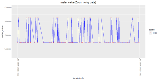
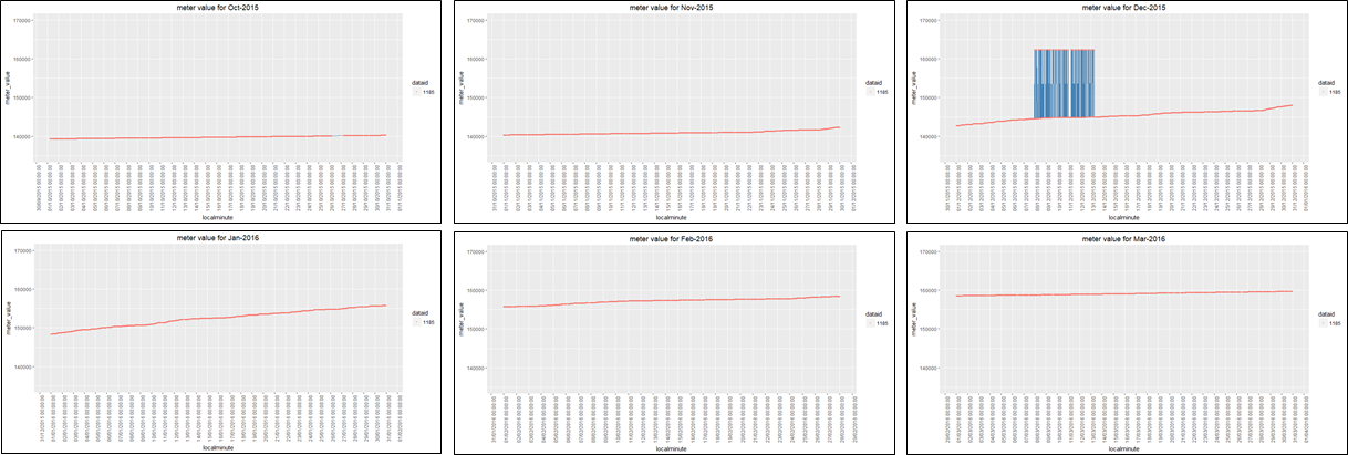
eg. for dataid =1185, arrange its' noisy data start from miniimum localminute (2015-12-04 23:19:59) to maximum localminute (2015-12-16 07:27:54)?

As u said "606024 is one day", but why multiple by 3?

> print(noisy_ranges)
> # A tibble: 16 x 3
>    dataid min_range           max_range          
>     <int> <dttm>              <dttm>             
>  1   1185 2015-12-04 23:19:59 2015-12-16 07:27:54
>  2   1556 2015-12-05 08:36:42 2015-12-14 08:14:36
>  3   2335 2015-12-05 22:33:26 2015-12-15 05:52:27
>  4   2449 2015-12-04 23:07:19 2015-12-16 07:34:19
>  5   3134 2015-12-05 12:56:40 2015-12-15 23:10:28
>  6   3544 2015-12-05 01:49:52 2015-12-16 00:48:35
>  7   4514 2015-12-04 22:41:04 2015-12-16 07:19:59
>  8   5129 2015-12-04 23:10:13 2015-12-16 08:02:14
>  9   5403 2015-12-04 23:42:18 2015-12-16 06:38:00
> 10   6836 2015-12-05 02:07:34 2015-12-16 05:56:47
> 11   7030 2015-12-04 23:54:21 2015-12-16 07:20:11
> 12   7117 2015-12-04 23:15:09 2015-12-16 07:12:02
> 13   8156 2015-12-04 22:47:45 2015-12-16 06:53:41
> 14   9134 2015-12-04 23:16:58 2015-12-16 08:01:12
> 15   9639 2015-12-19 06:27:07 2015-12-25 17:54:52
> 16   9982 2015-12-06 02:31:41 2015-12-14 18:29:49
> noisy_context <-
  sensor_data %>%
  left_join(noisy_ranges) %>%
  filter(localminute >= min_range,
         localminute <= max_range)
		 
> print(noisy_context)
# A tibble: 13,913 x 7
   localminute         dataid meter_value interval_hr meter_change min_range          
   <dttm>               <int>       <int>       <dbl>        <int> <dttm>             
 1 2015-12-04 23:22:06   1185      143862      0.266             0 2015-12-04 23:19:59
 2 2015-12-04 23:36:07   1185      143864      0.234             2 2015-12-04 23:19:59
 3 2015-12-04 23:51:06   1185      143864      0.250             0 2015-12-04 23:19:59
 4 2015-12-05 00:19:02   1185      143868      0.466             4 2015-12-04 23:19:59
 5 2015-12-05 00:42:54   1185      143874      0.398             6 2015-12-04 23:19:59
 6 2015-12-05 00:45:58   1185      143874      0.0511            0 2015-12-04 23:19:59
 7 2015-12-05 00:57:53   1185      143874      0.199             0 2015-12-04 23:19:59
 8 2015-12-05 01:14:53   1185      143876      0.283             2 2015-12-04 23:19:59
 9 2015-12-05 01:29:54   1185      143876      0.250             0 2015-12-04 23:19:59
10 2015-12-05 01:31:57   1185      143876      0.0342            0 2015-12-04 23:19:59
# ... with 13,903 more rows, and 1 more variable: max_range <dttm>	

I am confused about this 'function:noisy_context'. Why we need to create this 'noisy_context' data frame?

I tried plotting only one noisy dataid, what is the meaning of meter_value <= lead(meter_value)?

Looks like the data are overlapping, so couldnot clearly see the 3 different colours

ggplot(noisy_context %>% filter(dataid %in% c(4514)), aes(localminute, meter_value, 
                          group = dataid, label = dataid,
                          color = meter_value <= lead(meter_value))) +
    geom_point(shape = 1, alpha = 0.4) + 
    geom_line(alpha = 0.3) +
    scale_y_continuous(labels = scales::comma) +
    scale_x_datetime(date_breaks = "1 day", date_labels = "%b\n%d") +
    facet_wrap(~dataid, scales = "free")	 

![image|690x348](upload://hL2vjLb0x4JCpvA4WSUrYrc5svo.png)

The lag() function is a window function, so it's very important to sort your data before applying it — otherwise, you can get nonsensical results. See more about this in the dplyr window functions vignette:

The documentation for dplyr::lag() is here:

The default for lag() is to calculate the difference between the current value and the value 1 position behind it. It might help to imagine this like a spreadsheet —in this analogy, the function is moving down your column of data cell by cell, finding the difference between the value in a given cell and the value in the cell immediately above it — then moving down one cell and doing it again.

So, to break down that code:

  • group_by(dataid) %>% arrange(localminute, .by_group = TRUE):
    Sort the rows of the dataframe by localminute within each dataID — so for each dataID, we wind up with rows in the order in which the data were recorded
  • mutate(interval = localminute - lag(localminute)):
    Create a new variable called interval which contains the difference between each value of localminute and the value of localminute immediately before it. Make this calculation separately for each dataID, since the dataframe is still grouped by dataID.

So the new variable interval contains the amount of time that elapsed between each meter reading, calculated separately within each dataID. That's why interval is NA for the very first meter reading with a given dataID — there is no previous reading to calculate from.

Because localminute is in POSIXct format, which is based on seconds, the values in interval are the number of seconds between each reading and the previous reading.

This plot is showing how much time has passed since the last reading, for each reading. You can see that in some cases the readings are very close together, and in other cases a lot of time passed between readings. (You could also make a histogram of this data, but based on what you'd said before, I thought you might be more interested in the time series than in the distribution of interval values).

I have no idea where these data come from, so it's possible this is entirely expected — but if it's not expected, you might want to restrict your analysis to only the data that were collected with some minimum frequency (you could do this by filtering on the interval variable). But that's a question that requires knowledge of where your data come from and what they mean, so other people you work with are likely going to have the best answers to that.

Hi Jcblum,

Let's say if i want to plot all dataID for only certain period (eg. plot from 01-10-2015 to 31-10-2015), how should I filter the X-axis?

I tried using this code but I got "Error in filter"


> sensor_data <- data.table::fread("org_data.csv")
> sensor_data <- sensor_data %>% mutate(localminute = lubridate::as_datetime(localminute),dataid=factor(dataid))
> 
> ggplot(sensor_data %>%  filter (dataid %in% c(1185)), filter(localminute >= ymd(20151001), localminute <= ymd(20151031)), aes(x = localminute, y = meter_value,color=dataid)) + geom_point() + ggtitle("meter value") + scale_x_datetime(date_breaks = "10 days", date_labels = "%d/%m/%Y %H:%M:%S", minor_breaks = NULL) + scale_y_continuous(labels = scales::format_format(scientific = FALSE)) + theme(axis.text.x = element_text(angle = 90, hjust = 1))
# output# Error in filter(localminute >= ymd(20151001), localminute <= ymd(20151031)) :   object 'localminute' not found

It looks like you have a syntax error in your filter, where you're calling the filter function again as the 2nd term of your first filter:

filter (dataid %in% c(1185)), filter(localminute ....

Multiple filter conditions should either look like this:

filter(dataid %in% c(1185)) %>%
filter(localminute ....

or this:

filter (dataid %in% c(1185), 
        localminute ....

I appreciate that you are curious to dig into the details. I think many of your questions along these lines will make more sense as you get more familiarity with dplyr.

My understanding for this code above is that, we group dataid by arranging minimal interval to maximum.
original localminute YYYY-MM-DD HH:MM:SS-timezone, will convert to "second"

The "group_by" lets us analyze the meters separately, so any sorting or summarizing is limited to one meter at a time instead of all of them.

for: "localminute - lag(localminute),
how much lag, and how much interval will create?

the "Intervals between readings for meter 6685" graph, means that, how much meter_value has plotted in each interval?

What is the meaning of interval_hr = (localminute - lag(localminute)) / lubridate::dhours(1)?

Yes, the interval_hr variable is calculating how much time has passed since that meter's prior reading. It might be useful if you are interested in gaps in the data. As @jcblum noted, the "lag" function gets the immediately prior observation in your table. The "/lubridate::dhours(1)" term divides the time duration between those two measurements by the time duration of one hour. This makes the result a little simpler: instead of being a "time duration" object, it's now just a normal number, in this case using hours as the unit.

How the meter_change is calculated, as I saw some dataid has value in meter_change?

meter_change works the same way, by finding the difference in meter_value since the prior reading.

Ungroup() meaning?

Ungroup() is sometimes used if you've made groups in your data with group_by, and now want to stop treating your data as groups.

'function: sensor_data' is listing all the meter_value with meter_changes, means that: including spiky data and non-spiky data?
the list in 'function: noisy_readings' is filtered from 'sensor_data function'?

In this case "sensor_data" is the full table with both spiky and non-spiky data. I made a new table called noisy_readings by starting from the sensor_data table, and limiting it to only rows with suspicious large negative meter_change values. Dplyr keeps the original sensor_data unchanged, but now we have a subset of those in the noisy_readings table.

'function: noisy_meters' is listing the noisy dataid from the noisy_readings?
Is that what unique function meaning?

The unique function just identifies the unique entries, taking away duplicate mentions, so noisy_meters is just a list of noisy meters.

The noisy_ranges table takes the noisy_readings table and defines a min_range that is three days before the noise starts in each of the noisy meters, and a max_range that is three days after it ends. That was an arbitrary choice of time -- I just wanted to show some time on either side, and 3 days looked like enough to show what "normal" looks like before the noise. I used that to make the noisy_context data frame which showed data from the noisy meters 3 days before, during, and 3 days after the noise. I'm sure there are many approaches, this is just the one I tried.

"meter_value <= lead(meter_value)" was a quick way to visually test if my theory that the noisy data points were one-off spikes; if a value was typical, and less than the next value, that condition would be TRUE and you'd get one color, but if a meter reading was a one-off spike and was higher than the next value, it'd be FALSE and you'd get another color. I was hoping to see that all the noisy values would be that color, but in fact they were a mix. This showed that the noise wasn't one-off errors -- there was something that made the meters too high for a little while, sometimes for multiple readings, then normal, then too high again... And we saw from the noisy_context chart that most of the noise happened during the same few days, so it looks like there was some systemic cause.

All to say I think you have a challenging problem here which could be approached from many directions. The calcs I tried in this thread were some ideas I wanted to explore, but I'm sure there are other ways of digging into the data that could bring other insights.

Just for my curiosity, I was zooming the noisy data into day -by day.,
I just plot 08-Dec and 09-Dec data, How should I adjust the X-axis of localminute, if I want to scale it by hours (2hours gap)?

image

I tried it, hour_break but, got error that


> ggplot(sensor_data %>% filter (dataid %in% c(1185), localminute >= ymd(20151208), localminute <= ymd(20151209)), aes(x = localminute, y = meter_value,color=dataid))  +  geom_point() + ggtitle("meter value(Zoom noisy data)") + scale_x_datetime(hour_breaks = "2 hours", date_labels = "%d/%m/%Y %H:%M:%S", minor_breaks = NULL) + scale_y_continuous(limits =c(135000,170000),labels = scales::format_format(scientific = FALSE)) +  theme(axis.text.x = element_text(angle = 90, hjust = 1)) + theme(plot.title = element_text(hjust = 0.5))

Error in scale_x_datetime(hour_breaks = "2 hours", date_labels = "%d/%m/%Y %H:%M:%S",  : 
  unused argument (hour_breaks = "2 hours")

You should still use the date_breaks argument even if you are specifying a sub-day time period in the scale_x_datetime function. So you should replace hour_breaks with date_breaks

1 Like

I used filter function for local minute, for plotting month by month. (Meter value for Oct, Nov, Dec, Jan, Feb, Mar) , as reference to image below.

How should i use "facet" function for plotting monthly data?

I'd suggest something along the lines of
facet_wrap(~floor_date(localminute, "1 month"), scales = "free")

facet_wrap's first argument after the tilde (~) defines which variable should be faceted. In this case, I followed that with floor_date so that each day would be shown with the others in its month.

The scales = "free" part makes it so that each facet is cropped around the data it depicts. You might alternatively try "free_x" which will keep the y axis range constant across facets, which may give a better sense of comparative level and slope across facets.

2 Likes

Hi JonSpring,

I tried using your facet_wrap code, I expected six plots but the output plot (refer to PDF file attached), there were seven plots: plots for oct, nov, dec, jan, feb, mar, and apr

sensor_plot_all <- ggplot(sensor_data %>% filter (dataid %in% c(1185)), aes(x = localminute, y = meter_value)) + geom_line(size = 0.5) +  theme_bw() + facet_wrap(~floor_date(localminute,'1 month'), scales = "free_x",labeller = label_both) + theme(strip.text = element_text(face="bold"), strip.background = element_rect(fill="lightblue", colour="black",size=0.5)) + scale_x_datetime(date_breaks = "10 days",date_labels = "%d/%m/%Y %H:%M:%S",  minor_breaks = NULL ) + scale_y_continuous(labels = scales::format_format(scientific = FALSE)) + theme(axis.text.x = element_text(angle = 90, vjust = 0.5))

for dataID=1185 there was no data for April and I am curious that why there was plot from 01-Apr-2016, and there was no label at X-axis.

Do you have any suggestion, how to remove that plot for 01-Apr-2016, since there is no data.

sensor_plot_all.pdf (66.3 KB)

The plot suggests there was data for April (looks like at least six readings), but that they were all in the first few days. Coincidentally, none of those readings occurred near the date labels you have set at every 10 days.

A few ideas for solutions below.

  1. Make date breaks more frequent, like every 3 days. This might make the full month plots a little busy (~10 axis labels each), but might give you an axis label in April.

  2. pad your data with a dummy reading at the beginning and end of each month, so that each month of data includes the full range of a month. Would take some extra data wrangling and seems a little messy.

  3. Use localminute to make a column holding the day of month and time as a combined decimal. For instance, midnight on the 1st could be 1, while noon on the 25th would be 25.5. The point of that would be that then your facets could share a common x scale so they wouldn't be stretched horizontally like your April facet. That might look something like:

mutate(day_dec = lubridate::day(localminute) + lubridate::hour(localminute)/24 + lubridate::minute(localminute)/(24*60))

Then continue faceting by year-month, but change the x axis to day_dec (so you'd switch out scale_x_datetime for scale_x_continuous) and drop the "scales = free_x" so that all the facets would show the max month day range from 1 to 31.

Hi Jonspring,

I tried to break down the X-axis dates to 3 days, but I still can see the 7th Facet plot with no X-axis label , but linear line at 160,000. (Refer to attached pdf: sensor_plot_all-3days.pdf)

sensor_plot_all-3days.pdf (65.3 KB)

For your solution 2: since data wrangling seems messy then, I would rather use other solutions.

For your solution 3: I tried to run this code, but I could not save the output plots in pdf. It shows error.

 sensor_data <- sensor_data %>% mutate(day_dec = lubridate::day(localminute) + lubridate::hour(localminute)/24 + lubridate::minute(localminute)/(24*60),dataid=factor(dataid))

 sensor_plot_all <- ggplot(sensor_data %>% filter (dataid %in% c(1185)), aes(x = day_dec, y = meter_value)) + geom_line(size = 0.5) +  theme_bw() + facet_wrap(~floor_date(day_dec,'1 month'), scales = "free_x",labeller = label_both) + theme(strip.text = element_text(face="bold"), strip.background = element_rect(fill="lightblue", colour="black",size=0.5)) + scale_x_datetime(date_breaks = "3 days",date_labels = "%d/%m/%Y %H:%M:%S",  minor_breaks = NULL ) + scale_y_continuous(labels = scales::format_format(scientific = FALSE)) + theme(axis.text.x = element_text(angle = 90, vjust = 0.5))

ggsave( "sensor_plot_all3.pdf",  plot = sensor_plot_all, limitsize = FALSE )
#Saving 7 x 7 in image
#Error in object[[name, exact = TRUE]] : subscript out of bounds

alternatively, I try with limitsize=TRUE, still have error "subscript out of bounds"
> ggsave( "sensor_plot_allt.pdf",  plot = sensor_plot_all,  height = 30, width = 30, units = "cm", limitsize = TRUE )
# Error in object[[name, exact = TRUE]] : subscript out of bounds

Referring to @jcblum 's sensor_plot_all.pdf, how should I use facet_wrap function, if I wanted to plot all dataID by months, that is saving 6 pages in PDF, (1st page- plotting all dataID for Oct, 2nd page-for Nov, 3rd page- for Dec, ..., 6th page-for plotting till 31st Mar-2016).

I ran this code, but the output facet_wrap plots are weird. and I use, ggsave function to save plots as PDF, but only for one page, as I am not sure how to print multiple pages in PDF, using ggsave.

sensor_data <- sensor_data %>% mutate(localminute = lubridate::as_datetime(localminute),dataid=factor(dataid))

 sensor_plot_all <- ggplot(sensor_data %>% filter (dataid %in% c(1185)), aes(x = localminute, y = meter_value)) + geom_point() +  theme_bw() + facet_wrap(c("dataid", "localminute"), scales = "free_x",labeller = label_both) + theme(strip.text = element_text(face="bold"), strip.background = element_rect(fill="lightblue", colour="black",size=0.5)) + scale_x_datetime(date_breaks = "2 days",date_labels = "%d/%m/%Y %H:%M:%S",  minor_breaks = NULL ) + scale_y_continuous(limits =c(130000,170000),labels = scales::format_format(scientific = FALSE)) + theme(axis.text.x = element_text(angle = 90, vjust = 0.5)) 

 ggsave( "sensor_plot_all2.pdf",  plot = sensor_plot_all,  height = 50, width = 75, units = "cm", limitsize = FALSE )

Refer to attached PDF "sensor_plot_all2.pdf" -for output plots
sensor_plot_all2.pdf (605.4 KB)

I used floor_date in facet_wrap, but the output plots still same as the first code.

sensor_plot_all <- ggplot(sensor_data %>% filter (dataid %in% c(1185)), aes(x = localminute, y = meter_value)) + geom_point() +  theme_bw() + facet_wrap(c("dataid", "floor_date(localminute)"), scales = "free_x",labeller = label_both) + theme(strip.text = element_text(face="bold"), strip.background = element_rect(fill="lightblue", colour="black",size=0.5)) + scale_x_datetime(date_breaks = "2 days",date_labels = "%d/%m/%Y %H:%M:%S",  minor_breaks = NULL ) + scale_y_continuous(limits =c(130000,170000),labels = scales::format_format(scientific = FALSE)) + theme(axis.text.x = element_text(angle = 90, vjust = 0.5)) 

ggsave( "sensor_plot_all2.pdf",  plot = sensor_plot_all,  height = 50, width = 75, units = "cm", limitsize = FALSE )

I only can see two coloumns instead of plotting.

I’m away from a computer, but it looks like you still have the
scale_x_datetime(date_breaks = "3 days",date_labels = "%d/%m/%Y %H:%M:%S", minor_breaks = NULL )
term, which is looking for date-time data, which we’re no longer using in this approach. Rather, we’re breaking the date apart so that the facet relates to the year-month, and the x axis relates to the day of the month.

It looks like here the facet should still use the localminute variable (which holds year, month, day, time) instead of the day_dec variable (which just holds day and time)...
facet_wrap(~floor_date(day_dec,'1 month'), scales = "free_x",labeller = label_both)