Author: Jack Davison - Twitter - GitHub @jack-davison (Jack Davison) - Linkedin
View the Table - Original Submission - Repo
The tutorial, presented using rmarkdown , is an introduction to the gt package for an air quality professional already fairly comfortable with R , the tidyverse and openair . My approach when writing the tutorial was threefold:
- I wanted to present
gt(the unfamiliar) in analogue toggplot2(the familiar). - I wanted to "stage" the tutorial such that learners could drop off mid-way if desired.
- I wanted to present the most relevant and useful elements of
gtfor presenting air quality data specifically in an attractive and engaging way.
On point 2, I chose to present this very apparently, splitting the tutorial into three sections which build on one another. Each section uses rmarkdown tabs to split the section up into, a) , a mini-tutorial which guides the reader through the content, b) , a code block which reproduces the entire table from scratch and, c) , the table that is being created in that section. This ensures that more confident readers can quickly assess which level they would like to read to.
One of the key challenges of writing this was combining openair - a commonly used, industry-standard visualisation package self-described as a product of its time - with gt - a more modern tabulation tool. The key source of friction was inserting lattice -based openair plots into a gt HTML table, as gt only really streamlines the insertion of ggplot2 figures. This is sensible - ggplot2 has become the default tool for plotting in R - but in these fringe cases it can be useful to know how to marry the old and new.
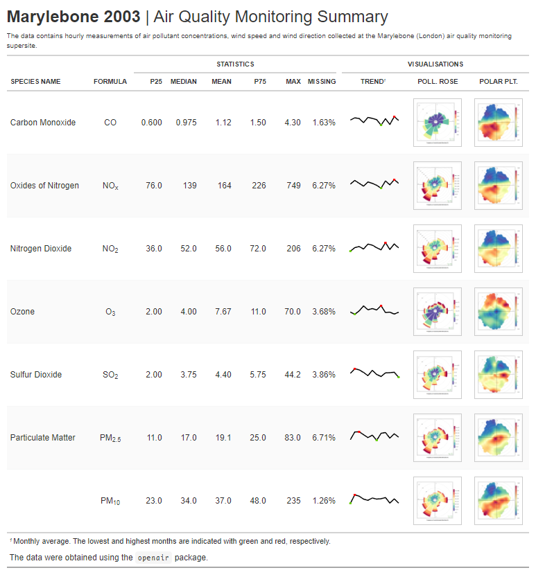
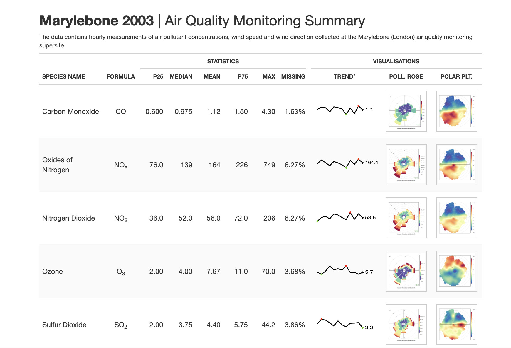
The "final plot" can be viewed below.
NB: This is a .png image of a HTML table. It is best viewed in the tutorial itself (see link below), where the plots can be enlarged.