If you have something specific in mind, it would help to understand better what you mean by:
- aggregate: sum? average? count? (I assume average below.)
- week_no: there are a few ways to calculate these, could you give some examples of what week_no should correspond to what dates? (I assume ISOweek below.)
- visualize: histograms are great for showing the distribution of one variable. Do you want to see the distribution across those summaries, or within them? (I assume the former.)
Here's an example of how that could work.
library(tidyverse)
library(lubridate)
example_data <-
tibble(date = seq.Date(from = ymd(20110101),
to = ymd(20151231),
by = "day"),
value = rnorm(length(date), 1000, sd = 500),
year = year(date),
week = isoweek(date))
example_data_summary <-
example_data %>%
group_by(year, week) %>%
summarize(avg = mean(value)) %>%
ungroup()
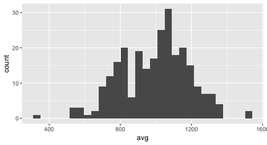
ggplot(example_data_summary, aes(x = avg)) +
geom_histogram()