Hi,
First, to make the example reproductible I fixed the dates and a seed. About the extended axis, I think it comes from ggplot2 behaviour. By default, the scale layer for x comes with an expansion so that there is some distance around the graph geom and the axis. From help("scale_x_date") , you can see there is an expand argument that explains and control this behaviour.
expand
A numeric vector of length two giving multiplicative and additive expansion constants. These constants ensure that the data is placed some distance away from the axes. The defaults are c(0.05, 0) for continuous variables, and c(0, 0.6) for discrete variables.
By default, there is an expansion, so there is space and the x axis is lengthier than the x aesthetic you provide. I guess it leads to more ticks when you control the scale_x_date behavior.
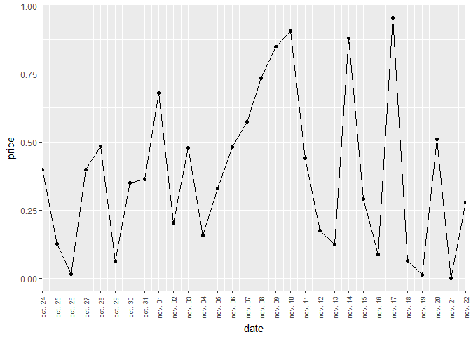
If I set expand to c(0,0), I have no more this expanded axis.
reprex::reprex_info()
#> Created by the reprex package v0.1.1.9000 on 2017-11-22

library(ggplot2)
library(scales)
last_month <- as.Date("2017-11-22", format = "%Y-%m-%d") - 0:29
set.seed(11)
df <- data.frame(
  date = last_month,
  price = runif(30)
)

base <- ggplot(df, aes(date, price)) +
  geom_line() +
  geom_point() +
  scale_x_date(breaks = date_breaks("1 day"),
               date_labels = "%b %d", expand = c(0,0))+
  theme(
    axis.text.x = element_text(angle=90,size=7, vjust = 0.5)
  )
base
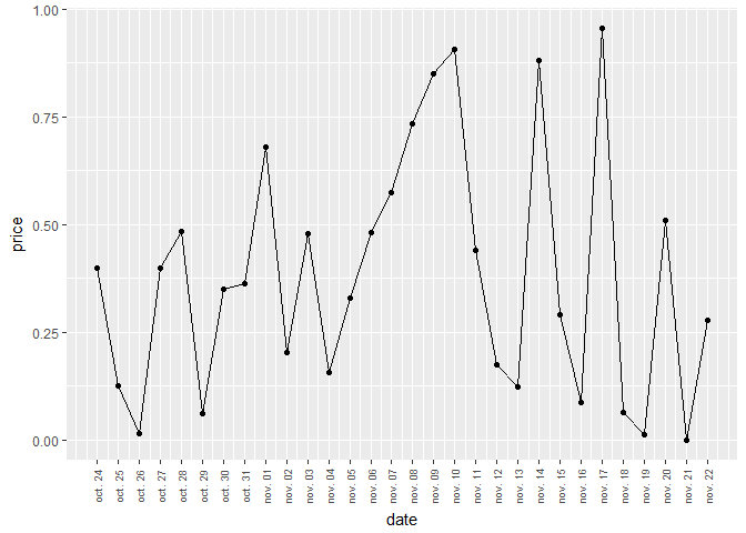
Note that, in scale_x_date, you use scales::date_breaks for setting new breaks. Doing that you use the default tick marks computed by ggplot2. but saying you want one tick per day. Hence my answer above. However, if you set explicitly the date breaks to be equal to last_month, you can have one tick mark per day and keep the expansion around the geom to have a nicer looking plot not touching the axis. indeed, ggplot still compute a space for the graph base of an expanded x axis, that you customize with scale_x_date to have only breaks and tick marks for the value in last_month. Here what it looks like.
reprex::reprex_info()
#> Created by the reprex package v0.1.1.9000 on 2017-11-22

library(ggplot2)
library(scales)
last_month <- as.Date("2017-11-22", format = "%Y-%m-%d") - 0:29
set.seed(11)
df <- data.frame(
  date = last_month,
  price = runif(30)
)

base <- ggplot(df, aes(date, price)) +
  geom_line() +
  geom_point() +
  scale_x_date(breaks = last_month,
               date_labels = "%b %d")+
  theme(
    axis.text.x = element_text(angle=90,size=7, vjust = 0.5)
  )
base
I hope these examples help you understand a little how ggplot2 magic is working.