Maso
November 2, 2022, 1:37pm
1
Hi!
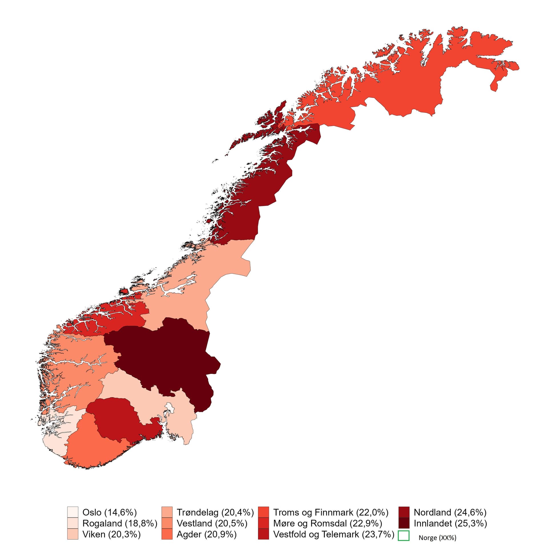
I have created a map in R displaying the population growth for different counties in Norway. Is there any way I can add a box at the end to display the mean value for Norway (see picture below)?
This is my current code:
andel_over_67 <- ggplot(map1, aes(long, lat, group = group)) +
Thanks!
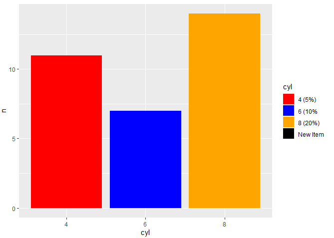
One way would be to add the mean value for Norway to the values (mycolors in your case) and labels vectors within scale_fill_manual. Without the map1 data, I could not recreate your specific situation. Below is an example using the mtcars dataset with comments noting the new addition.
library(tidyverse)

df = mtcars %>%
  mutate(cyl = as.character(cyl)) %>%
  count(cyl)

df
#>   cyl  n
#> 1   4 11
#> 2   6  7
#> 3   8 14

ggplot(df, aes(x = cyl, y = n)) +
  geom_bar(stat = 'identity', aes(fill = cyl)) +
  scale_fill_manual(values = c('4' = 'red',
                               '6' = 'blue',
                               '8' = 'orange',
                               'NA' = 'black' # added to values
                               ),
                    labels = c('4 (5%)',
                               '6 (10%',
                               '8 (20%)',
                               'New Item' # added to labels
                               )
                    )
Created on 2022-11-02 with reprex v2.0.2.9000
1 Like
Maso
November 2, 2022, 6:08pm
3
Thank you so much for the quick reply. Im using a color palette that only has 9 colors. In my case, "mycolors" refers to this code:
nb.cols <- 11
Does that change anything? Is it still possible to add to the values, or do I have to manually assign a color to each observation?
Thanks again!
You could try adding another line to the code you just shared, which adds white as the last color:mycolors <- c(mycolors, '#FFFFFF ')
Then, add the desired corresponding label at the end of labels vector within your plot:labels=c("Oslo (14,6%)", ..., "Norge XX%").
system
November 9, 2022, 6:39pm
5
This topic was automatically closed 7 days after the last reply. New replies are no longer allowed.