Adding percentage labels to a stacked bar chart

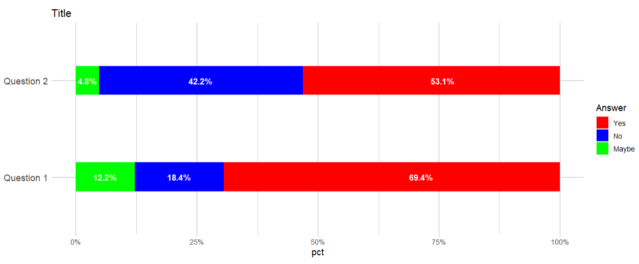
How to add percentage labels inside the bars of a stacked bar chart using geom_col?

Here is my code:

library(ggplot2)
library(dplyr)
library(tidyr)
library(stringr)
plot_data %>%
  drop_na() %>% 
  ggplot(mapping = aes(x = variable)) +
  geom_col(aes(fill = value, y = pct),
           position = 'fill',
           width = 0.30) +
  scale_y_continuous(labels = scales::percent) +
  xlab( element_blank()) +
  scale_fill_manual(
    values = c('red', 'blue', 'green'),
    labels = c(
      'Yes',
      'No',
      'Maybe'
    ),
    drop = FALSE
  ) +
  
  guides(
    fill = guide_legend(title = 'Answer')
  ) + theme(text = element_text(size = 12), 
            panel.background = element_blank(),
            axis.ticks.y = element_blank(),
            panel.grid.major = element_line(colour = 'grey'),
            axis.ticks.x = element_line(colour = 'grey'),
            panel.grid.minor = element_line(colour = 'lightgrey'),
            axis.text.y = element_text(
              size = 12,
              face = 'plain',
              hjust = 0
            )) +
  coord_flip() +
  ggtitle(str_wrap("Title", width = 50)) +
  scale_x_discrete(labels = function(x)
    str_wrap(x, width = 20))

And here is my data:

structure(list(variable = c("Question 1", "Question 1", "Question 1", 
"Question 2", "Question 2", "Question 2"), value = structure(c(1L, 
2L, 3L, 1L, 2L, 3L), .Label = c("Yes", "No", "Maybe"), class = c("ordered", 
"factor")), n = c(102L, 27L, 18L, 78L, 62L, 7L), pct = c(0.693877551020408, 
0.183673469387755, 0.122448979591837, 0.530612244897959, 0.421768707482993, 
0.0476190476190476)), class = c("grouped_df", "tbl_df", "tbl", 
"data.frame"), row.names = c(NA, -6L), groups = structure(list(
    variable = c("Question 1", "Question 2"), .rows = structure(list(
        1:3, 4:6), ptype = integer(0), class = c("vctrs_list_of", 
    "vctrs_vctr", "list"))), class = c("tbl_df", "tbl", "data.frame"
), row.names = c(NA, -2L), .drop = TRUE))

Below is one way to add labels using geom_text(), which uses a newly created data frame (plot_labels) that calculates new y-position values to place each label.

plot_labels = plot_data %>%
  arrange(variable, desc(value)) %>%
  group_by(variable) %>%
  mutate(label_y = 0.5 * cumsum(pct),
         label_y = cumsum(label_y)) %>%
  ungroup()

# plot
plot_data %>%
  drop_na() %>% 
  ggplot(mapping = aes(x = variable)) +
  geom_col(aes(fill = value, y = pct),
           position = 'fill',
           width = 0.30) +
  geom_text(data = plot_labels, 
            aes(x = variable, y = label_y, label = scales::percent(pct)),
            color = 'white',
            fontface = 'bold') +
  scale_y_continuous(labels = scales::percent) +
  xlab( element_blank()) +
  scale_fill_manual(
    values = c('red', 'blue', 'green'),
    labels = c('Yes', 'No', 'Maybe'),
    drop = FALSE
  ) +
  guides(fill = guide_legend(title = 'Answer')) + 
  theme(text = element_text(size = 12), 
            panel.background = element_blank(),
            axis.ticks.y = element_blank(),
            panel.grid.major = element_line(colour = 'grey'),
            axis.ticks.x = element_line(colour = 'grey'),
            panel.grid.minor = element_line(colour = 'lightgrey'),
            axis.text.y = element_text(
              size = 12,
              face = 'plain',
              hjust = 0
            )) +
  coord_flip() +
  ggtitle(str_wrap("Title", width = 50)) +
  scale_x_discrete(labels = function(x)
    str_wrap(x, width = 20))

Created on 2023-01-23 with reprex v2.0.2.9000

2 Likes

Thank you @scottyd22 . I wonder, there must be a shorter way to do it using the original data frame

I suppose you could do the same calculations within one continuous chain without generating a second data frame.

plot_data %>%
  drop_na() %>%
  arrange(variable, desc(value)) %>%
  group_by(variable) %>%
  mutate(label_y = 0.5 * cumsum(pct),
         label_y = cumsum(label_y)) %>%
  ungroup() %>%
  ggplot(mapping = aes(x = variable)) +
  geom_col(aes(fill = value, y = pct),
           position = 'fill',
           width = 0.30) +
  geom_text(aes(x = variable, y = label_y, label = scales::percent(pct)),
            color = 'white',
            fontface = 'bold') +
  scale_y_continuous(labels = scales::percent) +
  xlab( element_blank()) +
  scale_fill_manual(
    values = c('red', 'blue', 'green'),
    labels = c('Yes', 'No', 'Maybe'),
    drop = FALSE
  ) +
  guides(fill = guide_legend(title = 'Answer')) + 
  theme(text = element_text(size = 12), 
            panel.background = element_blank(),
            axis.ticks.y = element_blank(),
            panel.grid.major = element_line(colour = 'grey'),
            axis.ticks.x = element_line(colour = 'grey'),
            panel.grid.minor = element_line(colour = 'lightgrey'),
        plot.margin = margin(1,1,1,1,'cm'),
            axis.text.y = element_text(
              size = 12,
              face = 'plain',
              hjust = 0
            )) +
  coord_flip() +
  ggtitle(str_wrap("Title", width = 50)) +
  scale_x_discrete(labels = function(x)
    str_wrap(x, width = 20))
1 Like

This topic was automatically closed 7 days after the last reply. New replies are no longer allowed.

If you have a query related to it or one of the replies, start a new topic and refer back with a link.