Adding standard deviation error bars to a stacked barplot

Hi everyone,
I am not an R studio pro and I'm struggling quite a bit to create a specific diagram and after looking at every forum not understanding the code I hope someone may help me.
So basically, as the title says, I want to create a stacked barplot with standard deviation error bars.
If my understanding is right, I have to calculate myself the position of the error bars, which is where I'm stuck.

I created already my stack barplot using the very easy following line:
"barplot(as.matrix(dataset))"
I know I can also use ggplot2 but I was also struggling to understand every entry and since my data is already normalised to 100%, the barplot works for me.

But now is my problem, I calculated the standard deviation on Excel all of my data but I don't know how add it into R.
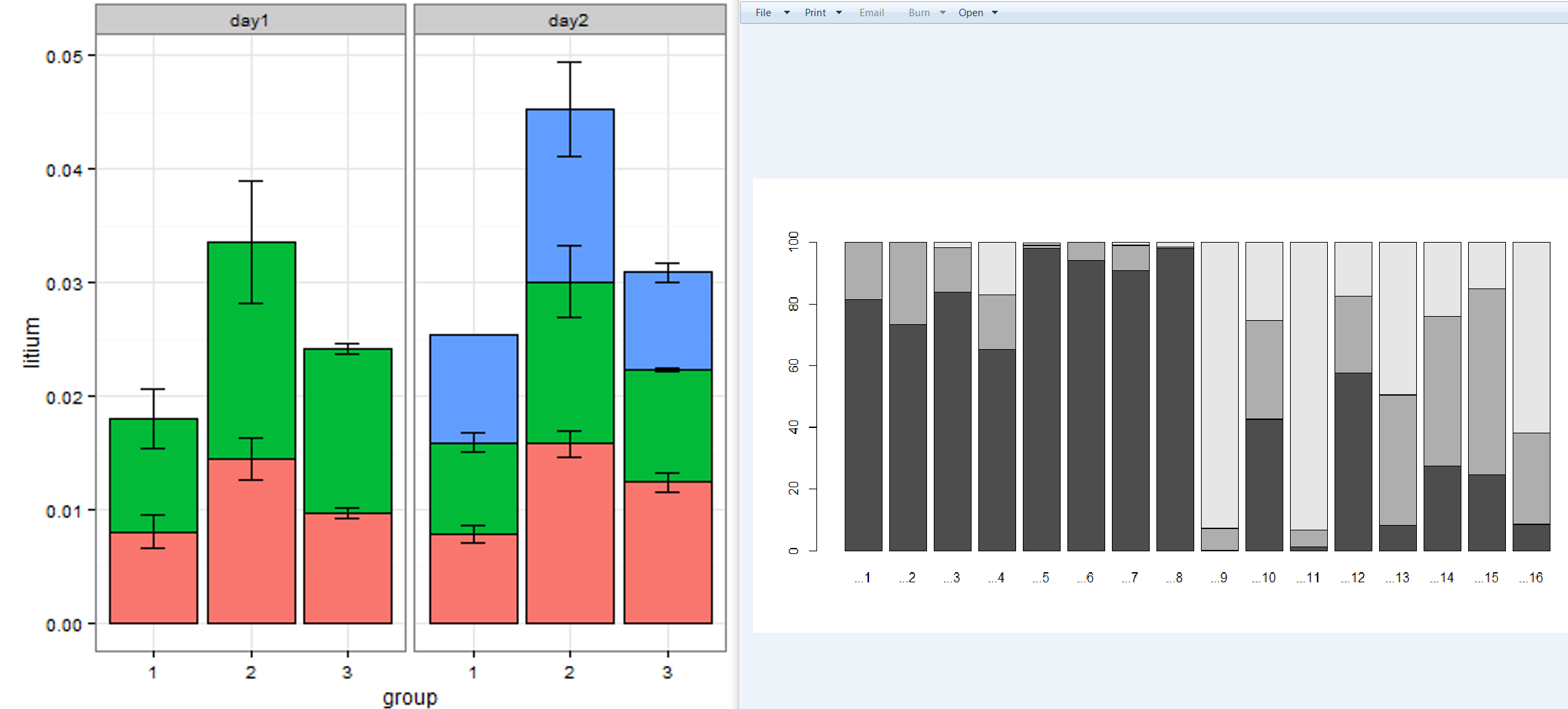
Here is a picture of my own stacked barplot on the right and the other one is a picture of what I would want, on the left.

Thanks a lot if anyone can help me or share some link that I could read :slight_smile:

Hi, try to put a reproducible example of data.

Like, this:

# paste the result (change of name of his data)
dput(data[1:100, ]

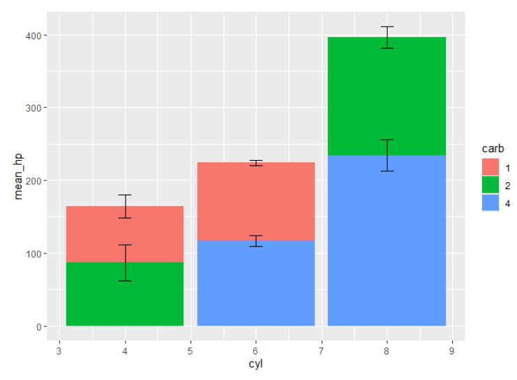
Below is an example using a subset of the mtcars data. The sample data has mean and standard deviation by cyl and carb. As you point out, the position of the error bars needs to be calculated. I did this by first arranging the data set (this may take some trial and error to get right), grouping by cyl, and then taking the cumulative sum of mean_hp. This new column is the center point of the error bar, from which the standard deviation is added to and subtracted from in geom_errorbar().

library(tidyverse)

# sample data
df = mtcars %>%
  filter(carb %in% c(1, 2, 4)) %>%
  group_by(cyl, carb) %>%
  summarise(mean_hp = mean(hp),
            sd_hp = sd(hp),
            .groups = 'drop') %>%
  mutate(carb = factor(carb))

df
#> # A tibble: 6 × 4
#>     cyl carb  mean_hp sd_hp
#>   <dbl> <fct>   <dbl> <dbl>
#> 1     4 1        77.4 16.1 
#> 2     4 2        87   24.9 
#> 3     6 1       108.   3.54
#> 4     6 4       116.   7.51
#> 5     8 2       162.  14.4 
#> 6     8 4       234   21.7

# build error bar data
error_bars = df %>%
  arrange(cyl, desc(carb)) %>%
  # for each cyl group, calculate new value by cumulative sum
  group_by(cyl) %>%
  mutate(mean_hp_new = cumsum(mean_hp)) %>%
  ungroup()

error_bars
#> # A tibble: 6 × 5
#>     cyl carb  mean_hp sd_hp mean_hp_new
#>   <dbl> <fct>   <dbl> <dbl>       <dbl>
#> 1     4 2        87   24.9          87 
#> 2     4 1        77.4 16.1         164.
#> 3     6 4       116.   7.51        116.
#> 4     6 1       108.   3.54        224 
#> 5     8 4       234   21.7         234 
#> 6     8 2       162.  14.4         396.

# plot
ggplot(df, aes(x = cyl, y = mean_hp)) +
  geom_bar(stat = 'identity', aes(fill = carb)) +
  geom_errorbar(data = error_bars,
                aes(x = cyl, ymax = mean_hp_new + sd_hp, ymin = mean_hp_new - sd_hp), 
                width = 0.2)

Created on 2023-01-22 with reprex v2.0.2.9000

1 Like

This topic was automatically closed 42 days after the last reply. New replies are no longer allowed.

If you have a query related to it or one of the replies, start a new topic and refer back with a link.