I am using following data from git: data
library(readr)
library(curl)
library(ggpubr)
data <- read_csv("https://raw.githubusercontent.com/fivethirtyeight/data/master/candy-power-ranking/candy-data.csv")
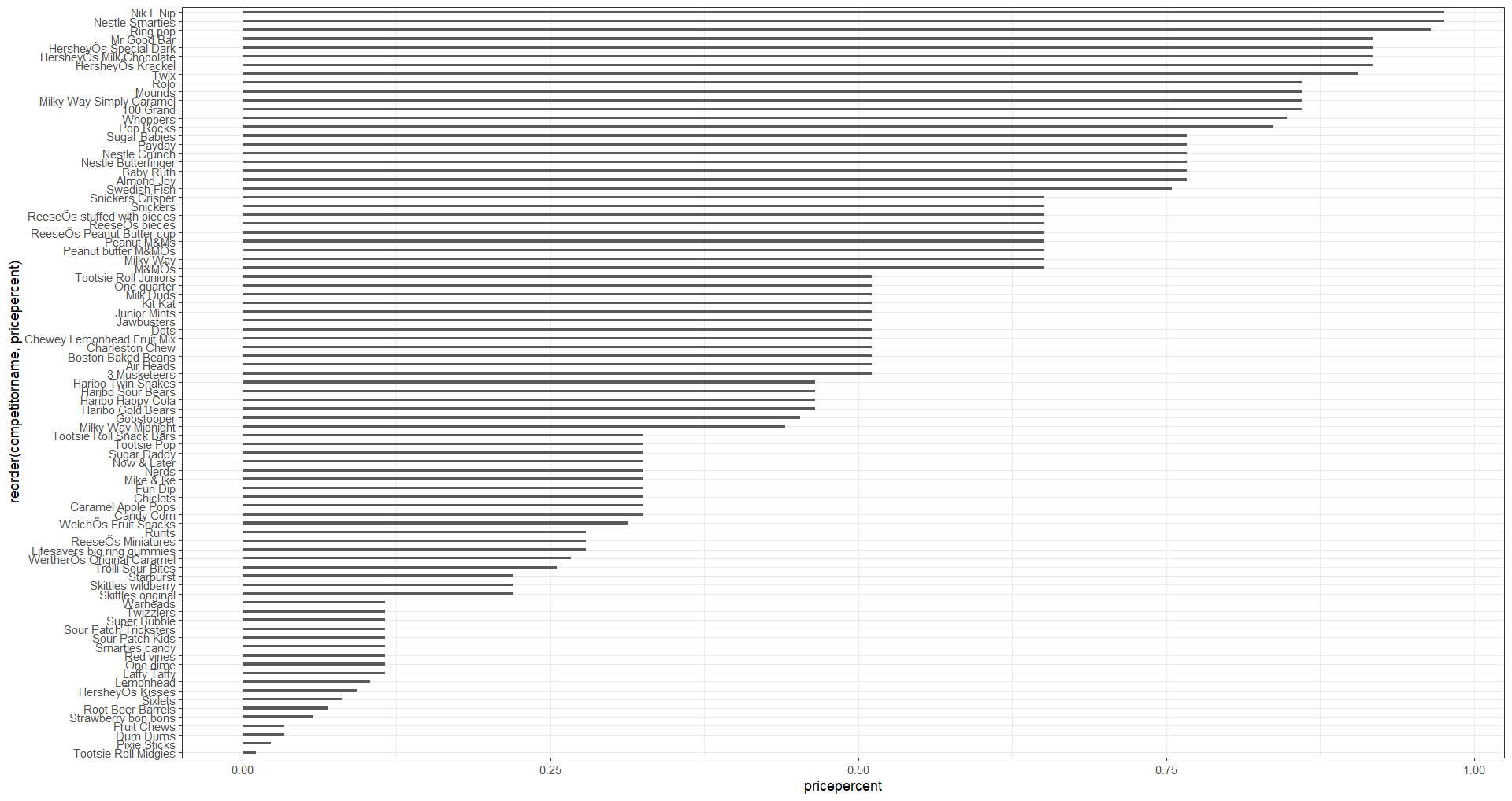
ggplot(data, aes(x=reorder(competitorname, pricepercent), y=pricepercent)) +
#geom_segment(aes(xend=reorder(competitorname, pricepercent), yend=0)) +
#geom_point() +
geom_bar(stat="identity", width=.3) +
coord_flip()+
theme_bw()
The y axis of the plot is very confusing. How can I stretch it so that the axis is clear and there is enough space in the axis for each competition name so that nothing overlaps?