Hi,
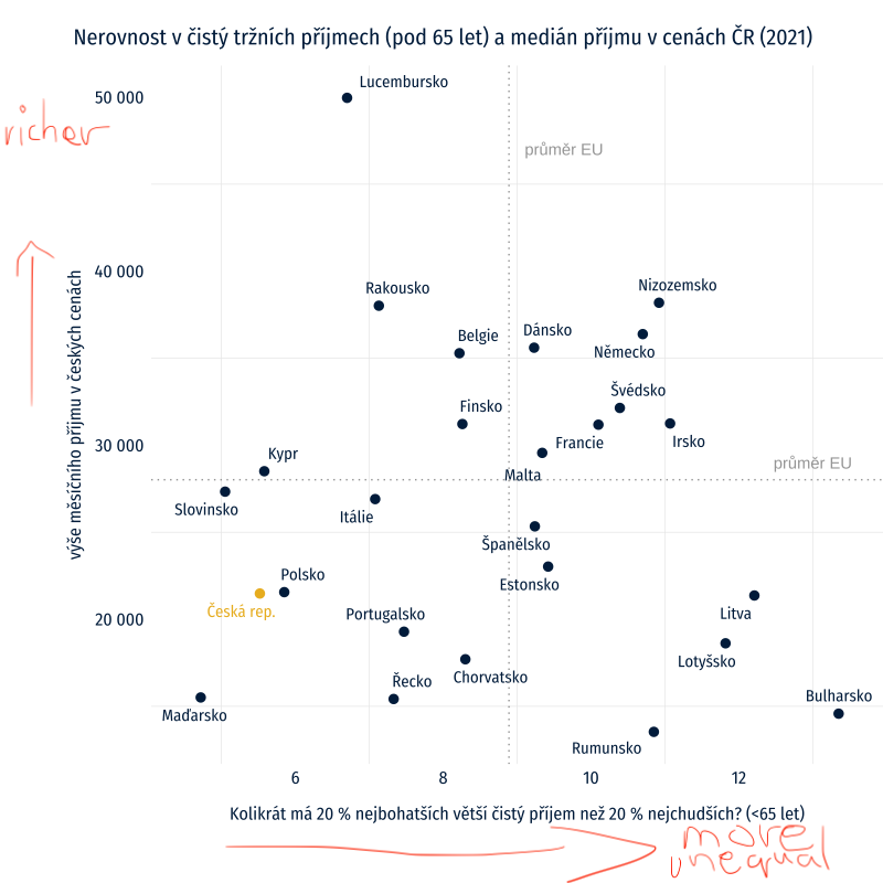
I'd like to add arrows below/next to axis labels in a plot like this:
say, one arrow 'more unequal' <--> 'more equal',
second arrow 'more weatlhy' <--> 'less wealthy'.
are there any packages you would recommend?
Many thanks,
Jakub
Hi,
I'd like to add arrows below/next to axis labels in a plot like this:
say, one arrow 'more unequal' <--> 'more equal',
second arrow 'more weatlhy' <--> 'less wealthy'.
are there any packages you would recommend?
Many thanks,
Jakub
Is this example of any use?
I think we need a FAQ: How to do a minimal reproducible example ( reprex ) for beginners
A handy way to supply some sample data is the dput() function. In the case of a large dataset something like dput(head(mydata, 100)) should supply the data we need.
I meant more ike a general question.
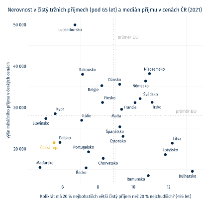
But here it is
data_plot <- structure(list(country = c("Belgie", "Bulharsko", "Česká rep.",
                                        "Dánsko", "Německo", "Estonsko", "Irsko", "Řecko", "Španělsko",
                                        "Francie", "Chorvatsko", "Itálie", "Kypr", "Lotyšsko", "Litva",
                                        "Lucembursko", "Maďarsko", "Malta", "Nizozemsko", "Rakousko",
                                        "Polsko", "Portugalsko", "Rumunsko", "Slovinsko", "Finsko", "Švédsko"
), net_market = c(8.22, 13.35, 5.52, 9.23, 10.7, 9.42, 11.07,
                  7.33, 9.24, 10.1, 8.3, 7.08, 5.58, 11.82, 12.21, 6.7, 4.72, 9.34,
                  10.92, 7.13, 5.85, 7.47, 10.85, 5.05, 8.26, 10.39), gross_market = c(12.6,
                                                                                       16.47, 7.89, 12.21, 14.37, 12.54, 16.43, 7.24, 10.98, 11.36,
                                                                                       11.15, 9.37, 6.44, 14.76, 19.61, 6.67, 7.39, 11.96, 12.21, 9.56,
                                                                                       6.58, 11.62, 16.96, 7.61, 11.84, 10.02), value = c(35286.9425,
                                                                                                                                          14576.5625, 21480.0225, 35604.1285, 36384.6548333333, 23027.0816666667,
                                                                                                                                          31250.5951666667, 15419.2821666667, 25339.1188333333, 31180.6276666667,
                                                                                                                                          17701.7775, 26904.836, 28506.3143333333, 18619.1291666667, 21366.5196666667,
                                                                                                                                          49959.9046666667, 15507.9076666667, 29560.4913333333, 38186.7066666667,
                                                                                                                                          38015.675, 21559.319, 19286.1526666667, 13531.7145, 27332.4151666667,
                                                                                                                                          31217.9436666667, 32143.0695), group = c("abroad", "abroad",
                                                                                                                                                                                   "Czech", "abroad", "abroad", "abroad", "abroad", "abroad", "abroad",
                                                                                                                                                                                   "abroad", "abroad", "abroad", "abroad", "abroad", "abroad", "abroad",
                                                                                                                                                                                   "abroad", "abroad", "abroad", "abroad", "abroad", "abroad", "abroad",
                                                                                                                                                                                   "abroad", "abroad", "abroad")), row.names = c(NA, -26L), class = c("tbl_df", "tbl", "data.frame"))


library(ggplot2)
library(ggrepel)
library(sysfonts)
library(showtext)
#> Loading required package: showtextdb

font_add_google("Fira Sans Condensed")
showtext_auto()

ggplot(data_plot,aes(x = net_market, y = value)) +
  geom_text_repel(aes(label = country),
                  vjust = 0.5 ,
                  color = ifelse(data_plot$group=="Czech", "#ECB925", "#00254B"),
                  family = c("Fira Sans Condensed"),
                  show.legend = F,
                  min.segment.length = Inf,
                  box.padding = 0.5) +
  geom_point(shape = 16,
             size = 3,
             color = ifelse(data_plot$group=="Czech", "#ECB925", "#00254B")) +
  scale_y_continuous(label = scales::comma_format(accuracy = 1, scale = 1, prefix = "", suffix = "",
                                                  big.mark = " ", decimal.mark = ","),
                     limits = c(13500,50000)) +
  scale_x_continuous(label = scales::comma_format(accuracy = 1, scale = 1, prefix = "", suffix = "",
                                                  big.mark = " ", decimal.mark = ","),
                     limits = c(4.5,13.5)) +
  scale_shape_manual(values = c("čistý tržní příjem" = 18)) +
  labs(title = "Nerovnost v čistý tržních příjmech (pod 65 let) a medián příjmu v cenách ČR (2021)",
       x = "Kolikrát má 20 % nejbohatších větší čistý příjem než 20 % nejchudších? (<65 let)",
       y = "výše měsíčního příjmu v českých cenách") +
  theme_minimal() +
  theme(axis.text = element_text(size = 12, color = "#00254B"),
        text = element_text(size = 15, family = "Fira Sans Condensed"),
        panel.grid.major = element_blank(),
        axis.title.x = element_text(size = 12, family = "Fira Sans Condensed", color = "#00254B",
                                    vjust = -2),
        axis.title.y = element_text(size = 12, family = "Fira Sans Condensed", color = "#00254B",
                                    vjust = 2),
        plot.title = element_text(size = 15, family = "Fira Sans Condensed",
                                  color="#00254B",
                                  margin = margin(t = 10,
                                                  r = 0,
                                                  b = 10,
                                                  l = 0)),
        legend.position =  "none",
        legend.title=element_blank(),
        plot.margin = margin(t = 10,
                             r = 0,
                             b = 20,
                             l = 20),
        plot.title.position = "plot",
        plot.caption.position =  "plot") +
  geom_vline(xintercept = 8.89,
             linetype = 'dotted',
             col = "#A6A6A6") +
  annotate("text", x = 8.89, y = 47000,
           label = "průměr EU", hjust = - 0.2,
           color = "#A6A6A6") +
  geom_hline(yintercept = 18019 *  (18.658)/12,
             linetype = 'dotted',
             col = "#A6A6A6") +
  annotate("text", y = 18019 *  (18.658)/12,  x = 13,
           label = "průměr EU", vjust = - 1,
           color = "#A6A6A6")
Here is a crude first attempt. I am messing up the x coordinates but it may give you a hint. It is not a solution. My appologies.
library(tidyverse)
x<-rnorm(20)
y<-rnorm(20)
df<-data.frame(x,y)

ggplot(df,aes(x,y))+geom_point()

p1  <- ggplot(df,aes(x,y)) + geom_point()


p2  <- p1 +  annotate("segment", x =   -1.5 , xend = 1, y = -3.5, yend = -3.5,
        colour = "blue", arrow = arrow()) + annotate("text", x = 2, y = -3.5, label = "dots") +
          coord_cartesian(xlim = c(-3, 3),  ylim=c(-2.5, 3), clip="off")

p2 +  annotate("segment", x =   -3.8 , xend = -3.8 , y = -2.5 , yend = 2.2,
               colour = "blue", arrow = arrow()) +
                annotate("text", x = -3.8, y = -2.5, label = "dashes")
This topic was automatically closed 21 days after the last reply. New replies are no longer allowed.
If you have a query related to it or one of the replies, start a new topic and refer back with a link.