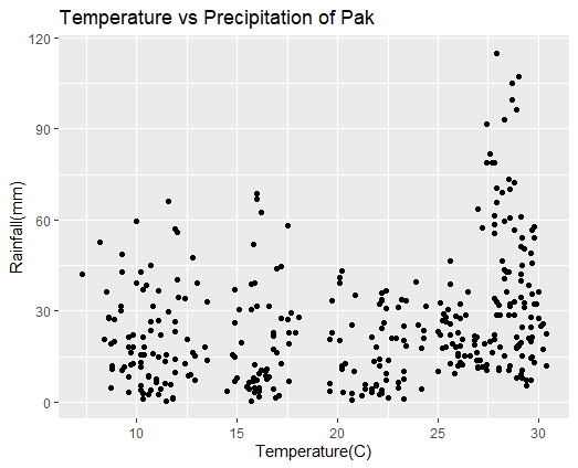
Hi all. I have successfully plotted x and y axes plot, using ggplot fucntion, by taking Temperature data on the x-axis and Rainfall data on the y-axis. Now I want to assign each variable a different color. How can I tweak my data further to accomplish this task? Your kind assistance is needed, please.
Here is my script for reference and find attached the plot also:
ggplot(data = data_pak,aes(x=Temperature, y=Rainfall))+
geom_point()+
ggtitle("Temperature vs Precipitation of Pak")+
xlab("Temperature(C)")+ylab("Rainfall(mm)")
Hi Yifan. Nice to meet you. I am a former master's graduate from the Chinese Academy of Sciences.
I am dropping below the data (in CSV, however, couldn't upload the file here), which I have used to reproduce ggplot . Also, I have shared more strings from script for reference.
I am learning R as a beginner, so apologies in advance for any trouble.
| Year|Months|Temperature|Rainfall|
|1991| Jan |8.9|20|
|1991| Feb |10.2|42.9|
|1991| Mar |15.9|39.3|
|1991| Apr |20.9|35.1|
|1991| May |25.4|28|
|1991| Jun |29.2|10.7|
|1991| Jul |29.5|21.1|
|1991| Aug |27.8|20.9|
|1991| Sep |25.4|26.4|
|1991| Oct |20.3|3.1|
|1991| Nov |15.6|4.4|
|1991| Dec |11.9|9.9|
|1992| Jan |9.3|48.7|
|1992| Feb |10.8|31.5|
|1992| Mar |14.9|37.1|
|1992| Apr |20.1|40.9|
|1992| May |25.1|22|
|1992| Jun |29.4|5.5|
|1992| Jul |28.5|42.9|
|1992| Aug |27|63.7|
|1992| Sep |24.4|31.8|
|1992| Oct |20.8|10.3|
|1992| Nov |15.8|7|
|1992| Dec |12.4|12.8|
|1993| Jan |8.6|28.1|
|1993| Feb |13.5|13.7|
|1993| Mar |15.1|30.6|
|1993| Apr |21.9|18.1|
|1993| May |27.2|11.5|
|1993| Jun |29.1|19.8|
|1993| Jul |28.5|73.3|
|1993| Aug |28|11.3|
|1993| Sep |26|16|
|1993| Oct |20.7|2.8|
|1993| Nov |16.6|8.5|
|1993| Dec |11.8|1|
|1994| Jan |9.8|18.2|
|1994| Feb |10.7|26.7|
|1994| Mar |17.9|22.8|
|1994| Apr |20.7|25.6|
|1994| May |26.8|19|
|1994| Jun |29.7|21.4|
|1994| Jul |28.3|93.2|
|1994| Aug |27.7|78.9|
|1994| Sep |23.9|39.6|
|1994| Oct |20.2|10.9|
|1994| Nov |16.9|1.6|
|1994| Dec |10.7|23.5|
|1995| Jan |8.8|11|
|1995| Feb |11.6|29.9|
|1995| Mar |14.9|26.3|
|1995| Apr |20.2|43.1|
|1995| May |26.2|12.2|
|1995| Jun |29.7|14.8|
|1995| Jul |28.7|99.6|
|1995| Aug |27.8|58.5|
|1995| Sep |25.4|18.3|
|1995| Oct |21.8|13.4|
|1995| Nov |15.5|5.1|
|1995| Dec |10.4|18.3|
|1996| Jan |8.6|27.7|
|1996| Feb |12|40.2|
|1996| Mar |17.2|44.7|
|1996| Apr |22.2|24.4|
|1996| May |25.1|32.7|
|1996| Jun |28.4|42.8|
|1996| Jul |28.6|32.3|
|1996| Aug |27.2|57.3|
|1996| Sep |26|12.1|
|1996| Oct |20.4|12.7|
|1996| Nov |14.5|3.7|
|1996| Dec |10.2|5.3|
|1997| Jan |8.7|19.2|
|1997| Feb |11.4|6.2|
|1997| Mar |15.7|39|
|1997| Apr |20.1|39.1|
|1997| May |24.2|17.9|
|1997| Jun |28|32.1|
|1997| Jul |29.2|54.1|
|1997| Aug |27.4|78.7|
|1997| Sep |25.8|9.4|
|1997| Oct |19.7|23|
|1997| Nov |14.9|6.8|
|1997| Dec |9.8|12.7|
|1998| Jan |9.2|31.5|
|1998| Feb |11.1|36.7|
|1998| Mar |15.7|30.5|
|1998| Apr |23|31.4|
|1998| May |26.8|20.5|
|1998| Jun |28.9|21.6|
|1998| Jul |29.1|51.3|
|1998| Aug |28.5|28.9|
|1998| Sep |26|22.8|
|1998| Oct |21.9|5.9|
|1998| Nov |15.7|0.3|
|1998| Dec |11.8|1.6|
|1999| Jan |9.2|30|
|1999| Feb |12.1|34.4|
|1999| Mar |16.8|21.8|
|1999| Apr |23.4|18.4|
|1999| May |27|11.7|
|1999| Jun |29.2|8.1|
|1999| Jul |29.3|32.7|
|1999| Aug |27.9|33.2|
|1999| Sep |26.8|21.9|
|1999| Oct |22.4|7.1|
|1999| Nov |17.2|12.8|
|1999| Dec |11.5|0.5|
|2000| Jan |9.6|21.4|
|2000| Feb |10.4|15.7|
|2000| Mar |16.2|10.4|
|2000| Apr |24.2|4.5|
|2000| May |28.9|8|
|2000| Jun |29|18.8|
|2000| Jul |28.6|60.6|
|2000| Aug |27.8|34.3|
|2000| Sep |25.6|22.3|
|2000| Oct |22.2|3.9|
|2000| Nov |15.9|4.8|
|2000| Dec |11.7|6|
|2001| Jan |8.7|4.9|
|2001| Feb |11.9|14.1|
|2001| Mar |17|16.4|
|2001| Apr |22.7|21.2|
|2001| May |28.5|10.7|
|2001| Jun |29.1|42|
|2001| Jul |28.6|70.1|
|2001| Aug |27.9|28.8|
|2001| Sep |25.6|12.6|
|2001| Oct |22.2|3|
|2001| Nov |16.5|10.9|
|2001| Dec |12.6|8.7|
|2002| Jan |9.6|8.3|
|2002| Feb |11.1|26.9|
|2002| Mar |17.6|23|
|2002| Apr |23.3|20.2|
|2002| May |28|10.5|
|2002| Jun |29.6|24.7|
|2002| Jul |29.2|15.2|
|2002| Aug |28.4|36.2|
|2002| Sep |25|23.3|
|2002| Oct |22.1|2.7|
|2002| Nov |16.4|10.3|
|2002| Dec |11.4|13.4|
|2003| Jan |9.7|12.4|
|2003| Feb |12|55.9|
|2003| Mar |16.6|31.8|
|2003| Apr |22.9|21.2|
|2003| May |25.7|19.1|
|2003| Jun |29.8|13.2|
|2003| Jul |28.7|105|
|2003| Aug |27.9|65.7|
|2003| Sep |25.6|25.8|
|2003| Oct |21.4|4.4|
|2003| Nov |15|8.1|
|2003| Dec |11|7.5|
|2004| Jan |10|39.3|
|2004| Feb |12.9|15.1|
|2004| Mar |19.6|6.3|
|2004| Apr |24|25.5|
|2004| May |27.1|14|
|2004| Jun |29|18.7|
|2004| Jul |29.2|24.8|
|2004| Aug |27.8|55.6|
|2004| Sep |26|15.3|
|2004| Oct |20.2|12|
|2004| Nov |16.8|4.2|
|2004| Dec |11.9|23.2|
|2005| Jan |8.5|36.3|
|2005| Feb |10|59.6|
|2005| Mar |17|43.9|
|2005| Apr |21.7|21.5|
|2005| May |25.2|26.9|
|2005| Jun |29.6|7.3|
|2005| Jul |28.8|56.7|
|2005| Aug |28.1|28.9|
|2005| Sep |26.4|28.9|
|2005| Oct |21.9|5.4|
|2005| Nov |16|7.4|
|2005| Dec |10.7|4.1|
|2006| Jan |8.9|27.4|
|2006| Feb |14.8|15.7|
|2006| Mar |17.2|27.8|
|2006| Apr |19.7|33.3|
|2006| May |29.1|9|
|2006| Jun |28.9|17.8|
|2006| Jul |29.7|56.7|
|2006| Aug |27.6|81.8|
|2006| Sep |25.9|28.2|
|2006| Oct |23.3|10.3|
|2006| Nov |16.8|17.4|
|2006| Dec |10.5|38.5|
|2007| Jan |9.6|3.4|
|2007| Feb |12.8|47.6|
|2007| Mar |16.2|62.7|
|2007| Apr |25|10.2|
|2007| May |27.4|10.6|
|2007| Jun |29.1|34.5|
|2007| Jul |29.1|61.1|
|2007| Aug |28.3|43.5|
|2007| Sep |26.1|27.6|
|2007| Oct |20.7|0.8|
|2007| Nov |17.1|2.2|
|2007| Dec |10.6|8.3|
|2008| Jan |7.3|42.1|
|2008| Feb |10.2|13.2|
|2008| Mar |19.6|3.5|
|2008| Apr |22.4|36.7|
|2008| May |27.7|16.4|
|2008| Jun |30.1|25.1|
|2008| Jul |29.3|50.5|
|2008| Aug |27.4|91.6|
|2008| Sep |25.9|18.3|
|2008| Oct |23|6.5|
|2008| Nov |16.1|4.7|
|2008| Dec |11.9|26.5|
|2009| Jan |10.3|37.2|
|2009| Feb |13.5|33|
|2009| Mar |18.1|28|
|2009| Apr |22.2|33.4|
|2009| May |28|11.1|
|2009| Jun |28.9|18.3|
|2009| Jul |29.6|49.1|
|2009| Aug |29.3|31.4|
|2009| Sep |26.6|15.4|
|2009| Oct |21.7|4.2|
|2009| Nov |15.6|6.6|
|2009| Dec |11.5|15.6|
|2010| Jan |10.6|8.9|
|2010| Feb |12.4|34.1|
|2010| Mar |20.1|20.2|
|2010| Apr |25.2|17.8|
|2010| May |27.8|22.3|
|2010| Jun |28.8|33.2|
|2010| Jul |29|107.3|
|2010| Aug |27.9|114.9|
|2010| Sep |25.3|29.2|
|2010| Oct |23|4.6|
|2010| Nov |16.1|1.7|
|2010| Dec |10.2|4|
|2011| Jan |8.8|11.9|
|2011| Feb |11.9|57.2|
|2011| Mar |17.7|29.3|
|2011| Apr |22.3|26.1|
|2011| May |28.6|12.1|
|2011| Jun |30.2|17.5|
|2011| Jul |29.1|39.9|
|2011| Aug |28.2|68.9|
|2011| Sep |25.6|38.8|
|2011| Oct |22.1|11.9|
|2011| Nov |17.6|6.8|
|2011| Dec |10.3|2.8|
|2012| Jan |8.4|20.8|
|2012| Feb |9.6|18.2|
|2012| Mar |16.8|22.9|
|2012| Apr |22.1|32.3|
|2012| May |27|11.4|
|2012| Jun |29.4|7.2|
|2012| Jul |30|27.6|
|2012| Aug |28.2|46.4|
|2012| Sep |25.6|46.6|
|2012| Oct |21.4|6|
|2012| Nov |16.1|3.5|
|2012| Dec |11.2|22|
|2013| Jan |9.3|10.6|
|2013| Feb |11.6|66|
|2013| Mar |17.5|27.3|
|2013| Apr |22.2|33.7|
|2013| May |27.4|10.7|
|2013| Jun |30|36.3|
|2013| Jul |29.7|45.7|
|2013| Aug |27.8|79|
|2013| Sep |26.9|16.3|
|2013| Oct |23.3|7.5|
|2013| Nov |15.9|12.5|
|2013| Dec |11.1|2.4|
|2014| Jan |9.4|11.7|
|2014| Feb |10.3|21.3|
|2014| Mar |16|31.8|
|2014| Apr |22.2|36.1|
|2014| May |26.1|18.6|
|2014| Jun |30.4|12|
|2014| Jul |29.9|32.3|
|2014| Aug |28.6|31.5|
|2014| Sep |26.5|36.3|
|2014| Oct |22.4|9.4|
|2014| Nov |16.1|9.4|
|2014| Dec |10.3|1.1|
|2015| Jan |9.7|16.5|
|2015| Feb |13|39.2|
|2015| Mar |16|66.8|
|2015| Apr |23.2|33.7|
|2015| May |27.3|19.1|
|2015| Jun |29.6|28.1|
|2015| Jul |28.8|72.3|
|2015| Aug |27.9|70.4|
|2015| Sep |25.5|30.7|
|2015| Oct |22.5|13.9|
|2015| Nov |16.4|8.7|
|2015| Dec |11|6.5|
|2016| Jan |10.8|16.1|
|2016| Feb |12.7|9.2|
|2016| Mar |17.5|58.2|
|2016| Apr |23.3|25.1|
|2016| May |28.1|18.1|
|2016| Jun |30.4|22.6|
|2016| Jul |29.8|57.8|
|2016| Aug |27.8|61.3|
|2016| Sep |26.9|13.7|
|2016| Oct |22.5|1.3|
|2016| Nov |15.9|3.3|
|2016| Dec |12.9|7.2|
|2017| Jan |9.3|42.8|
|2017| Feb |12.5|20.7|
|2017| Mar |17.6|19.1|
|2017| Apr |24.3|23.6|
|2017| May |28.3|15.3|
|2017| Jun |29.8|32.5|
|2017| Jul |29.2|45.2|
|2017| Aug |28.3|40.6|
|2017| Sep |26.3|15.2|
|2017| Oct |23.3|1|
|2017| Nov |15.8|8|
|2017| Dec |11.1|14.8|
|2018| Jan |10.6|2.7|
|2018| Feb |13.4|18|
|2018| Mar |19.6|20.8|
|2018| Apr |24.3|21.2|
|2018| May |27.4|12.2|
|2018| Jun |30.2|25.9|
|2018| Jul |29.5|38.5|
|2018| Aug |28.8|28.7|
|2018| Sep |26.1|13.1|
|2018| Oct |21.7|3.1|
|2018| Nov |16.5|7.5|
|2018| Dec |11.2|4.4|
|2019| Jan |9.8|22.2|
|2019| Feb |10.7|44.9|
|2019| Mar |15.8|51.9|
|2019| Apr |23.4|33.5|
|2019| May |26.2|20.9|
|2019| Jun |29.6|20|
|2019| Jul |29.8|54.2|
|2019| Aug |28.3|59.5|
|2019| Sep |27.6|19.9|
|2019| Oct |22.1|14.1|
|2019| Nov |15.2|19.6|
|2019| Dec |10.2|11.5|
|2020| Jan |8.2|52.6|
|2020| Feb |12.8|16.3|
|2020| Mar |16|68.7|
|2020| Apr |22.4|30.8|
|2020| May |26.9|21.4|
|2020| Jun |29.6|14.7|
|2020| Jul |29.7|35.6|
|2020| Aug |28.9|96.3|
|2020| Sep |26.1|32.5|
|2020| Oct |21.2|2.3|
|2020| Nov |14.9|14.8|
|2020| Dec |10.2|15.7|
SCRIPT
install.packages("readr")
library(readr)
data_pak <- read_csv("TP-1991_2020_PAK.csv") #I am doing data inspection here after uploading data. #This is the 1st step of data exploratory analysis
View(data_pak)
str(data_pak)
dim(data_pak)
head(data_pak)
head(data_pak$Temperature)
Tail(data_pak$Rainfall)
library(tidyr)
library(tidyverse)
library(ggplot2)
ggplot(data = data_pak,aes(x=Temperature, y=Rainfall))+
geom_point()+
ggtitle("Temperature vs Precipitation of Pak")+
xlab("Temperature(C)")+ylab("Rainfall(mm)")
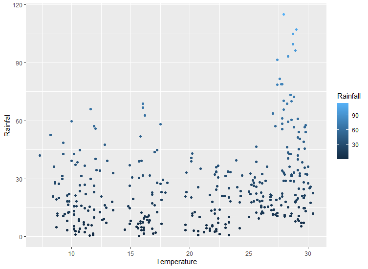
I read your data, and find out that the information of Temp. and Rainfall are already shown in x- and y- coordinates. By principle, there's no need to apply them into color again, the information is repeated. But if you insist, try to map your ideal parameters in the aesthetics (i.e., mapping = aes(...)):
You can see that the color is changing vertically since the Y-axis represents Rainfall.
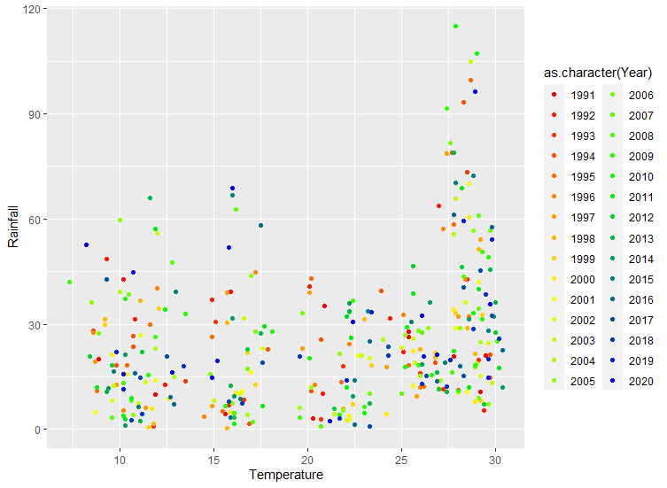
Geometry aesthetics in any plot should provide additional information than the coordinate. For example, Year is seemed suitable as the additional information:
For anyone new to R and tidyverse syntax, I recommend to read Hadley Wickham(the author of tidyr, dplyr, and ggplot2)'s book R for data science , in chapter 3 He detailedly introduces show to use ggplot to draw a plot.
I am extremely grateful for your swift help. Indeed, there cannot be a better and more simplified explanation than this one. I hope to learn more from your recommended book and your good self in the future. Truly thankful!