Hello,
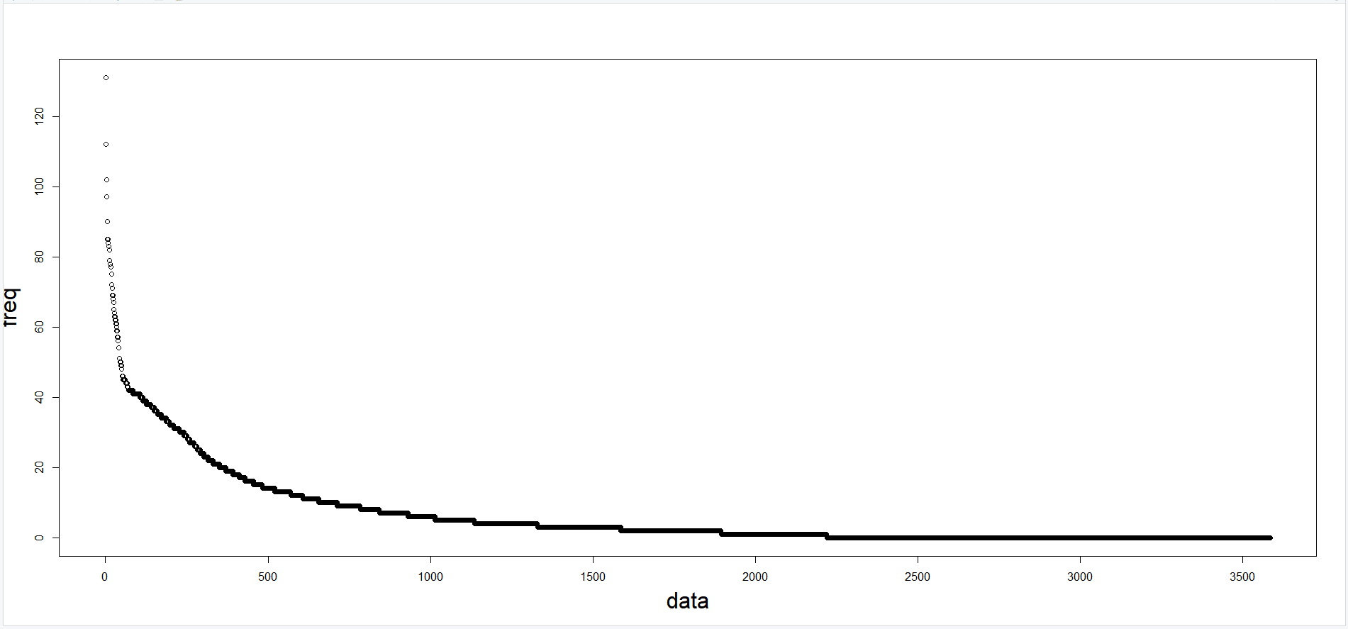
I made a graph like this. I made y axis label bigger by using 'cex' element.
And the problem is, as you can see, the y axis label has been cut out. I think this is gonna be ok if I export the graph with function. But for in case that I just want to capture it or see at there, I want to know if there is any option or command that adjusting the location of graph to the right(There are some space that I can use, since I didn't make axis on the right).
And in addition, can I adjust only axis label to the left? The reason I asking about this is, if I grow the y axis gradiations, it will likely to overlap the label.
Aaah the code I provided can used in ggplot; you are using plot instead. Is there any reason not to use ggplot?
If you are not comfortable with, you can provide me part of your df using dput(head(yourdf,10))so that I can write the code for you.