Hi,
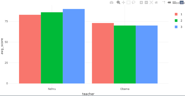
I have a data for monitoring teachers. There are master trainers and under them we have teachers. In the shiny app I need clustered bar chart of score of teachers week-wise. In the X-axis, I will have the name of teachers and y-axis the average score. I want the graph to react to the trainer and week. I select the trainer first and then the week, the graphs of that week will appear for all the teachers. This is how how I want it to appear.
library(tidyverse)
library(shiny)
library(shinydashboard)
#>
#> Attaching package: 'shinydashboard'
#> The following object is masked from 'package:graphics':
#>
#>     box
library(janitor)
#>
#> Attaching package: 'janitor'
#> The following objects are masked from 'package:stats':
#>
#>     chisq.test, fisher.test
library(plotly)
#>
#> Attaching package: 'plotly'
#> The following object is masked from 'package:ggplot2':
#>
#>     last_plot
#> The following object is masked from 'package:stats':
#>
#>     filter
#> The following object is masked from 'package:graphics':
#>
#>     layout
data<-tibble::tribble(
      ~trainer, ~week_no,    ~teacher, ~score,
  "Madhumathi",       1L,    "Gandhi",    76L,
       "Nagma",       1L,     "Nehru",    83L,
        "Anil",       1L,     "Patel",    86L,
  "Madhumathi",       1L,    "Rajaji",    57L,
       "Nagma",       1L,     "Obama",    73L,
        "Anil",       1L, "Roosevelt",    67L,
  "Madhumathi",       2L,    "Gandhi",    73L,
       "Nagma",       2L,     "Nehru",    86L,
        "Anil",       2L,     "Patel",    72L,
  "Madhumathi",       2L,    "Rajaji",    65L,
       "Nagma",       2L,     "Obama",    70L,
        "Anil",       2L, "Roosevelt",    84L,
  "Madhumathi",       3L,    "Gandhi",    75L,
       "Nagma",       3L,     "Nehru",    90L,
        "Anil",       3L,     "Patel",    70L,
  "Madhumathi",       3L,    "Rajaji",    75L,
       "Nagma",       3L,     "Obama",    70L,
        "Anil",       3L, "Roosevelt",    63L
  )

ui<-dashboardPage(
  skin = "red",
  dashboardHeader(title = "EarlySpark MIS Dashboard 2022-23",titleWidth = 550),
  dashboardSidebar("Choose your inputs here",
                   selectInput("master","Select the Master Trainer",choices=unique(data$trainer),multiple=T),
                   selectInput("week","Select the Week number", choices = NULL,multiple = T)),
  dashboardBody(
    tabsetPanel(
      tabPanel(title = "First Tab",
               plotlyOutput("plot1",height = 500,width = 1500))

    )
  )
)


server<-function(input,output,session){
  observe({
    req(input$master)


    x<-data %>%
      filter(trainer %in% input$trainer) %>%
      select(week_no)
    updateSelectInput(session,"week","Select the Week number",choices = c("All",x))
  })

  instr_attend<-reactive({
    req(input$master)
    req(input$week)

    data %>%
      group_by(trainer,week_no,teacher,score) %>%
      summarise(avg_score=mean(score)) %>%
      filter(trainer %in% input$master | "All"  %in% input$master,
             week_no %in% input$week | "All" %in% input$week)
  })

  output$plot1<-renderPlotly({
    req(instr_attend())

    student_att1<-ggplot(instr_attend(),aes(teacher,score,fill=week_no))+
      geom_bar(stat="identity",width = 0.5,position = "dodge")+
      coord_flip()+
      theme_minimal()

    ggplotly(student_att1)
  })

}

shinyApp(ui,server)
#> PhantomJS not found. You can install it with webshot::install_phantomjs(). If it is installed, please make sure the phantomjs executable can be found via the PATH variable.
Shiny applications not supported in static R Markdown documents
Created on 2022-09-20 by the reprex package (v2.0.1)