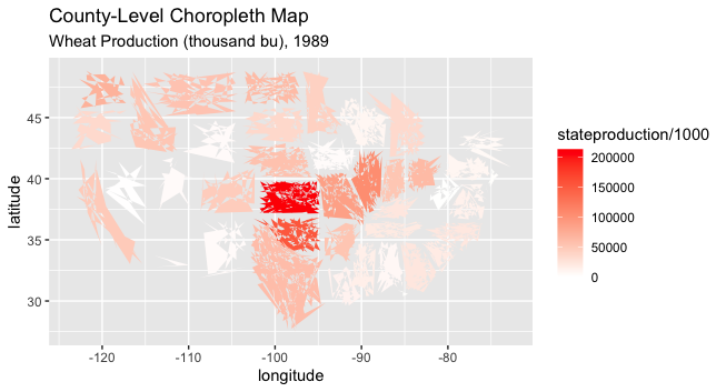
I am trying to plot the geographical distribution of wheat production using a county-level data set.
In order to create the data set, I combined a data set of county-level fips code with unique latitude-longitude for each fips code, with a data set of county-level wheat production.
I do not know why, it shows gaps between States, instead of having them connected (figure below)
library(maps)
g43 <- wheat_corn_insurance1 %>% filter(year==1989) %>% filter(wheat==1)%>%
        ggplot(aes(x = longitude, y = latitude, group = state, fill = stateproduction/1000)) +
        geom_polygon(color = NA) +
        scale_fill_gradient(low = "white", high = "red") +
        labs(title = "County-Level Choropleth Map",
        subtitle = "Wheat Production (thousand bu), 1989")

g43
I tried using the urbnmapr package as well, but I received a similar result.
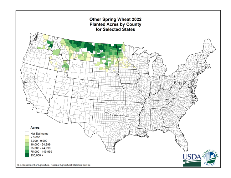
Well, that’s what it would look like if, for example, Elko County, NV is included. NA ≠ 0, is a possible reason. In fact, for spring wheat, for example, only a handful of counties had more than 5,000 acres of spring wheat planted in 2022.
Yes, thats true. But the ggplot command groups data at the state level, and also asks for plotting the production at the state level. With this set-up, I should not still expect to see well-connected states?
Oh, I see now. After enlarging the map. No borders, either between counties or at the state level.
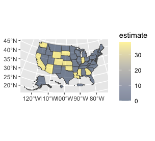
This can be fixed most simply with the {sf} package, which uses a data frame with a column that handles spatial geometry. There’s a bit of a lift to install one of the system library dependencies, but you get very fine grained control.
Here's an example. I set the estimate variable being used as fill to zero to emulate your situation. It does not knock out the states, although setting them to NA does.