Dataset has several penguin species and no numerical value related to that. I need to be able to make a graph representing prevalence of different species. I’ve made a table with the species count but how can I now make this into a graph of some sort?
Here you can find some options
If you need more specific help, please provide a proper REPRoducible EXample (reprex) illustrating your issue.
I don’t have ggplot2 available, we’re only allowed to use the standard R given to us for the statistics unit.
I will try to get an example
With more effort the graphs below could be approximated in {base} or {lattice} but shouldn't be used at all in preference to a simple table.
library(ggplot2)
library(palmerpenguins)

census <-
# the right way
| Var1 | Freq |
|---|---|
| Adelie | 152 |
| Chinstrap | 68 |
| Gentoo | 124 |
some wrong ways
too much syntax
pander::pander(penguins |> dplyr::group_by(species) |> dplyr::count())
| species | n |
|---|---|
| Adelie | 152 |
| Chinstrap | 68 |
| Gentoo | 124 |
# too misleading b/c visual perception exaggerates the differences

# example adapted from
#`https://stackoverflow.com/questions/67205251/i-want-to-add-the-count-percentage-for-each-category-as-a-label-to-my-ggplot-pie
ggplot(penguins, aes("",fill = species)) +
  geom_bar(position="fill") +
  geom_text(
    stat='count',
    aes(y=after_stat(..count..),
        label=after_stat(scales::percent(..count../sum(..count..),1))),
    position=position_fill(0.5),
  ) +
  coord_polar(theta="y") +
  labs(x=NULL, y=NULL) +
  scale_fill_brewer(palette="Pastel1") +
  theme_void()
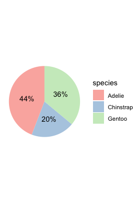
same problems
census <- penguins |> dplyr::group_by(species) |> dplyr::count()
p <- ggplot(census) + theme_minimal()
p + geom_col(aes(n,species, group = species, fill = species))

only slightly better because adds nothing to table
recipe from 3.10 Making a Cleveland Dot Plot | R Graphics Cookbook, 2nd edition
ggplot(census, aes(n,species)) +
geom_point(size = 3) + # Use a larger dot
theme_bw() +
theme(
panel.grid.major.x = element_blank(),
panel.grid.minor.x = element_blank(),
panel.grid.major.y = element_line(colour = "grey60", linetype = "dashed")
)

Created on 2023-01-21 with [reprex v2.0.2](https://reprex.tidyverse.org/)This topic was automatically closed 42 days after the last reply. New replies are no longer allowed.
If you have a query related to it or one of the replies, start a new topic and refer back with a link.