Hey and welcome to the forum!
You can essentially use the same method that has been used in the thread you have linked in your post.
Here is the method presented there adjusted to your problem.
library(tidyverse)
Df<-data.frame(group= c("A", "B", "C"),
               Co= c(0.021, 0.013,0.03),
               Se =c(0.061, 0.101, 0.300),
               Fe = c(62.663, 53.500,60.000),
               Zn = c( 5.329, 8.400, 3.000))


Df%>%pivot_longer(-group, names_to = "Element")%>%
  mutate(scaled_value = ifelse(Element == "Co" | Element == "Se", value * 200, value))%>%
  ggplot(aes(x=group, y = scaled_value, fill = Element))+
  geom_col(position = "dodge")+
  scale_y_continuous(sec.axis = sec_axis(~ . / 200, name = "Co and Se"))+
  labs(y="Fe and Zn")
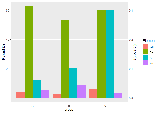
Created on 2022-11-15 with reprex v2.0.2
However, I personally would be carefull with such a plot, as it is not easy to identify which of the y axes applies on which of the variables. You could try to improve it by reordering the the bars so that Zinc and Iron are on the left and Selenium and Copper appear on the right side of each group; for example by adding Element = factor(Element, levels = c("Fe", "Zn", "Co", "Se")) into the mutate() function.
Alternatively, you could use ggplot's faceting functions to create a plot that I think is easier to interpret (but of course I don't know what you are intending to show with your plot). Here is a way you could use facets to show all four elements:
library(tidyverse)
Df<-data.frame(group= c("A", "B", "C"),
               Co= c(0.021, 0.013,0.03),
               Se =c(0.061, 0.101, 0.300),
               Fe = c(62.663, 53.500,60.000),
               Zn = c( 5.329, 8.400, 3.000))

Df%>%pivot_longer(-group, names_to = "Element")%>%
  mutate(scale = ifelse(Element == "Co" | Element == "Se", "Co and Se", "Fe and Zn"))%>%
  ggplot(aes(x=group, y = value, fill = Element))+
  geom_col(position = "dodge")+
  facet_wrap(~scale, scales = "free")
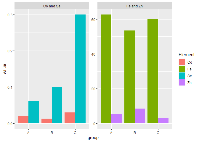
Created on 2022-11-15 with reprex v2.0.2
I hope those suggestions are helpful to you!