Creating Bar chart in R

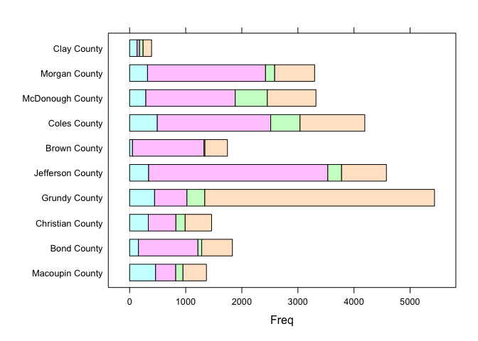
I have a table in CSV with first column "Community", second column with name "girls", second column with name "boys" , third column "men"...etc. under community column it contains names of different communities, under column of "girls" it contains number of girls for various communities(e.g: 100) also for other column. I want to create a bar chart for all communities with other column information.

Thank you

It's preferable to provide a reprex. See the FAQ so that answers better can be tailored to the specific data.

community = c(
  "Macoupin County", "Bond County",
  "Christian County", "Grundy County", "Jefferson County", "Brown County",
  "Coles County", "McDonough County", "Morgan County", "Clay County"
)
d <- data.frame(
  women = c(463, 157, 333, 445, 339, 51, 493, 289, 319, 134),
  men = c(
    359, 1061, 492, 577, 3194, 1275, 2022, 1594, 2104,
    43
  ), girls = c(
    129, 67, 165, 318, 246, 16, 523, 572, 163,
    63
  ), boys = c(
    418, 547, 471, 4096, 799, 402, 1155, 867, 712,
    151
  )
)
m <- as.matrix(d)
row.names(m) <- community
lattice::barchart(m)

dotchart(m)

mosaicplot(m)

Created on 2023-03-18 with reprex v2.0.2

1 Like

This topic was automatically closed 42 days after the last reply. New replies are no longer allowed.

If you have a query related to it or one of the replies, start a new topic and refer back with a link.