Hi!
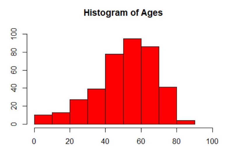
I recently finished cleaning the chronic kidney disease dataset, and I want to use R to input the cleaned data and visualize it with the help of at least 3 different plots. For instance, the correlation between the age and how many have the disease and so on.
I want to edit the visual parameters of the data to make the information I want to express clearly visible. The final visualization should have variables clearly labelled and units equally proportioned.