Hi
library(tidyverse)
library(janitor)

data1<-tibble::tribble(
        ~usage, ~miles,
            1L,    23L,
            1L,    42L,
            1L,    17L,
            1L,    32L,
            1L,    39L,
            2L,    38L,
            2L,    47L,
            2L,    25L,
            2L,    14L,
            2L,    28L,
            2L,    21L,
            3L,    35L,
            3L,    19L,
            3L,    18L,
            3L,    37L,
            3L,    27L
        )

data1 %>%
  ggplot(aes(usage,miles))+
  geom_line(stat = "identity")+
  theme_minimal()
FJCC
November 12, 2022, 6:40pm
2
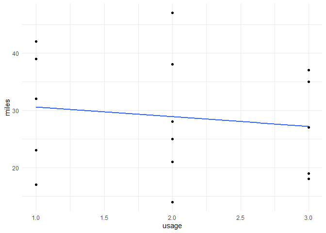
With only three values of usage and multiple values of miles at each usage , a line graph is likely to look strange. How do you want the graph to look?
I agree with @FJCC , this will look rather odd in this setting. Since usage seems to be a factor, you could use splitted histogram like this:
data1 |>
  ggplot() +
  geom_histogram(aes(miles), bins = 4) +
  facet_wrap(~ usage) +
  theme_minimal()
If you had a third meaningful variable, you could do a line chart with groups.
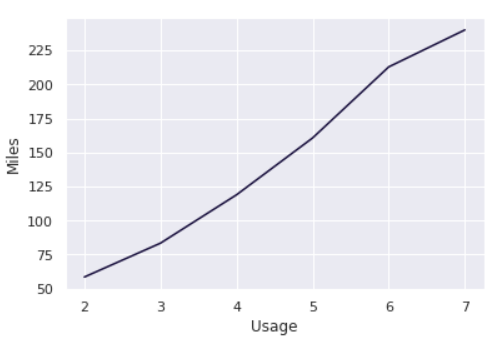
The actual data has more values actually. The graph I want is attached as screenshot.
yeah histogram works, but the project had specifically asked for creating a line graph.
FJCC
November 13, 2022, 4:48pm
6
There is nothing wrong with your code. The data are such that a line plot will not be helpful. With multiple points at each x value, the line will have vertical regions. You could plot a line that represents the best fit to the data and that would at least be smooth.
library(tidyverse)
data1<-tibble::tribble(
  ~usage, ~miles,
  1L,    23L,
  1L,    42L,
  1L,    17L,
  1L,    32L,
  1L,    39L,
  2L,    38L,
  2L,    47L,
  2L,    25L,
  2L,    14L,
  2L,    28L,
  2L,    21L,
  3L,    35L,
  3L,    19L,
  3L,    18L,
  3L,    37L,
  3L,    27L
)

data1 %>%
  ggplot(aes(usage,miles))+
  geom_point()+
  geom_smooth(formula = y ~ x, method = "lm", se = FALSE) +
  theme_minimal()
Created on 2022-11-13 with reprex v2.0.2
Oh yeah that's true. I have just sorted it now. I have grouped it and summarized. So for each usage value I get one value (average) as given below:
data1 %>%
  group_by(usage) %>%
  summarise(avg_miles=mean(miles)) %>%
  ggplot(aes(usage,avg_miles))+
  geom_line(size=2)+
  theme_minimal()
Thank you very much for your response.
system
November 20, 2022, 4:59pm
8
This topic was automatically closed 7 days after the last reply. New replies are no longer allowed.