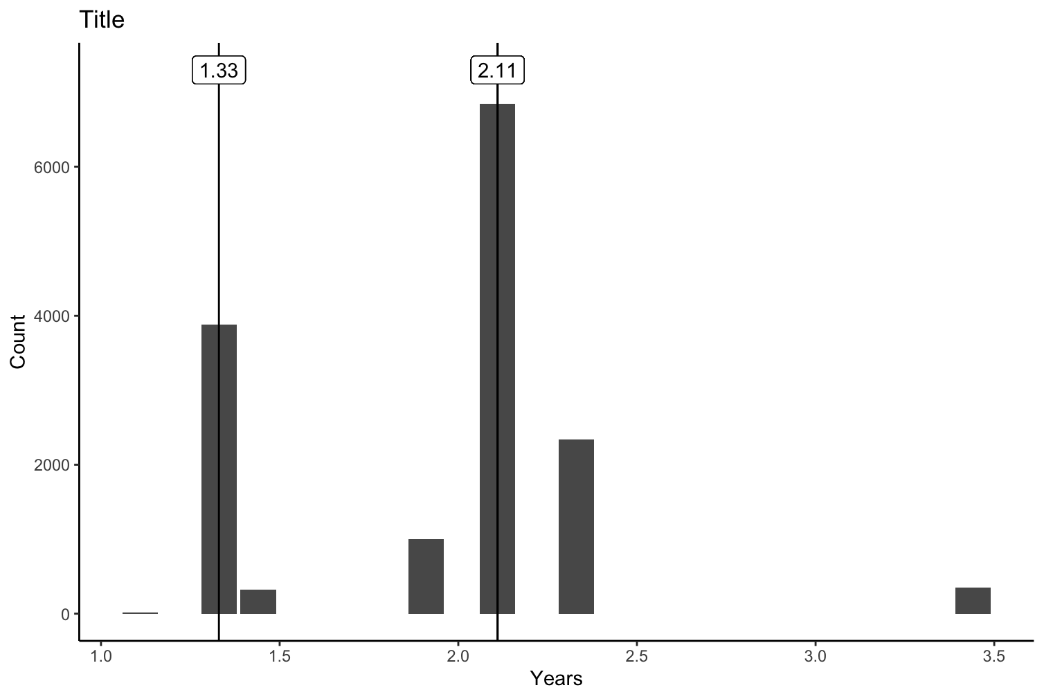
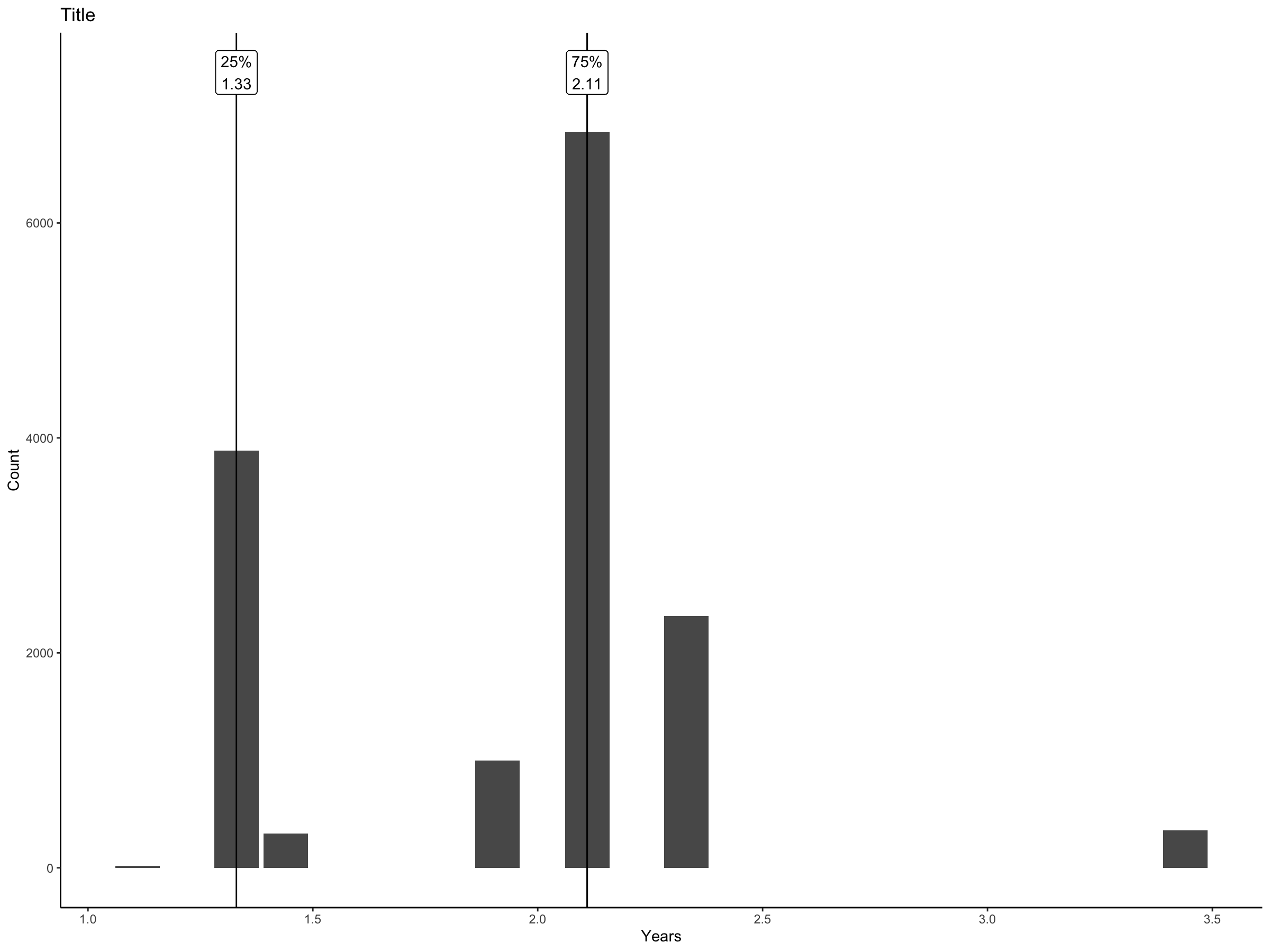
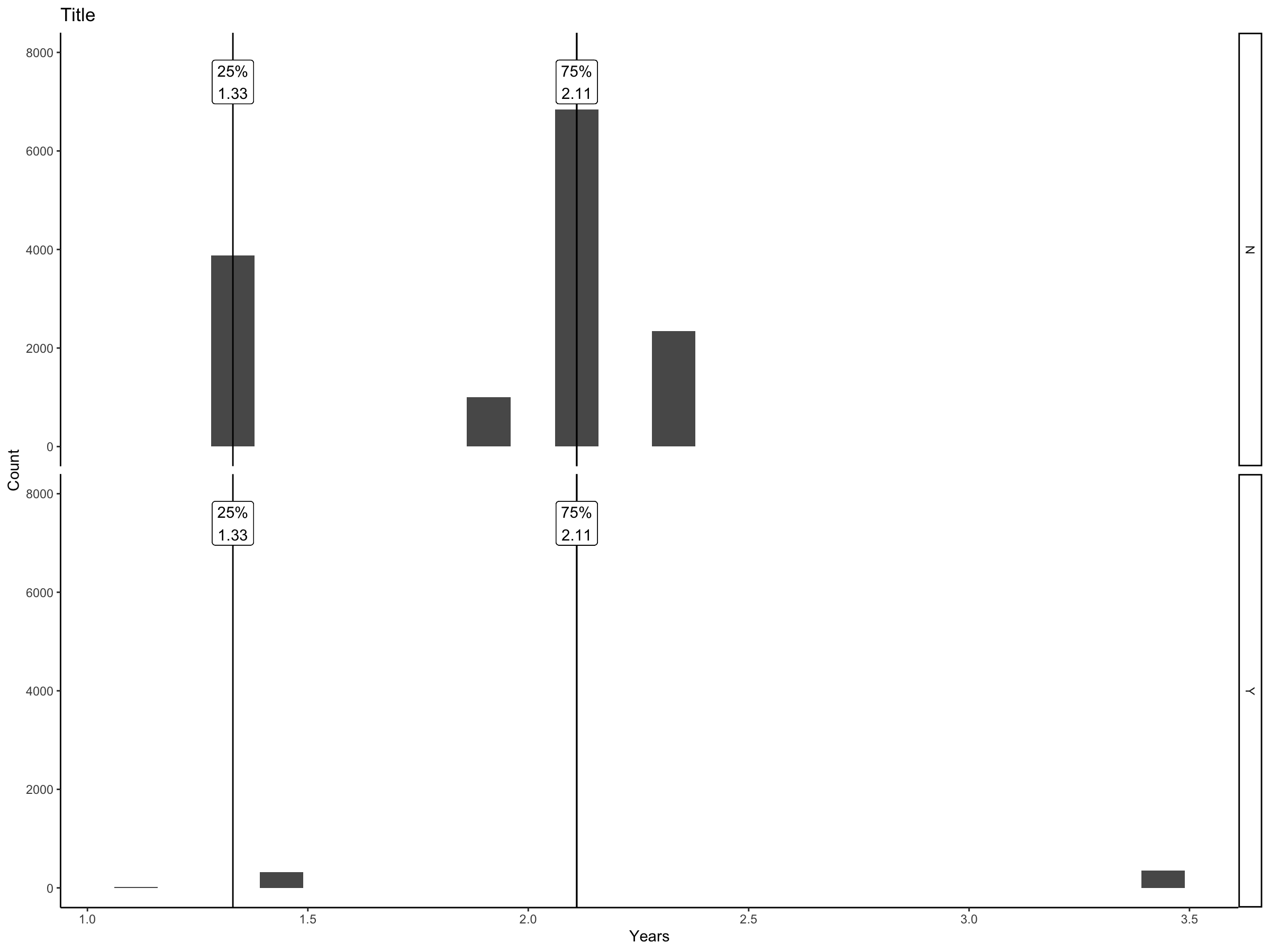
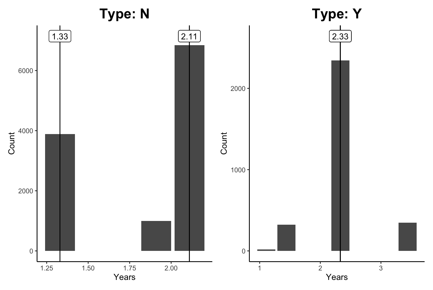
hello I have data that looks like this:
years n
1.11  19
1.33  3882
1.44. 321
1.91  1000
2.11  6844
2.33  2343
3.44  348
...
...
I am seeking to make a histogram and label the 25th quantile, 50th(median), and 75th quantile with the numbers on the graph too. this is what i have so far:
clean_data <- data %>% uncount(weights = n)
ggplot(clean_data, aes(x = years)) +
geom_histogram() +
# this is code I found online to add 25th, 50th, and 75th percentiles with lines but the exact values are not present next to the lines
stat_summary(
aes(y = 1, xintercept = stat(x)),
fun.data = function(x) {
data.frame(
y = quantile(x, probs = c(0.25, 0.5, 0.75)) ) },
geom = "vline",
orientation = "y")
is there any better way to do this? thank you so much