I am importing excel data from a url in order to create a bar plot. My raw data currently looks like this:
AC activity; V (fmol/min/µg protein) ...2 ...3 ...4 ...5 ...6
I need row 1 to be my x-axis, and sample 1:3 to be on my y-axis. How can I do this?
Flm
November 5, 2022, 1:11pm
2
Paste the output of dput(head(YOURDATAFRAME, 20)) so that I can create the plot
Flm
November 5, 2022, 1:26pm
4
I think the excel file was not imported correctly because the file looks like this
A tibble: 4 × 6
  `AC activity; V (fmol/min/µg protein) ` ...2                ...3               ...4               ...5        ...6
  <chr>                                   <chr>               <chr>              <chr>              <chr>       <chr>
1 NA                                      GST                 PpAFB1             PpAFB2             PpAFB3      PpAF…
2 Sample1                                 0.111277            5.1862890000000004 8.3298559999999995 2.41231999… 5.40…
3 Sample2                                 0.182812            6.5693000000000001 6.314953           3.09985100… 4.60…
4 Sample3                                 0.26229508200000001 6.4381520119999998 5.8181818180000002 3.47739691… 5.19…
>
Is the table correct?
Yes that table looks correct and is the same as the raw data table on the Excel file. I am struggling to input the data into a ggplot bar plot as I need "GST", "PpAFB1", "PpAFB2", "PpAFB3" and "PpAFB4" to be on the x-axis, and the other values to by on my y-axis. I cannot directly alter the data on Excel and swap the sample column for the "GST" row, I have to alter it on R, and I don't know how to!
I need to get my data to look like below I think...
GST Sample 1 0.111277
Flm
November 5, 2022, 2:07pm
6
Is this what you want?
# import
library(tidyverse)
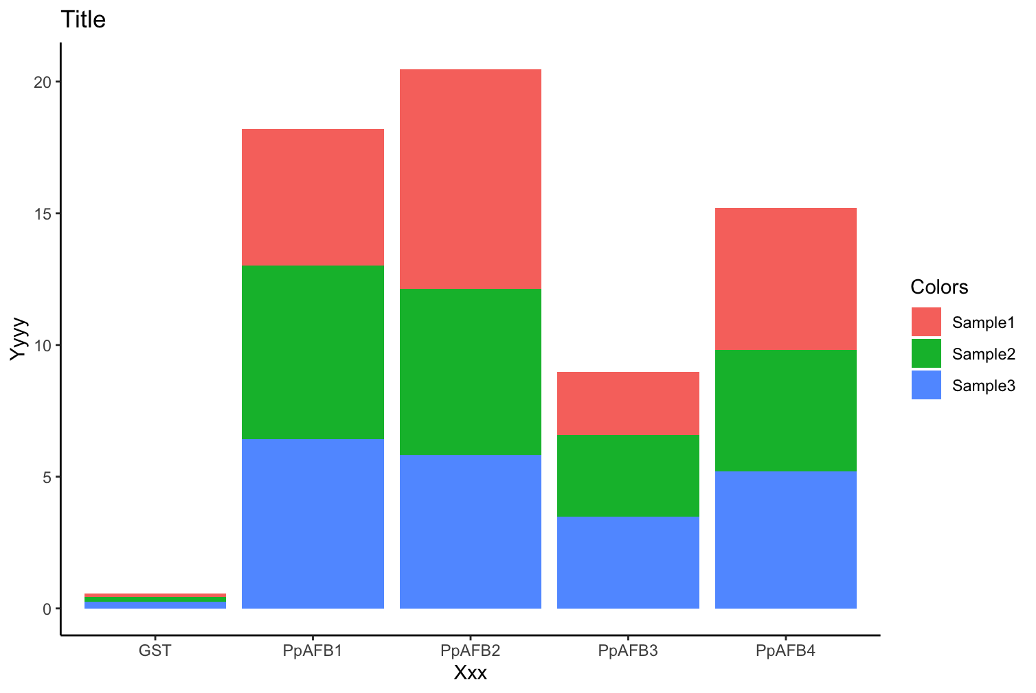
df <- structure(list(`ACactivity;V(fmol/min/µgprotein)`=c(NA,"Sample1","Sample2","Sample3"),`...2`=c("GST","0.111277","0.182812","0.26229508200000001"),`...3`=c("PpAFB1","5.1862890000000004","6.5693000000000001","6.4381520119999998"),`...4`=c("PpAFB2","8.3298559999999995","6.314953","5.8181818180000002"),`...5`=c("PpAFB3","2.4123199999999998","3.0998510000000001","3.4773969199999999"),`...6`=c("PpAFB4","5.4088430000000001","4.6060610000000004","5.1942374569999998")),row.names=c(NA,-4L),class=c("tbl_df","tbl","data.frame"))
# rename column
names(df) <- c("activity", "GST", "PpAFB1", "PpAFB2", "PpAFB3", "PpAFB4")
# remove first row
df <- df[2:nrow(df),]
# create the plot
df %>%
type_convert() %>%
pivot_longer(-activity) %>%
ggplot(aes(x = name, y = value, fill = activity)) +
geom_col() +
labs(x = "Xxx",
y = "Yyyy",
title = "Title",
fill = "Colors") +
theme_classic()
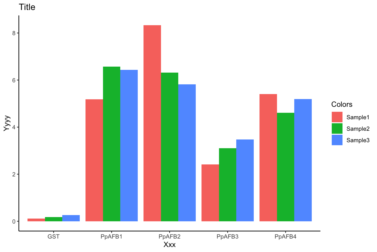
Or if you prefer: geom_col(position = "dodge") produces
1 Like
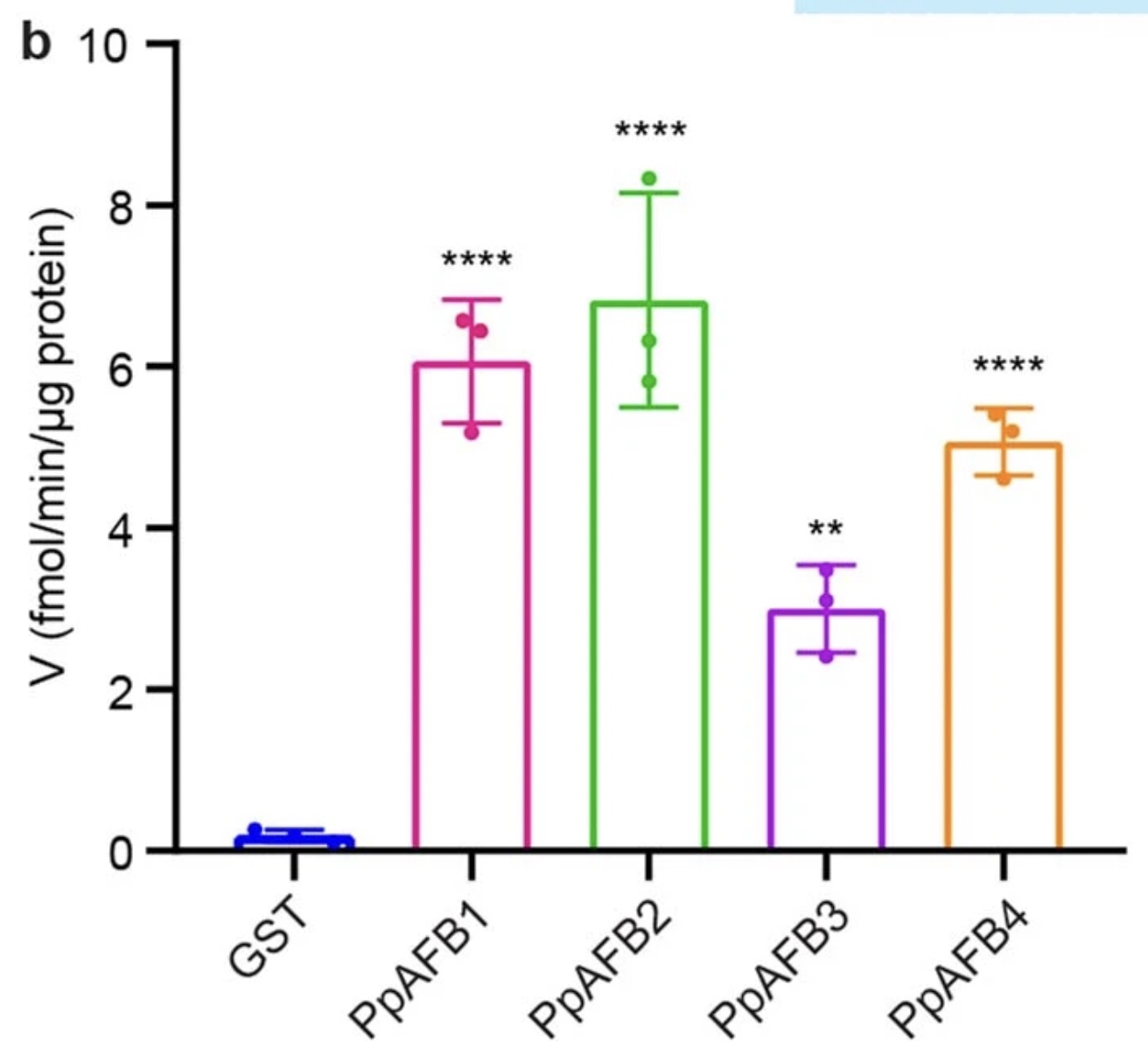
The first one looks very similar to the one I need however, the samples are grouped on each bar. I have attached a photo of what the graph looks like that I need to produce. It seems as though it is grouped? I am not too sure! (I just need to produce a standard basic graph, no colour changes or axis changes!)
Flm
November 5, 2022, 2:31pm
8
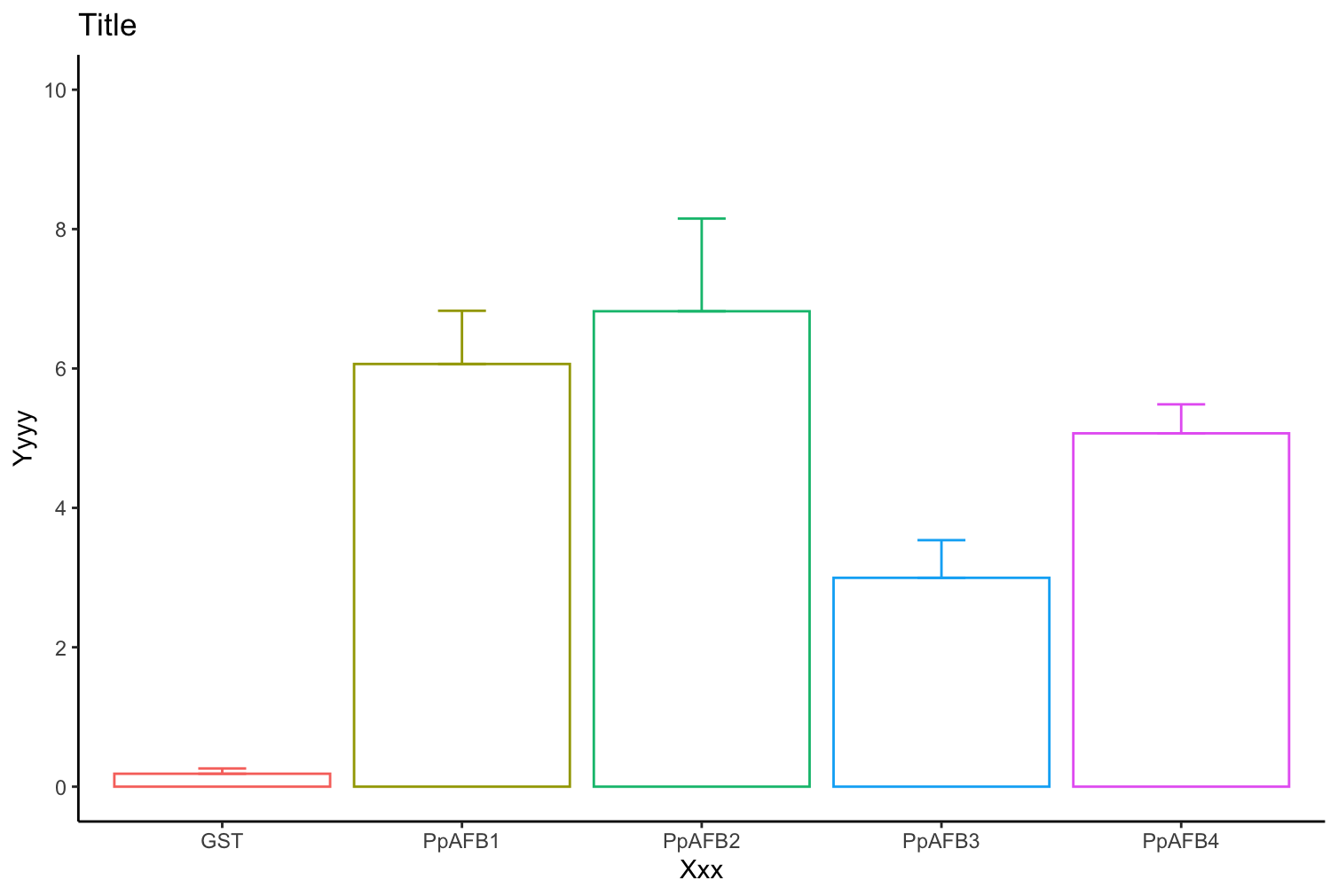
Is it better?
df %>%
  type_convert() %>%
  pivot_longer(-activity) %>%
  group_by(name) %>%
  summarise(mean = mean(value),
         sd = sd(value)) %>%
  ggplot(aes(x = name, y = mean, color = name)) +
  geom_col(fill = "white") +
  geom_errorbar(aes(ymin = mean, ymax = mean + sd, width=.2)) +
  scale_y_continuous(breaks = seq(0,10, by = 2),
                     limits = c(0,10)) +
  labs(x = "Xxx",
       y = "Yyyy",
       title = "Title",
       fill = "Colors") +
  theme_classic() +
  theme(legend.position = "none")
1 Like
Thank you so much for your help!
system
November 12, 2022, 4:24pm
10
This topic was automatically closed 7 days after the last reply. New replies are no longer allowed.