Heatmaps are a method of representing data graphically where values of the third dimension, in relation to the values on the x-axis and the y-axis, are depicted by color, making it easy to visualize complex data and understand it at a glance. We plot them in R with the help of package latticeExtra. But now I have a question about the mathematical calculation: Does anyone know what formula is used to calculate the third dimension? I am interested in whether the image depends not only on the position of the x, y points, but also on the density / amount of points at the x, y positions. Thanks for the answers.
Show us your heatmap and your code and we can help you answer your question...
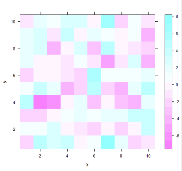
In a typical heatmap you have a raster, a matrix of datapoints, e.g. from 1:10 in one and 1:50 in the other dimension, these values can be categorical as well.
Here no smoothing is applied, each point typically shows its own values. (Sometimes a clustering is applied and then the mean within this clusters are shown).
# create data
set.seed(1)
data <- data.frame(x = rep(1:10, each = 10),
                   y = rep(1:10, 10),
                   z = rnorm(100, sd = 3))

# show "typical" heatmap
levelplot(z ~ x * y, data)
The R graph gallery presents a heatmap with smoothing:
Here clearly a smoothing is used.
# showing data points and density
levelplot(z ~ x * y, data,
          panel = panel.levelplot.points, cex = 1.2) +
  layer_(panel.2dsmoother(..., n = 50))
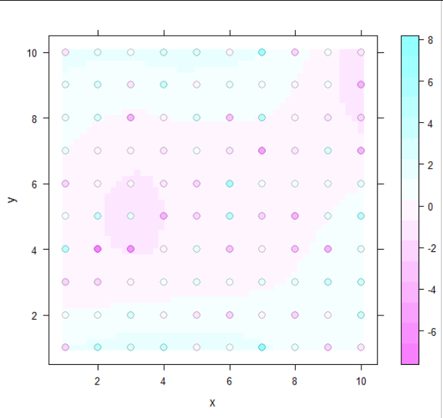
But I think this is a bit uncommon, and when the x and y values aren't so discrete but more free (1.2, 1.3, 1.4....) than this is more a 2D density plot.
1 Like
Matthias, thanks. I understand that already.
This topic was automatically closed 42 days after the last reply. New replies are no longer allowed.
If you have a query related to it or one of the replies, start a new topic and refer back with a link.