Hi There,
i am a Newbie and am running a Project for my university and i am kind of hitting a dead end here^^.
So any help or tips regarding my problem(s) would be heavily appreciated.
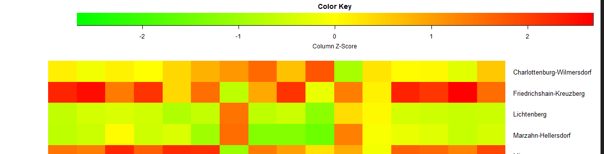
I manged to prepare the data to a point where i can plot a heatmap. Yay Me!
But for the life of me, i cannot figure out how to change the following (1 = highest Priority, 2 & 3 are just nice to have):
-
i would like to change the valus of the x Axis of the color key. The default seems to be Column Z score
(-2 to 2). But i want to print the actual values of my data (at least some of it. Maybe in steps of 200 or so, i would need to see what fits best). -
I would like the color key to begin at the upper left corner, so it is in line with the left side of the heatmap.
-
obviously, it would be great if the color key would end on the right side of the heat map. (At the moment it ends with the legend of the y axis)
I checked the usual suspects (StackOverflow, R Documentation etc) , but i am not fluent enough in R to be able to understand enough of it. Plus i think i am not using the correct keywords. So if someone could nudge me in the right direcction...
The heat map code is as follows:
#used librarys
library(ggplot2)
library(dplyr)
library(RColorBrewer)
library("gplots")
library(lattice)

# followed by lots and lots of data manipulation :-)

# create heatmap
heatmap.2(data_matrix
          , dendrogram = "none"
          , Rowv = FALSE
          , Colv = FALSE
          , scale = "column"
          , trace = "none"
          , margins = c(10,12)
          , cexRow = 1
          , cexCol = 1
          , col = colors
          , density.info = "none"
          , keysize = 0.75
          , lmat = rbind(c(3,4), c(2,1)))
Thanks a lot!
Best
S.