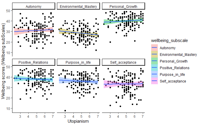
I would like to ask how can I create specific colour for each data frame. In this code below, I want to illustrate the correlations between utopian thinking and each of the wellbeing subscale (Autonomy, Environmental_Mastery, Personal_Growth, Positive_Relations, Purpose_in_life, Self_acceptance) in Carol Ryff's wellbeing scale. Since i want each subscale to have a specific color for its datapoint but I can only do so with the best fitted lines. I would like to know is there specific argument to help me with that?
Hard to answer definitely without a reproducible example since you didn't provide test data, but I think you'll get the desired result by using the aesthetic color for the geom_point:
Thank you so much Alexis, I have one more question though. How can i remove the legend from the graph. Although I have added show.legend=FALSE in ggplot, geom_point, but the legend still appear. Is there any argument that I can add that would remove the legend.
and the legends are shown. This is because inside aes(), ggplot expects aesthetic mappings but this is a more general parameter, it's not about the data. So it has to be outside aes().
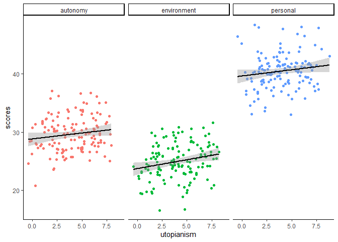
Here is a reproducible example with fake data:
library(tidyverse)

n <- 20
slopes <- c("autonomy" = 0, "environment" = -.1, "personal" = .1)
offsets <- c("autonomy" = 30, "environment" = 25, "personal" = 40)

tibble(utopianism = rep(1:7, times = 3*n) + rnorm(7*3*n, mean = 0, sd = .7),
       wb_subscale = rep(c("autonomy","environment","personal"), each = 7*n),
       scores = slopes[wb_subscale]*utopianism + offsets[wb_subscale] +
         rnorm(7*3*n, mean = 0, sd = 3)) |>
  ggplot(aes(x=utopianism, y=scores)) +
  theme_classic() +
  geom_point(aes(color = wb_subscale), show.legend=FALSE) +
  facet_wrap(~wb_subscale) +
  geom_smooth(method = "lm", se = TRUE, color = 'black', show.legend=FALSE)
#> `geom_smooth()` using formula 'y ~ x'
You can try playing with this example: if you put show.legend in ggplot() but outside its aes(), it's equivalent to indicating it both in geom_point() and geom_smooth(). But if you put it inside the aes() parentheses, it will be ignored because it is not an aesthetic.