Hello,
I currently want to create an histogram and some problems occurred.
That is the code I created:
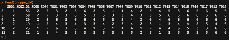
Gruppe_LM$Bilder <- subset(Gruppe_LM, select = c(T001, T002, T003, T004, T005, T006, T007, T008, T009, T010, T011, T012, T013, T014, T015, T016, T017, T018, T019))
Gruppe_DM$Bilder <- subset(Gruppe_DM, select = c(T001, T002, T003, T004, T005, T006, T007, T008, T009, T010, T011, T012, T013, T014, T015, T016, T017, T018, T019))
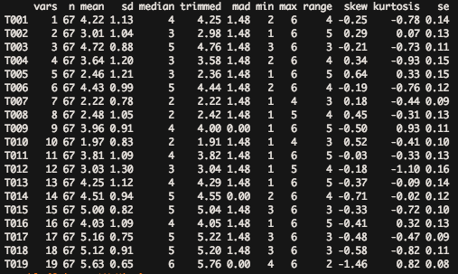
describe(Gruppe_LM$Bilder)
table(Gruppe_LM$Bilder)
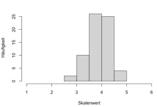
hist(Gruppe_LM$Bilder, main=" Stimmung Light Mode", ylab = "Häufigkeit", xlab="Skalenwert", breaks = 5, xlim = c(1,6))
This is the info I get from R after "hist"
Fehler in hist.default(Gruppe_LM$Bilder, main = " ", ylab = "Häufigkeit", :
'x' muss numerisch sein
'x' has to be numeric
I aswell can't create an table-function with "Gruppe_LM$Bilder" because there is a mistake in table(Gruppe_LM$Bilder) : Versuch eine Tabelle mit mehr als 2^31 Elementen zu erstellen
How can I change that on my data?
Thank you for every answer
Lea