Horizonal axis labels not showing on ggplot 2

Hi, I plotted a graph with stream discharge data from May 31 to October 31 of each year from 2010 until 2022, but cannot get the years displayed properly on the horizontal axis.

Below is the code that I used to create my graph


# Read the data
data <- read.csv("fifteenminuteintervaldata.csv")
data

# Combine 'Date' and 'Time' columns into a single datetime object
library(lubridate)
data$DateTime <- ymd_hms(paste(data$Date, data$Time))

# Troubleshoot the Warning message "1 failed to parse" 
# Combine 'Date' and 'Time' columns into a single datetime object
library(lubridate)
combined_datetime <- paste(data$Date, data$Time)
parsed_datetime <- ymd_hms(combined_datetime, quiet = TRUE)

# Identify rows with failed parsing
failed_rows <- which(is.na(parsed_datetime))
failed_rows # row 24958 failed to parse
  # Remove row 24958 from the dataset 
data <- subset(data, !(row.names(data) == "24958"))

# Remove rows with missing discharge values 
data <- data[!is.na(data$Discharge), ]

# Combine 'Date' and 'Time' columns into a single datetime object
library(lubridate)
data$DateTime <- ymd_hms(paste(data$Date, data$Time))
data # view the combined "DateTime" column 

# Extract the year, as do not want to have data from October 31 of previous year connected with data from May 1 of next year 
data$Year <- year(data$DateTime)

# Step 1: Load the Data
data <- read.csv("fifteenminuteintervaldata.csv")

# Step 2: Prepare the Data
# Assuming your CSV has columns: 'Date', 'Time', 'Precipitation', and 'Discharge'
# You may need to adjust column names accordingly

# Combine 'Date' and 'Time' columns into a single datetime object
library(lubridate)
data$DateTime <- ymd_hms(paste(data$Date, data$Time))

# Extract year
data$Year <- year(data$DateTime)

# Filter data for May 1 to October 31 for each year
filtered_data <- lapply(unique(data$Year), function(year) {
  subset(data, Year == year & month(DateTime) >= 5 & month(DateTime) <= 10)
})

# Step 3: Plotting
library(ggplot2)

# Create the plot using ggplot2
plot <- ggplot() +
  labs(x = "Year",
       y = "Discharge (m3/s)") +
  theme_minimal() +  # Remove grey background
  theme(axis.text = element_text(family = "Times New Roman", size = 12),  # Change font to Times New Roman and increase size
        panel.grid.major = element_blank(),  # Remove major gridlines
        panel.grid.minor = element_blank(),  # Remove minor gridlines
        axis.line = element_line(color = "black")) +  # Add lines for horizontal and vertical axis
  scale_x_continuous(breaks = seq(2010, 2022, by = 1),  # Set breaks for x-axis from 2010 to 2022
                     labels = c("2010", "2011", "2012", "2013", "2014", "2015", "2016", "2017", "2018", "2019", "2020", "2021", "2022"))  # Set labels for x-axis

# Add line segments for each year
for (i in 1:length(filtered_data)) {
  plot <- plot + geom_segment(data = filtered_data[[i]], 
                              aes(x = DateTime, xend = lead(DateTime), 
                                  y = Discharge, yend = lead(Discharge)), 
                              color = "blue")
}

# Hide the title
plot <- plot + theme(plot.title = element_blank()) + scale_x_continuous(breaks = seq(2010, 2022, by = 1),  # Set breaks for x-axis from 2010 to 2022
labels = c("2010", "2011", "2012", "2013", "2014", "2015", "2016", "2017", "2018", "2019", "2020", "2021", "2022"))  # Set labels for x-axis

# Show the plot
print(plot)

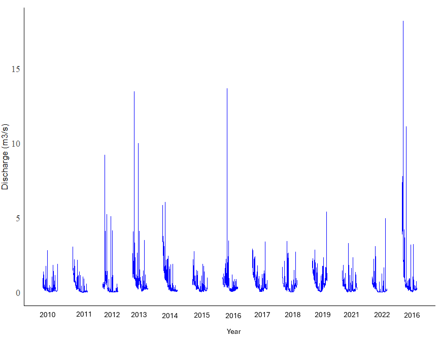
The above code produced the following plot:

As shown above, there are no labels on the horizontal axis. There are 13 clusters of lines in this graph. I want the labels "2010", "2011", "2012", "2013", "2014", "2015", 2016", "2017", "2018", "2019" and "2020" under each cluster. I also want to change the font on the plot to Times New Roman. Does anyone have any advice?

TIA

Please post the output of

dput(head(filtered_data[[1]]))

This looks like it refers to the same data as Brant posted here.

Brant: In the code block you posted, the second half of the code overrides the first half — could remove the first half, meaning the half ends at "Step 1"?

Also, a reprex would help, and for this topic, aggregate data would be good. Could run the following code and post the output?

library(tidyverse)
data <- read.csv("fifteenminuteintervaldata.csv")
data |> 
  separate_wider_delim(
    cols = Date, 
    names = c("year", "month", "day"), 
    delim = '-', 
    cols_remove = F) |> 
  group_by(year, month) |> 
  summarise(
    Precipitation = sum(Precipitation), 
    Discharge = sum(Discharge)
  ) |> 
  dput()
dput(head(filtered_data[[1]]))
structure(list(Date = c("2010-05-01", "2010-05-01", "2010-05-01", 
"2010-05-01", "2010-05-01", "2010-05-01"), Time = c("0:00:00", 
"0:15:00", "0:30:00", "0:45:00", "1:00:00", "1:15:00"), Precipitation = c(0, 
0, 0, 0.2, 0.2, 0), Discharge = c(0.299, 0.302, 0.305, 0.308, 
0.312, 0.317), DateTime = structure(c(1272672000, 1272672900, 
1272673800, 1272674700, 1272675600, 1272676500), class = c("POSIXct", 
"POSIXt"), tzone = "UTC"), Year = c(2010, 2010, 2010, 2010, 2010, 
2010)), row.names = c(NA, 6L), class = "data.frame")```

In your ggplot code, you set the breaks of the x axis to the year value, e.g. 2010, but the DateTime variable you plot on the x axis is a POSIX datetime with values like 1272672000. Try setting the x axis to a sequence of datetimes like

DateSeq <- seq.POSIXt(as.POSIXct("2010-01-01 00:00:00"),
                      as.POSIXct("2022-01-01 00:00:00"), by = "year")

Thanks everyone, I tried making your suggested edits, however, the dates are still not showing up on my plot. Here is my updated code:

# Step 1: Load the Data
data <- read.csv("fifteenminuteintervaldata.csv")

# Step 2: Prepare the Data
# Assuming your CSV has columns: 'Date', 'Time', 'Precipitation', and 'Discharge'
# You may need to adjust column names accordingly

# Combine 'Date' and 'Time' columns into a single datetime object
library(lubridate)
data$DateTime <- ymd_hms(paste(data$Date, data$Time))

# Extract year
data$Year <- year(data$DateTime)

# Filter data for May 1 to October 31 for each year
filtered_data <- lapply(unique(data$Year), function(year) {
  subset(data, Year == year & month(DateTime) >= 5 & month(DateTime) <= 10)
})

# Step 3: Plotting
library(ggplot2)

# Create the plot using ggplot2
DateSeq <- seq.POSIXt(as.POSIXct("2010-01-01 00:00:00"),
                      as.POSIXct("2022-01-01 00:00:00"), by = "year")
plot <- ggplot() +
  labs(x = "Year",
       y = "Discharge (m3/s)") +
  theme_minimal() +  # Remove grey background
  theme(axis.text = element_text(family = "Times New Roman", size = 12),  # Change font to Times New Roman and increase size
        panel.grid.major = element_blank(),  # Remove major gridlines
        panel.grid.minor = element_blank(),  # Remove minor gridlines
        axis.line = element_line(color = "black")) +  # Add lines for horizontal and vertical axis
  scale_x_continuous(breaks = seq(2010, 2022, by = 1),  # Set breaks for x-axis from 2010 to 2022
                     labels = c("2010", "2011", "2012", "2013", "2014", "2015", "2016", "2017", "2018", "2019", "2020", "2021", "2022"))  # Set labels for x-axis

# Add line segments for each year
for (i in 1:length(filtered_data)) {
  plot <- plot + geom_segment(data = filtered_data[[i]], 
                              aes(x = DateTime, xend = lead(DateTime), 
                                  y = Discharge, yend = lead(Discharge)), 
                              color = "blue")
}

dput(head(filtered_data[[1]]))

# Hide the title
plot <- plot + theme(plot.title = element_blank()) + scale_x_continuous(breaks = seq(2010, 2022, by = 1),  # Set breaks for x-axis from 2010 to 2022
                                                                          labels = c("2010", "2011", "2012", "2013", "2014", "2015", "2016", "2017", "2018", "2019", "2020", "2021", "2022"))  # Set labels for x-axis

# Show the plot
print(plot)

The plot shows the exact same as the previous plot did without the years posted along the horizontal axis.

I have attached a figure of a plot I revised in word. This is what I would like to achieve using the above code. Does anyone have any advice as to how to get these dates to display as they are in the figure below?

Edit: I realize my last date on my horizontal axis shows "2016", "2021" should be shown as "2020", "2022" as "2021" and "2016" as "2023". I will fix this after.

Hi Brant,

Could you post data so folks can help identify what might help from start to finish? Just follow the steps I posted here.

I guess I was unclear in my last suggestion. You need to use the DateSeq variable as the breaks value in scale_x_continuous(). Compare scale_x_continuous() in the two plots below where I invented some simple data to plot.

library(tidyverse)
DF <- data.frame(DateTime =ymd_hm(c("2010-3-13 12:34", "2011-2-23 09:35",
                                  "2012-8-01 03:19", "2016-5-17 12:34",
                                  "2018-6-13 12:34", "2019-7-13 12:34",
                                  "2021-1-18 16:04")), 
                 Discharge = c(4,7,2,9,8,1,4))

DateSeq <- seq.POSIXt(as.POSIXct("2010-01-01 00:00:00"),
                      as.POSIXct("2022-01-01 00:00:00"), by = "year")

#Using seq(2010, 2022, by = 1)
plot <- ggplot() +
  labs(x = "Year",
       y = "Discharge (m3/s)") +
  theme_minimal() +  # Remove grey background
  theme(panel.grid.major = element_blank(),  # Remove major gridlines
        panel.grid.minor = element_blank(),  # Remove minor gridlines
        axis.line = element_line(color = "black")) +  # Add lines for horizontal and vertical axis
  scale_x_continuous(breaks = seq(2010, 2022, by = 1),  # Set breaks for x-axis from 2010 to 2022
                   labels = c("2010", "2011", "2012", "2013", "2014", "2015", "2016", "2017", "2018", "2019", "2020", "2021", "2022"))  # Set labels for x-axis


plot + geom_segment(data = DF, 
                            aes(x = DateTime, xend = lead(DateTime), 
                                y = Discharge, yend = lead(Discharge)), 
                            color = "blue")
#> Warning: Removed 1 rows containing missing values (`geom_segment()`).

##Using DateSeq
plot <- ggplot() +
  labs(x = "Year",
       y = "Discharge (m3/s)") +
  theme_minimal() +  # Remove grey background
  theme(panel.grid.major = element_blank(),  # Remove major gridlines
        panel.grid.minor = element_blank(),  # Remove minor gridlines
        axis.line = element_line(color = "black")) +  # Add lines for horizontal and vertical axis
  scale_x_continuous(breaks = DateSeq,  # Set breaks for x-axis from 2010 to 2022
                     labels = c("2010", "2011", "2012", "2013", "2014", "2015", "2016", "2017", "2018", "2019", "2020", "2021", "2022"))  # Set labels for x-axis

plot + geom_segment(data = DF, 
                            aes(x = DateTime, xend = lead(DateTime), 
                                y = Discharge, yend = lead(Discharge)), 
                            color = "blue")
#> Warning: Removed 1 rows containing missing values (`geom_segment()`).

Created on 2024-04-07 with reprex v2.0.2

Attached is a .csv file containing my data if anyone can help identify what might help from start to finish, that would be much appreciated. My .csv contains both precipitation and discharge data in 15-minute intervals from May 1 through October 31 for the years 2010 through 2023.

fifteenminuteintervaldata.csv - Google Drive.

I want to create two plots: One showing the precipitation depth from 2010 to 2023 (only the months of May through October), and the other showing stream discharge from 2010 to 2023 (only the months of May through October). These two plots should look similar to the plot that I previously provided above, and include the years "2010", "2011", "2012", "2013", "2014", "2015", 2016", "2017", "2018", "2019", "2020", "2021" and "2022".

Thanks.

Hi Brant,

In order to not overwhelm the folks who would like to help you, and not burden them with additional work and risk (by following links, for example), it is important to share your data here in a reproducible manner. The primary tool for this is the dput() function, which can convert a table you have in your RStudio environment into a command that folks here can execute safely to reproduce your table in their own RStudio environment.

For the purpose of illustrating how to fix the issue you've asked about in this topic, it is not necessary to share the very large table (with at least 600K rows, if I recall) that you've linked here. An aggregated version would be enough to illustrate what you can do. If you follow the steps I shared here, that would be enough for folks to find a solution that you can then apply to your own data.

Sorry about that, I didn't think of the additional work and risk of following these links. I tried loading my data and using the dput() function from the code that you provided above, but I am not getting the following error:

Error in `separate_wider_delim()`:
! Expected 3 pieces in each element of `Date`.
! 1 value was too short.
ℹ Use `too_few = "debug"` to diagnose the problem.
ℹ Use `too_few = "align_start"/"align_end"` to silence this message.
Run `rlang::last_trace()` to see where the error occurred.```

Below is the code that I attempted to run:

data <- read.csv("fifteenminuteintervaldata.csv")
data |> 
  separate_wider_delim(
    cols = Date, 
    names = c("year", "month", "day"), 
    delim = '-', 
    cols_remove = F) |> 
  group_by(year, month) |> 
  summarise(
    Precipitation = sum(Precipitation), 
    Discharge = sum(Discharge)
  ) |> 
  dput()

Does anyone know why I am unable to post my data using the steps provided by @dromano?

1 Like

Could you execute just as_tibble(data) and post a screenshot of the output?

Sure, here is the output that I receive when I execute as_tibble(data). I am getting the error:

Error in `separate_wider_delim()`:
! Expected 3 pieces in each element of `Date`.
! 1 value was too short.
ℹ Use `too_few = "debug"` to diagnose the problem.
ℹ Use `too_few = "align_start"/"align_end"` to silence this message.
Run `rlang::last_trace()` to see where the error occurred.```

Hi Brant,

Could you execute these commands

data <- read.csv("fifteenminuteintervaldata.csv")
data |>
  as_tibble()

and post a screenshot of the output? (In other words, not copy and paste.)

Ok, here is a screenshot of my output when I execute the commands you provided

OK, if you run the code from before now, it should work:

data |> 
  separate_wider_delim(
    cols = Date, 
    names = c("year", "month", "day"), 
    delim = '-', 
    cols_remove = F) |> 
  group_by(year, month) |> 
  summarise(
    Precipitation = sum(Precipitation), 
    Discharge = sum(Discharge)
  ) |> 
  dput()

I just copied and pasted your code and it is giving me the error:

Error in `separate_wider_delim()`:
! Expected 3 pieces in each element of `Date`.
! 1 value was too short.
ℹ Use `too_few = "debug"` to diagnose the problem.
ℹ Use `too_few = "align_start"/"align_end"` to silence this message.
Run `rlang::last_trace()` to see where the error occurred.```

OK, try this then, and post a screenshot rather than copy and paste:

data <- read.csv("fifteenminuteintervaldata.csv")
data |> 
  separate_wider_delim(
    cols = Date, 
    names = c("year", "month", "day"), 
    delim = '-', 
    cols_remove = F)

Thanks, Brant — now lets try this:

data <- read.csv("fifteenminuteintervaldata.csv")
data |> as_tibble()
data |> 
  separate_wider_delim(
    cols = Date, 
    names = c("year", "month", "day"), 
    delim = '-', 
    cols_remove = F)

and post a screenshot that include all the code and output from the console, like you just did.