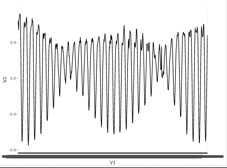
When I put the output, it throws me an error
structure(list(V1 = c("01/01/2022 00:00", "01/01/2022 01:00",
"01/01/2022 02:00", "01/01/2022 03:00", "01/01/2022 04:00", "01/01/2022 05:00",
"01/01/2022 06:00", "01/01/2022 07:00", "01/01/2022 08:00", "01/01/2022 09:00",
"01/01/2022 10:00", "01/01/2022 11:00", "01/01/2022 12:00", "01/01/2022 13:00",
"01/01/2022 14:00", "01/01/2022 15:00", "01/01/2022 16:00", "01/01/2022 17:00",
"01/01/2022 18:00", "01/01/2022 19:00", "01/01/2022 20:00", "01/01/2022 21:00",
"01/01/2022 22:00", "01/01/2022 23:00", "02/01/2022 00:00", "02/01/2022 01:00",
"02/01/2022 02:00", "02/01/2022 03:00", "02/01/2022 04:00", "02/01/2022 05:00"
), V2 = c(0.644, 0.554, 0.543, 0.642, 0.669, 0.695, 0.715, 0.724,
0.715, 0.691, 0.513, 0.205, -0.11, -0.371, -0.589, -0.701, -0.701,
-0.585, -0.419, -0.221, 0.027, 0.266, 0.445, 0.573, 0.622, 0.632,
0.602, 0.569, 0.598, 0.595), V3 = c(0.644, 0.554, 0.543, 0.642,
0.669, 0.695, 0.715, 0.724, 0.715, 0.691, 0.513, 0.205, -0.11,
-0.371, -0.589, -0.701, -0.701, -0.585, -0.419, -0.221, 0.027,
0.266, 0.445, 0.573, 0.622, 0.632, 0.602, 0.569, 0.598, 0.595
)), row.names = c(NA, 30L), class = "data.frame")
Error: attempt to use zero-length variable name