My problems isn't new — I took a look around and saw similar examples here and on StackOverflow. Despite the examples, I have not managed to find my error.
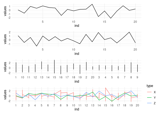
I have three datasets, one of which was wide and I made it longer. I stacked them all to have one "big" data frame. My plan was to use the "big" data frame to plot lines for each type of data, out of which there are 3. There should be 20 lines for X and 1 line each for types Y and Z. All 20 type X lines should have the same color. But that's not what happened and I'm not sure how to proceed.
Here's an example that reproduces the error.
# Pkgs
library(tidyr)
#> Warning: package 'tidyr' was built under R version 4.2.3
library(dplyr)
#>
#> Attaching package: 'dplyr'
#> The following objects are masked from 'package:stats':
#>
#>     filter, lag
#> The following objects are masked from 'package:base':
#>
#>     intersect, setdiff, setequal, union
library(ggplot2)
#> Warning: package 'ggplot2' was built under R version 4.2.3

# Create data
x = matrix(data = rnorm(200), ncol = 20)
x = data.frame("type" = rep("X", 10),  x)
colnames(x) = c("type", paste0(1:20))

y = data.frame("type" = "Y", "ind" = 1:20, "values" = rnorm(20))
z = data.frame("type" = "Z", "ind" = 1:20, "values" = rnorm(20))

# Wrangle x to it's longer
x_lon =
  x |>
  pivot_longer(cols = -c(type),
               names_to = "ind",
               values_to = "values")

# Bind all dataframes together
all_df = rbind(x_lon,y,z)
all_df = all_df |> mutate(ind = factor(ind, levels = paste0(1:20)))


all_df |>
  ggplot(aes(x = ind, y = values, col = type)) +
  geom_line(aes(group = type, col = type)) +
  theme_minimal() +
  theme(legend.title = element_blank(),
        legend.position = "bottom")
Hi there! I understand your frustration with the line colors not being consistent in your plot. I've taken a look at your example and the issue seems to stem from how you're setting the group aesthetic in your geom_line layer. Here's how you can fix it:
The problem:
The current code sets group = type in the aes argument of geom_line . This essentially tells ggplot2 to treat each "type" (X, Y, Z) as a separate group and assign a different color to each group. However, since all 20 "X" lines should have the same color, using "type" as the grouping variable is leading to the undesired behavior.
The solution:
There are two ways to fix this:
1. Set a custom grouping variable for the X lines:
Instead of using type as the grouping variable, you can create a new variable that groups all "X" lines together:
Code snippetall_df |> mutate(group = ifelse(type == "X", "X_group", type)) |> ggplot(aes(x = ind, y = values, col = type)) + geom_line(aes(x = ind, y = values, col = type, group = group)) + theme_minimal() + theme(legend.title = element_blank(), legend.position = "bottom")
This code creates a new variable called group that assigns "X_group" to all rows where type is "X" and keeps the original type for Y and Z. Now, the geom_line layer uses both type for coloring and group for grouping, resulting in all 20 X lines having the same color.
2. Use linetype instead of color:
If you don't need to distinguish between Y and Z visually (i.e., they can share the same color), you can use the linetype aesthetic to differentiate them while keeping all X lines the same color:
This code sets the same color for all lines (controlled by col = type ) and uses the linetype aesthetic to distinguish between Y and Z. You can customize the linetype for each type using the lty argument within geom_line .