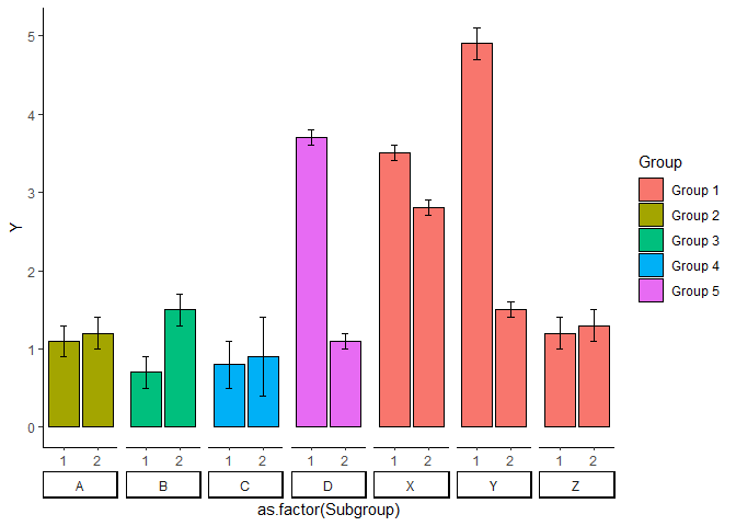
Already got my plot working. Thanks to @StatSteph, I today learned how to use facet_wrap.
y2 = ggplot(df, aes(x=as.factor(Subgroup), y=Mean, fill=Group)) +
  theme_classic() + labs(y = 'Y') +
  geom_bar(position=position_dodge(), stat="identity", colour='black') +
  geom_errorbar(aes(ymin= Mean - Error,
                    ymax= Mean + Error),
                width=.2,
                position=position_dodge(.9))

y2 +
  facet_wrap(~Name, nrow=1, strip.position = "bottom") +
  theme(strip.placement = "outside")
The next thing that I have to do is to add significance bars between Groups and Subgroups.
For example, the p-value for within Group B is p = 0.0012 (**) while between the Subgroup 1 of Groups A and D is p = 0.00015(***).
Normally, what I usually do in normal barplot is to define the following dataframe:
groupB.1vs.2 <- tibble(
   x = c(, 0.77, 1.23, 1.23),
   y = c(4.5, 4.8, 4.8, 3.6)
 )  ## p = 0.0012 (**)
and add it to the plot, like the following:
y2 = y2 +
 annotate("text", x = 1, y = 2.5, label = "***", size = 6, color = "black") +
geom_line(data = groupB.1vs.2 , aes(x= x, y = y, group=1), inherit.aes = F)
I know the above code is tedious but it works like charm always. And I have control over the aesthetics of the significance bars, unlike the pre-packaged libraries.
Is it possible to manually add something like this in y2 considering that it uses facet_wrap?
Thank you for the help!