Hi, my name is Paolo. I'm doing some Spearman's correlation analysis for a project with a big dataset (240k obs.). For justifying Spearman's instead of Pearson's, I have to produce plots where I highlight that the two variables don't have a linear relation before the phase of calculating correlation coefficients. I'm using ggplot2.
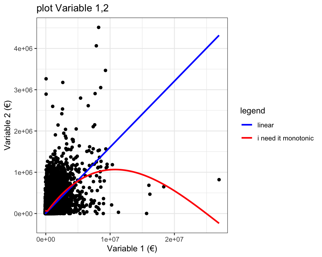
Here's my lines, where s2 is the dataset, x and y two quantitative variables (expenditures in euro).
s2 %>%
       ggplot(aes(x = `Farm Net Value Added`,
                  y = `NPK+Difesa`))+
       geom_point()+
       geom_smooth(method = "lm", se = F,aes(color = "blue"))+
       geom_smooth(se = F, aes(color = "red"))+
       scale_color_identity(name = "legend",
                            labels = c("linear", "i need it monotonic"),
                            guide = "legend")+
       labs(x = "Variable 1 (€)",
            y = "Variable 2 (€)",
            title = "plot Variable 1,2")+
            theme_bw()
This is my output, where blue line is the linear model smooth and red curve is the default smooth that I'm trying to replace with a monotonic function:
Question: there is a function in ggplot2 for plotting a monotonic decreasing curve or an argument for doing that with geom_smooth (I tried with method = "loess" but the output is similar to the red curve (non monotonic).
I'm thanking in advance all the people that will respond to my post
Seeing your data, I would start with plotting it on a log scale to see if the relationship becomes more obvious.
For your question, to fit a monotonic increasing curve I think you need to specify a model. The easiest are probably something like Variable2 ~ log(Variable1) or Variable2 ~ sqrt(Variable1).
Hi Alexis thank you for reply me. I'll try to transform variables. Instead of creating new columns in the dataset, is it possible to transform directly when plotting ? I mean like
ggplot(aes(log(x = The variable I need to transform),
                       y = the other variable))+ ...
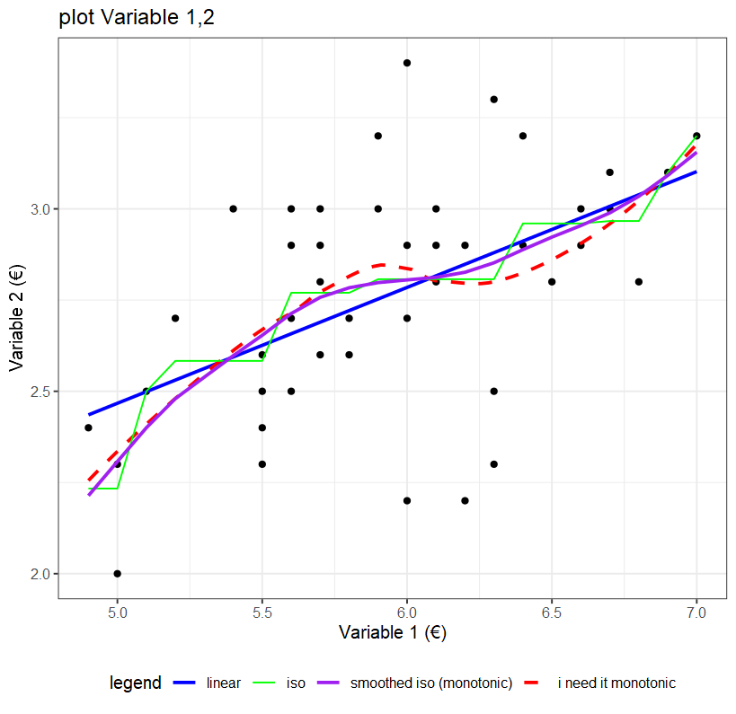
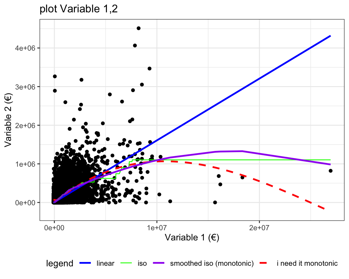
The green line is an isotonic regression, so its monotonic in the way you want but its not smooth, decrease the spar=.5 of the smooth.spline to a lower number that achieves a smoother result, without bending below the green line.
Thanks for the tips, I tried with span=.2 and then .1 but it seems the same. And, instead of a monotonic increasing curve, for trying to see if a monotonic decreasing curve fits to my plot, what I have to do, in parallel to transforming variables as @AlexisW said?
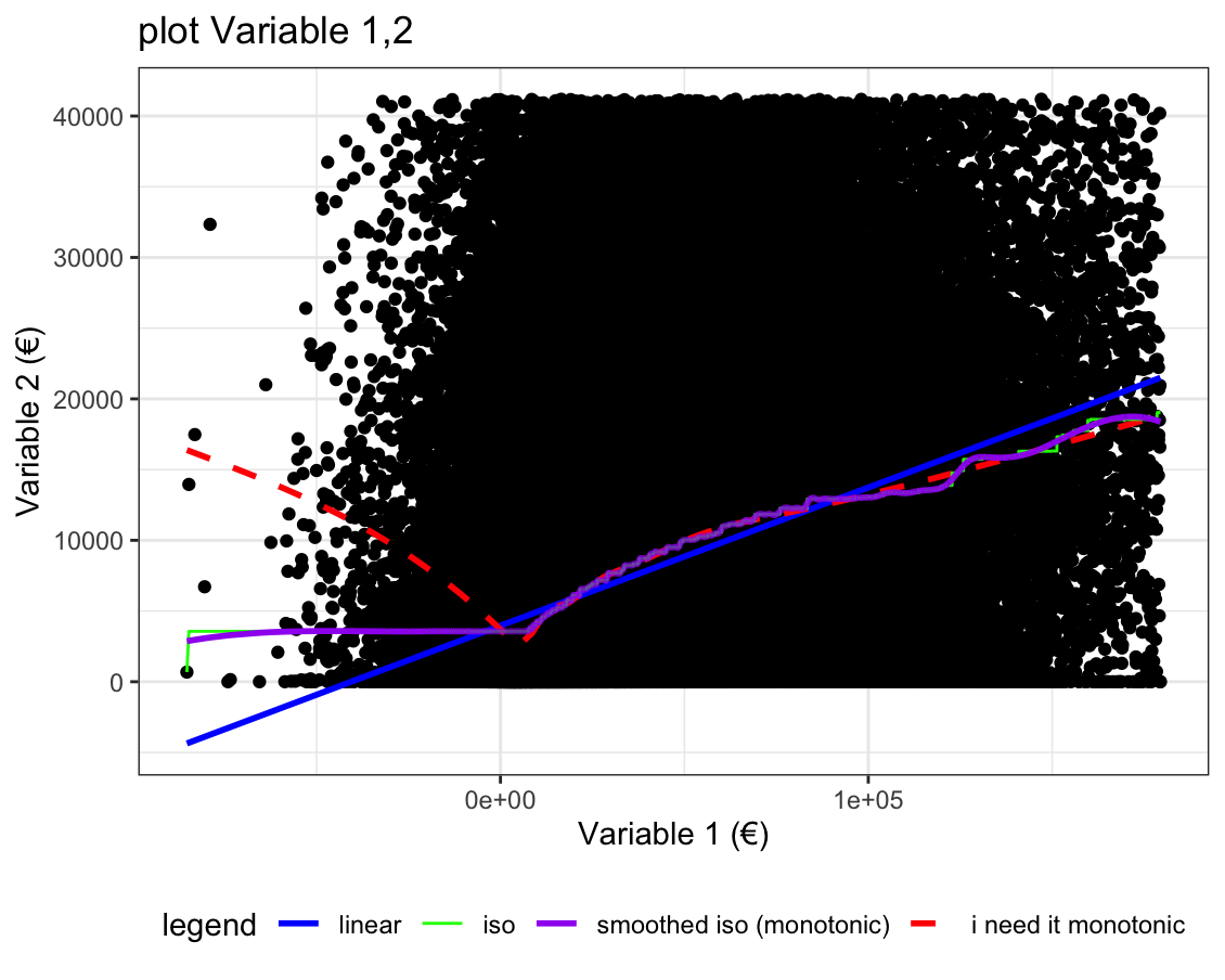
Only watching plots , I assume that when variable on Y decreases the X increases. But the problem is that there are 239,790 observation and maybe I only led myself astray by the fact that many observations are concentrated towards the origin of the axes , and the outliers are on the margins (high X low Y, low x high Y). That dots disposition makes me think of that trend
if the general trend was ambigious your lm slope would be close to flat / horizontal,
your non-monotonic smooth tells you where its increasing/decreasing over different regions,so it tells you how it goes in different regions.
you can fit the lm a second time after you remove outliers.
Looking at the image you shared it seems clearly increasing where the greatest mass of dots are
I would look at that zoomed in region again , without the outliers having been removed also. coord_cartesian can do that.
Generally I'd advise you to adjust your scales so that values can be usefully read off from them ...
finally analsyis wise - yeah, it seems that the smoothed red dashed line is giving potentially useful information about a discontinuity around that low positive value, whatever it is.
The aim of this plot is to justify the use of Spearman's instead of Pearson's, because, analysing summary stats of variables ad QQplots I noticed that there aren't gaussian distributions of values. And for that reason Spearman's is a more robust indicator of correlation . Maybe I can demonstrate that by plotting columns of ranks instead column of variables ? like they said here : plotting spearman correlation (with geom_smooth?) - #3 by Matthias