Dear community
I would like to change the plots that are all the same color different.
But I prefer the default color scheme.
So I wouldn't like to specify the colors of the plot.
How can I make plots be different colors and have a default color scheme?
x=read.csv("watakushi.csv",header=T,row.names=1)
library("vegan")
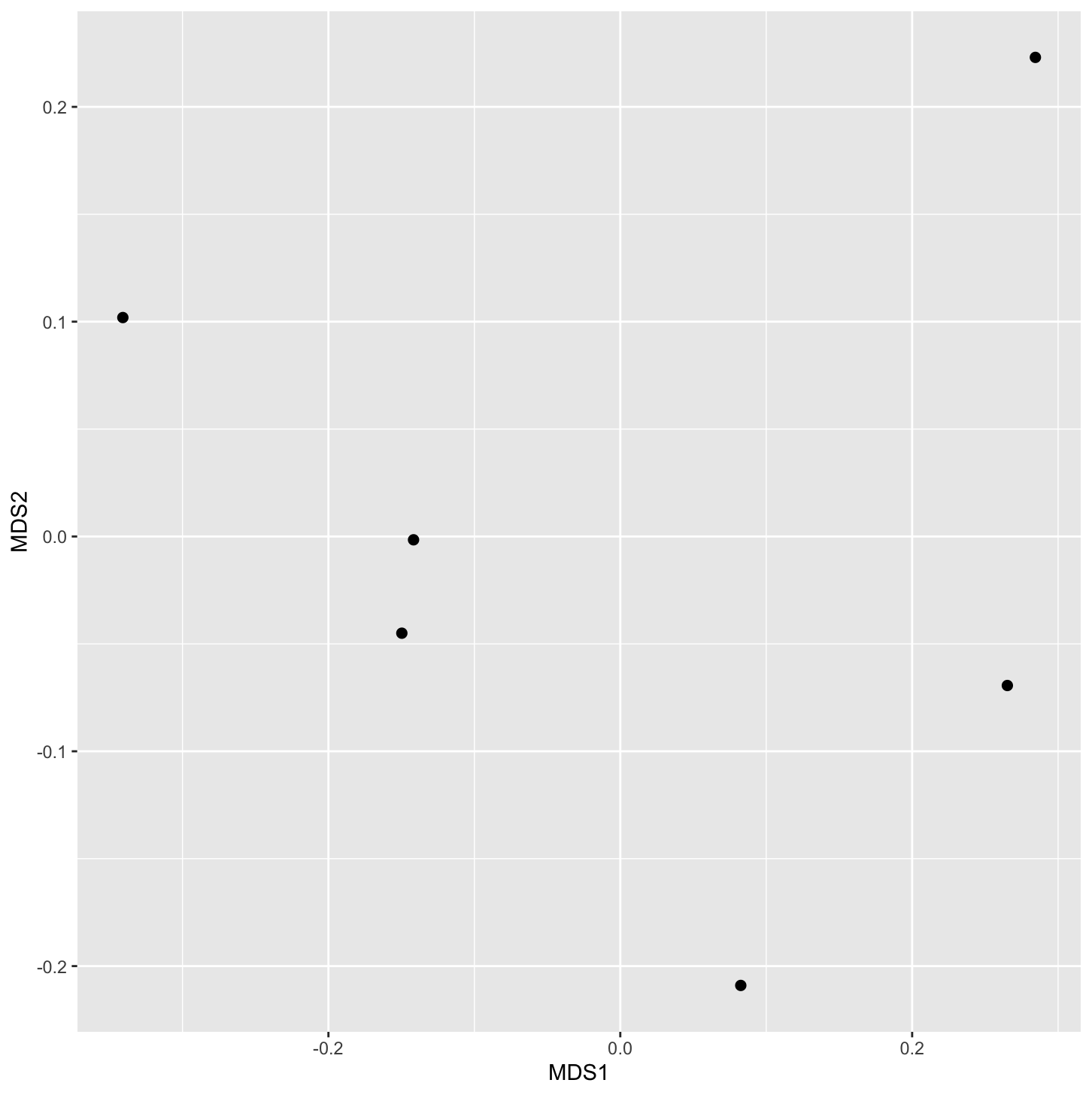
nmds=metaMDS(x,distance="bray")
nmds_xy=data.frame(nmds$points)
library("tidyverse")
ggplot(nmds_xy,aes(MDS1,MDS2))
+geom_point(size=3)
nmds_xy
MDS1 MDS2
21N -0.34087362 0.101920607
21A -0.14167136 -0.001546407
21F 0.28444552 0.223030000
22H 0.26523581 -0.069376792
22N -0.14969636 -0.045022657
22F 0.08256002 -0.209004752
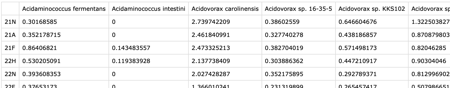
watakushi.csv↓
ggplot↓
Thank you for your quick reply and kindness.
I'll look over them.
Can I ask you one more question?
How do I specify row name to change the plot color?
Do I have to convert watakushi.csv into some data frame?
Are there categories that you are using to colour the points? Are you hoping to colour using one of the other continuous variables?
Can you provide a reproducible example instead of a screenshot?
system
Closed
5
This topic was automatically closed 42 days after the last reply. New replies are no longer allowed.
If you have a query related to it or one of the replies, start a new topic and refer back with a link.