I am a beginner in R and any tips would be appreciated:
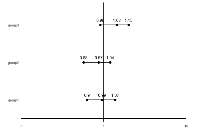
What package and how do i get started with drawing this graph? I have the numbers and data but have no clue how to approach:
Thank you in advance!
I am a beginner in R and any tips would be appreciated:
What package and how do i get started with drawing this graph? I have the numbers and data but have no clue how to approach:
Thank you in advance!
It looks like you want a forest plot. Something like an internet search for ggplot2 r statistics forest plot or just r statistics forest plot should turn up some useful links such as this one ggforestplot or this one Introduction to forestploter
Thanks @jrkrideau !
I actually don't need to do any meta analysis as I have the physical data already - so it will just be simply plotting the numbers like the example diagram - would the ggforestplot work? or ggplot is more appropriate?
Thanks!
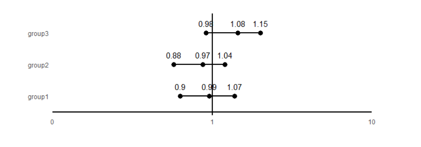
Alternatively, here is one way to do it using just ggplot2.
library(tidyverse)

# sample data
df = data.frame(
  x = c(0.9, .99, 1.07,
        .88, .97, 1.04,
        .98, 1.08, 1.15),
  y = c(rep('group1', 3),
        rep('group2', 3),
        rep('group3', 3)
        )
)

ggplot(df, aes(x = x, y = y)) +
  geom_point(size = 3) +
  geom_line(aes(group = y), size = 1) +
  geom_text(aes(label = x), vjust = -1) +
  geom_hline(yintercept = 0.5, size = 1) +
  geom_vline(xintercept = 1, size = 1) +
  theme_minimal() +
  labs(x = '', y = '') +
  scale_x_continuous(limits = c(0.5, 1.5),
                     breaks = c(0.5, 1, 1.5),
                     labels = c(0, 1, 10),
                     expand = c(0,0)) +
  theme(panel.grid = element_blank())
Thank you! This is actually very helpful!!
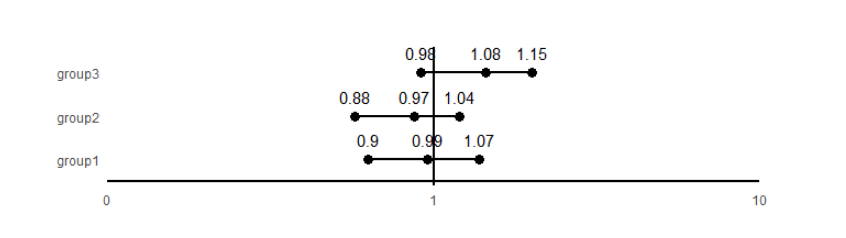
I know this may be a simple question - but do you know how to make the groups closer together (vertically closer together)?
As scottyd22 shows it can be done with ggplot readily enough. I have not even read up on ggforestplot but my guess is that either will do the job. ggforestplot probably simplifies the process as it looks to be a ggplot2 wraper but you may be able to tweak things more easily in ggplot2.
In R there are usually many different ways to get to the objective.
Assuming you have more than three, plotting more groups will make them closer together. You can also add coord_fixed() and adjust the ratio until you get an acceptable output.
coord_fixed(ratio = 1/10)
coord_fixed(ratio = 1/15)
This topic was automatically closed 21 days after the last reply. New replies are no longer allowed.
If you have a query related to it or one of the replies, start a new topic and refer back with a link.