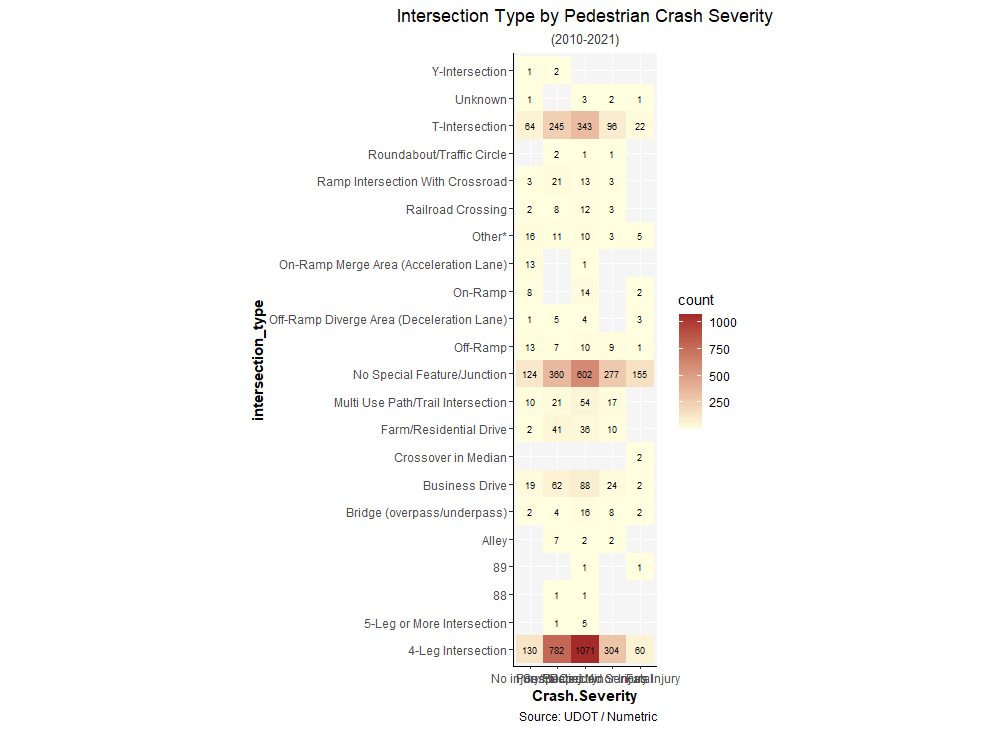
Hi, I am trying to plot a heatmap of crashes by the Intersection types, and using geom_tile gives me square tiles, which creates a problem of overlapping X-axis labels, as shown in the picture:
Is there a way to change just the width/scale of categorical variables such that the Axis labels do not overlap?
Here is the ggplot code I have used so far:
crash_variables %>% filter(`Pedestrian.Involved` == "Y") %>%
  mutate(Crash.Severity = factor(Crash.Severity, levels = c("No injury/PDO", "Possible injury", "Suspected Minor Injury", "Suspected Serious Injury", "Fatal"))) %>%
  group_by(intersection_type, Crash.Severity) %>% summarize(count = n()) %>%
  ggplot(aes(x = Crash.Severity, y = intersection_type, fill = count)) +
  geom_tile() +
  scale_x_discrete() +
  scale_fill_gradient(low = "lightyellow", high = "brown") +
  geom_text(aes(label = count), color = "black", size = 2.5) +
  coord_fixed()