Interpretation of 'shape' or 'k' from a weibul?

Context is a churn/survival analysis.

I have a Surv object, Kaplan Meier plot and an accompanying Weibul overlaid.

# create a survival object
surv_object <- Surv(time = rawd$billing_cycle, event = rawd$churned)

# fit it to kaplan meir
km_null <- survfit(surv_object ~ 1, data = rawd)
km_plan <- survfit(surv_object ~ plan_family, data = rawd)

# visualize
km_null_plot <- km_null %>% ggsurvplot(data = rawd, conf.int = F)
km_plan_plot <- km_plan %>% ggsurvplot(data = rawd, pval = T)

# weibul with function for overlay
wb <- rawd %>% 
  group_by(plan_period) %>% # dummy, all are 'Monthly'
  nest %>% 
  mutate(WB = map(.x = data, ~ survreg(Surv(time = billing_cycle, event = churned) ~ 1, data = .x, dist = 'weibull'))) %>% 
  mutate(SurvWBDF = map(.x = WB, ~ data.frame(surv = seq(.99, .01, by = -.01), upper = NA, lower = NA, std.err = NA) %>% 
                          mutate(time = predict(.x, type = "quantile", p = 1 - surv, newdata = data.frame(1)))))

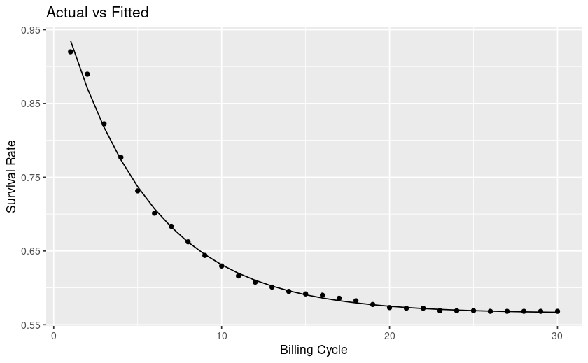
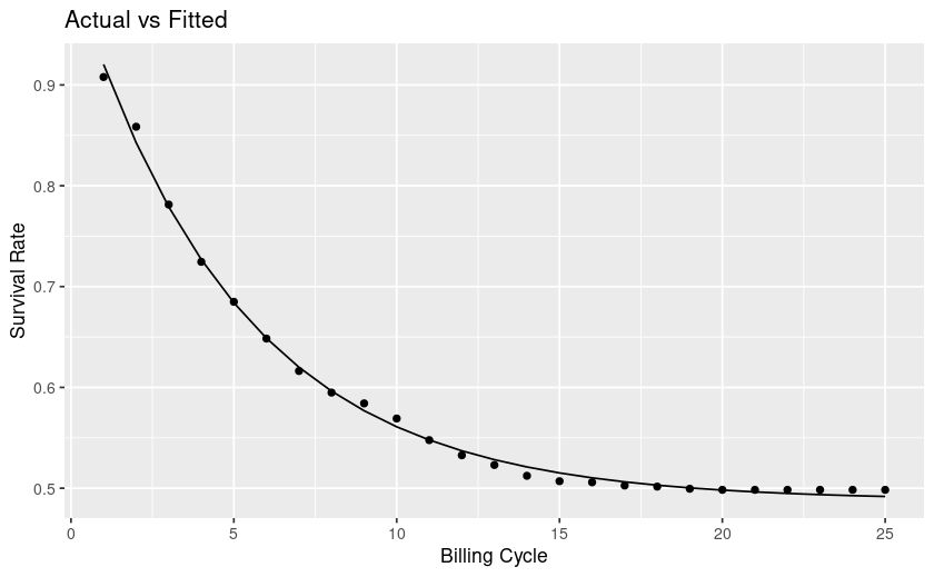
# plot actual and predicted overlay
km_null_plot$plot + 
  geom_line(data = wb$SurvWBDF[[1]], aes(time, surv, color = 'weibul fit'), size = 1) +
  labs(title = "Actual and Fitted Survival")

Produces this plot:
image

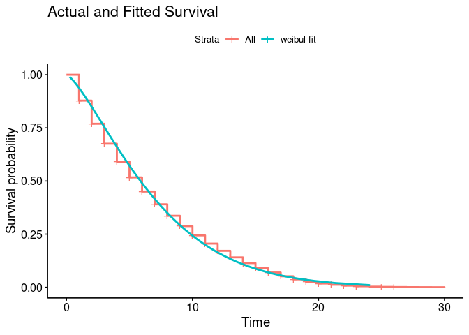
The summary() of the model is:

Call:
survreg(formula = Surv(time = billing_cycle, event = churned) ~ 
    1, data = .x, dist = "weibull")
              Value Std. Error    z       p
(Intercept)  4.0953     0.0814 50.3 < 2e-16
Log(scale)  -0.1647     0.0375 -4.4 1.1e-05

Scale= 0.848 

Weibull distribution
Loglik(model)= -2538.3   Loglik(intercept only)= -2538.3
Number of Newton-Raphson Iterations: 11 
n= 6261 

From this I calculated shape or 'k' based on this post thus, where WB is my weibul fit:

Shape = map_dbl(.x = WB, ~ 1 / .x$scale)

Gives me 1.179 shape.

From searching online, e.g. wikipedia:

If the quantity X is a "time-to-failure", the Weibull distribution gives a distribution for which the failure rate is proportional to a power of time. The shape parameter, k

... is that power plus one, and so this parameter can be interpreted directly as follows:

  • A value of k<1

  • indicates that the failure rate decreases over time. This happens if there is significant "infant mortality", or defective items failing early and the failure rate decreasing over time as the defective items are weeded out of the population. In the context of the diffusion of innovations, this means negative word of mouth: the hazard function is a monotonically decreasing function of the proportion of adopters;

  • A value of k=1

  • indicates that the failure rate is constant over time. This might suggest random external events are causing mortality, or failure. The Weibull distribution reduces to an exponential distribution;

  • A value of k>1
    indicates that the failure rate increases with time. This happens if there is an "aging" process, or parts that are more likely to fail as time goes on. In the context of the diffusion of innovations, this means positive word of mouth: the hazard function is a monotonically increasing function of the proportion of adopters. The function is first concave, then convex with an inflexion point at (e1/k−1)/e1/k,k>1

From looking at my plot my curve levels off, at future timepoints the rate of survival is mostly flat, whereas towards the left it's steep and thus churn is high. This interpretation is counter to the explanations I find online.

Have I misinterpreted, does my shape look correct for this curve? How can I interpret it? Do people churn more or less with time?

The plot shows a classic exponential decay curve

library(ggplot2)

exponential_decay <- function(x, a, b) a * exp(-b * x)

d <- data.frame(
  x <- seq(0, 5, 0.1),
  y <- exponential_decay(x, a = 10, b = 1)
)

ggplot(d, aes(x, y)) +
  geom_line() +
  ggtitle("Exponential Decay Curve") +
  theme_minimal()

Created on 2023-06-09 with reprex v2.0.2

In the context of your plot, this is just the same as a decreasing \Delta for Survival probability where the rate of decrease for unit time is monotonically decreasing until it asymptotically approaches zero. The interpretation for k > 1 is on all fours.

Are you reading too much into the flattening in real-world terms? Achilles does overtake the tortoise in the end. :grinning:

Hi thanks for the additional info here!

For context I'm working with business stakeholders who have a target churn rate of x%. Since churn rate changes over a users lifecycle and since older accounts churn less, I'm trying to make a case that making a churn rate a goal in itself is challenging and that we should instead target a parameter change on whichever decay function our subscriber retention curve fits.

I may be optimistic in trying to change thinking and having stakeholders shift the way they look at churn and retention, but I'll do my best nonetheless!

Are you saying that I would be better of using an exponential decay model rather than fitting it to a weibul? I chose a weibul since I was familiar with it from a previous project and I liked the idea of being able to somewhat interpret shape and scale. But I guess I can do the same with an exponential decay function, why pick one over the other?

In your function, I think x=time, a=? and b=labmda, the power. Is that correct? What's a?

To find the value lambda, would I use nls()?

I tried what I think is exponential decay using nls(), does this seem like a sound approach to you?

Example sample dput dataframe 'pdata':

structure(list(plan_family = c("PlanA", "PlanB", "PlanC"), data = list(
    structure(list(billing_cycle = c(1, 2, 3, 4, 5, 6, 7, 8, 
    9, 10, 11, 12, 13, 14, 15, 16, 17, 18, 19, 20, 21, 22, 23, 
    24, 25, 26, 27, 28, 29, 30), survival_rate = c(0.92003367003367, 
    0.88973063973064, 0.822390572390572, 0.776936026936027, 0.731481481481482, 
    0.701178451178451, 0.683501683501683, 0.662457912457912, 
    0.643939393939394, 0.62962962962963, 0.616161616161616, 0.607744107744108, 
    0.601010101010101, 0.595117845117845, 0.591750841750842, 
    0.59006734006734, 0.585858585858586, 0.582491582491583, 0.577441077441077, 
    0.573232323232323, 0.572390572390572, 0.572390572390572, 
    0.569023569023569, 0.569023569023569, 0.569023569023569, 
    0.568181818181818, 0.568181818181818, 0.568181818181818, 
    0.568181818181818, 0.568181818181818)), row.names = c(NA, 
    -30L), class = c("tbl_df", "tbl", "data.frame")), structure(list(
        billing_cycle = c(1, 2, 3, 4, 5, 6, 7, 8, 9, 10, 11, 
        12, 13, 14, 15, 16, 17, 18, 19, 20, 21, 22, 23, 24, 25, 
        26, 27), survival_rate = c(0.922613065326633, 0.878894472361809, 
        0.818090452261306, 0.774874371859297, 0.733165829145729, 
        0.69748743718593, 0.674874371859296, 0.652763819095477, 
        0.632160804020101, 0.616582914572864, 0.606030150753769, 
        0.593467336683417, 0.587437185929648, 0.579899497487437, 
        0.571356783919598, 0.564321608040201, 0.558793969849246, 
        0.555276381909548, 0.552261306532663, 0.549748743718593, 
        0.548241206030151, 0.547738693467337, 0.547236180904523, 
        0.547236180904523, 0.546733668341709, 0.546733668341709, 
        0.546733668341709)), row.names = c(NA, -27L), class = c("tbl_df", 
    "tbl", "data.frame")), structure(list(billing_cycle = c(1, 
    2, 3, 4, 5, 6, 7, 8, 9, 10, 11, 12, 13, 14, 15, 16, 17, 18, 
    19, 20, 21, 22, 23, 24, 25), survival_rate = c(0.907824222936763, 
    0.858520900321543, 0.781350482315113, 0.72454448017149, 0.684887459807074, 
    0.648445873526259, 0.616291532690247, 0.594855305466238, 
    0.584137191854234, 0.569131832797428, 0.547695605573419, 
    0.532690246516613, 0.523043944265809, 0.512325830653805, 
    0.506966773847803, 0.505894962486602, 0.502679528403001, 
    0.501607717041801, 0.4994640943194, 0.498392282958199, 0.498392282958199, 
    0.498392282958199, 0.498392282958199, 0.498392282958199, 
    0.498392282958199)), row.names = c(NA, -25L), class = c("tbl_df", 
    "tbl", "data.frame")))), class = c("grouped_df", "tbl_df", 
"tbl", "data.frame"), row.names = c(NA, -3L), groups = structure(list(
    plan_family = c("PlanA", "PlanB", "PlanC"), .rows = structure(list(
        1L, 2L, 3L), ptype = integer(0), class = c("vctrs_list_of", 
    "vctrs_vctr", "list"))), class = c("tbl_df", "tbl", "data.frame"
), row.names = c(NA, -3L), .drop = TRUE))

Then some nls with a decay function:

# Define the exponential decay function
exponential_decay <- function(i, a, lambda, billing_cycle) i + a * exp(-lambda * billing_cycle)

decay <- pdata |> 
  mutate(nls_fit = map(data, ~ nls(survival_rate ~ exponential_decay(i, lambda, a, billing_cycle), 
                                   data = .x, start = list(i = 0.01, lambda = 0.1, a = 0.1))),
         
         
         plot = map2(data, nls_fit, ~{ggplot(.x, aes(x = billing_cycle, y = survival_rate)) +
             geom_point() +
             geom_line(aes(y = predict(.y))) +
             labs(title = "Actual vs Fitted", x = "Billing Cycle", y = "Survival Rate")})
         )

decay$plot

Returns the following 3 plots:


I think these look 'good' fits visually, I'm interpreting as survival rate is a function of an intercept i + amplitude coefficient a, time (billing cycle) and lambda the parameter controlling the 'steepness' (but isn't that what a does?)

Something I cannot 'see' is the difference in a and lambda. They seem to overlap in what they do, they both impact the 'curviness' or steepness. Do I have some redundancy? Could I make my decay function simpler?

Any reason why one would use this approach over the weibul? I had to change by df here to be survival% at each time point, but I get similar curves. My goal is to make these as simple to understand as I can :confused:

No, none at all. It was just to jump start thinking about the problem in order better to understand the underlying phenom—the fitted curve never goes to zero even after the data might. But what you did with nls() might be a better fit. Try a root mean squared evaluation?

would make sense if the rate was linear in the parameters, but that's not the world that the data live in. I like to say that it's always the second derivative that kills you, the rate of change of the rate of change. That may be something that can best be brought home by illustrating a linear model fit with error bands.

1 Like

The rate of change of the rate of change

Would that be represented by the lambda param here?

Thanks for the tip, will try a root mean squared fit too.

In the provided exponential_decay function in R, the a parameter represents the amplitude or scaling factor of the exponential decay curve. It determines the vertical stretch or compression of the curve.

When x increases, the exponential term, exp(-b * x), decreases exponentially. The b parameter controls the rate of decay or how quickly the exponential term decreases as 'x' increases. A higher value of b leads to a faster decay, while a lower value of b results in a slower decay.

Multiplying the exponential term by a scales the decay curve vertically. It determines the overall magnitude of the function's output.

1 Like

Yes. Here's an example

exponential_parameters <- function(pdata) {
  # Fit an exponential decay curve to the survival rate data
  fit <- nls(
    survival_rate ~ a * exp(-b * billing_cycle),
    data = pdata,
    start = list(a = 1, b = 0.1)
  )
  
  # Extract the amplitude (a) and rate of decay (b) from the fitted curve
  a <- coef(fit)["a"]
  b <- coef(fit)["b"]
  
  # Return the amplitude and rate of decay
  return(list(amplitude = a, decay_rate = b))
}

pdata <- data.frame(
  plan_family = c("PlanA", "PlanB", "PlanC"),
  billing_cycle = c(
    1, 2, 3, 4, 5, 6, 7, 8,
    9, 10, 11, 12, 13, 14, 15, 16, 17, 18, 19, 20, 21, 22, 23,
    24, 25, 26, 27, 28, 29, 30
  ),
  survival_rate = c(
    0.92003367003367,
    0.88973063973064, 0.822390572390572, 0.776936026936027, 0.731481481481482,
    0.701178451178451, 0.683501683501683, 0.662457912457912,
    0.643939393939394, 0.62962962962963, 0.616161616161616, 0.607744107744108,
    0.601010101010101, 0.595117845117845, 0.591750841750842,
    0.59006734006734, 0.585858585858586, 0.582491582491583, 0.577441077441077,
    0.573232323232323, 0.572390572390572, 0.572390572390572,
    0.569023569023569, 0.569023569023569, 0.569023569023569,
    0.568181818181818, 0.568181818181818, 0.568181818181818,
    0.568181818181818, 0.568181818181818
  )
)

result <- exponential_parameters(pdata)
result
#> $amplitude
#>         a 
#> 0.8022218 
#> 
#> $decay_rate
#>          b 
#> 0.01562382

Created on 2023-06-11 with reprex v2.0.2

1 Like

Thank you once again for the guidance here, it 'feels' clearer now

1 Like

This topic was automatically closed 7 days after the last reply. New replies are no longer allowed.

If you have a query related to it or one of the replies, start a new topic and refer back with a link.