Legend in ggplot2

Hello,
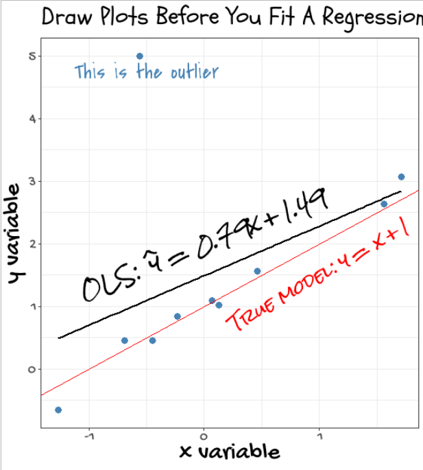
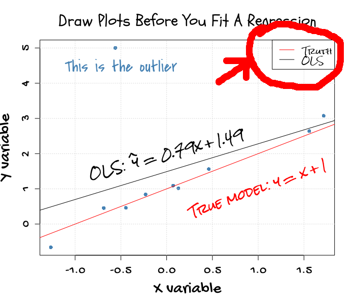
I'm trying to recreate this plot using ggplot2. I have been quite successful until now but I'm unable to put the legend like the example. How should I get the legend as in cited plot (I know how to do a legend in ggplot, I just want to get the same legend and position if possible.
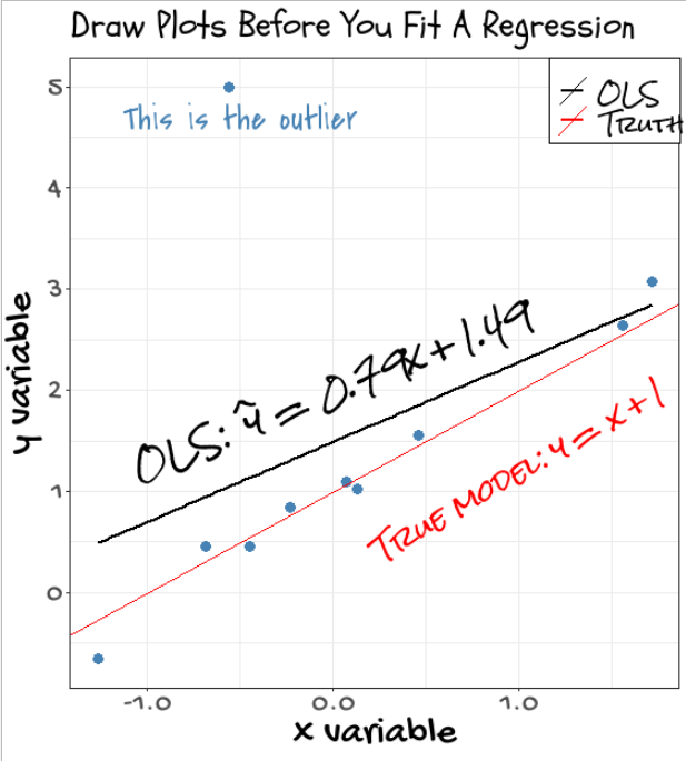
This is my code:

# ----------------------------------------------------------------------------
# Mi versión con ggplot
library(tidyverse)
library(showtext)

## Loading Google fonts (https://fonts.google.com/)
font_add_google("Gochi Hand", "gochi")
font_add_google("Schoolbell", "bell")
font_add_google("Covered By Your Grace", "grace")
font_add_google("Rock Salt", "rock")

## Automatically use showtext to render text for future devices
showtext_auto()

## Tell showtext the resolution of the device,
## only needed for bitmap graphics. Default is 96
showtext_opts(dpi = 96)

set.seed(123)
x  <- rnorm(10)
y  <-  1 + x + rnorm(10, sd = 0.2)
y[1] <-  5
mod <- lm(y ~ x)

df <- data.frame(x,y)

df |> ggplot(aes( x = x, y = y)) +
  geom_point(size = 3, colour = "steelblue") + # colores: cadetblue4, dodgerblue3, firebrick4, 
  geom_smooth(method = 'lm', formula = y~x, se = F, colour = "black") +
  geom_abline(aes(slope = 1, intercept = 1), colour = "red") +
  labs(
    x = "x variable",
    y = "y variable",
    title = "Draw Plots Before You Fit A Regression",
  ) +
  geom_text(
    aes(x, y), 
    data = data.frame(x = -0.5, y = 4.75), 
    label = "This is the outlier",
    colour = "steelblue",
    family = "grace",
    size = 7
  ) + 
  geom_text(
    aes(x,y),
    data = data.frame(x = 1, y = 1.5), 
    label = expression(paste("True model: ", y == x + 1)),
    family = "rock",
    angle = 30,
    size = 6, 
    colour = "red" 
  ) +
  geom_text(
    aes(x,y),
    data = data.frame(x = 0, y = 2), 
    label = expression(paste("OLS: ", hat(y) == 0.79 * x + 1.49)),
    family = "rock",
    angle = 22,
    size = 7, 
    colour = "black" 
  ) +
  theme_bw() + 
  theme(
    plot.title = element_text(size = 24, family = "bell"),
    axis.text.x = element_text(size=14, family = "gochi"),
    axis.text.y = element_text(size=14, family = "gochi"),
    axis.title.x = element_text(size=24, family = "gochi"),
    axis.title.y = element_text(size=24, family = "gochi"),
  )

This is the plot rendered:

This doesn't have what ggplot thinks of as a legend. The plot shows a "title" on top and "labels" for the x-axis and y-axis. Where is what you are looking to change?

It's true, as it is, code doesn't have any legend element to plot. I am looking for some layer or geom to add to the code posted to get that legend. It is only an exercise; I am practising with ggplot just to learn. I have tried several different ones, but I haven't found any geom that adds the legend as it is on the original plot. R basic plot functions add that legend with just

legend("topright", legend = c("Truth", "OLS"), col = c("red", "black"), lty = 1)

This is the legend in original plot and that's what I want to get.

We are still not on the same page for legend I think. Here's what one looks like

Thanks for answering. Yeah, I know what a legend is, of course. I think I have been a bit clearer maybe on my last post

Posing the question is always the hard part, ain't it? Still unclear on the what though that you want to add.

Getting closer to it, only x axis ticks labels missing
The code:

# ----------------------------------------------------------------------------
# Mi versión con ggplot
library(tidyverse)
library(showtext)
library(scales)

## Loading Google fonts (https://fonts.google.com/)
font_add_google("Gochi Hand", "gochi")
font_add_google("Schoolbell", "bell")
font_add_google("Covered By Your Grace", "grace")
font_add_google("Rock Salt", "rock")

## Automatically use showtext to render text for future devices
showtext_auto()

## Tell showtext the resolution of the device,
## only needed for bitmap graphics. Default is 96
showtext_opts(dpi = 96)

set.seed(123)
x  <- rnorm(10)
y  <-  1 + x + rnorm(10, sd = 0.2)
y[1] <-  5
mod <- lm(y ~ x)

df <- data.frame(x,y)

df |> ggplot(aes( x = x, y = y)) +
  geom_point(size = 3, colour = "steelblue") + # colores: cadetblue4, dodgerblue3, firebrick4, 
  geom_smooth(aes(colour = "black"), method = 'lm', formula = y~x, se = F) +
  geom_abline(aes(slope = 1, intercept = 1, colour = "red")) +
  scale_colour_manual(values=c("black", "red"), labels = c("OLS", "Truth")) +
  scale_x_continuous(labels = label_number(accuracy = 0.1)) +
  labs(
    x = "x variable",
    y = "y variable",
    title = "Draw Plots Before You Fit A Regression",
  ) +
  geom_text(
    aes(x, y), 
    data = data.frame(x = -0.5, y = 4.7), 
    label = "This is the outlier",
    colour = "steelblue",
    family = "grace",
    size = 7
  ) + 
  geom_text(
    aes(x,y),
    data = data.frame(x = 1, y = 1.2), 
    label = expression(paste("True model: ", y == x + 1)),
    family = "rock",
    angle = 30,
    size = 6, 
    colour = "red" 
  ) +
  geom_text(
    aes(x,y),
    data = data.frame(x = 0, y = 2), 
    label = expression(paste("OLS: ", hat(y) == 0.79 * x + 1.49)),
    family = "rock",
    angle = 22,
    size = 7, 
    colour = "black" 
  ) +
  theme_bw() + 
  theme(
    plot.title = element_text(size = 22, family = "bell"),
    axis.text.x = element_text(size=18, family = "gochi"),
    axis.text.y = element_text(size=18, family = "gochi"),
    axis.title.x = element_text(size=24, family = "gochi"),
    axis.title.y = element_text(size=24, family = "gochi"),
    legend.position = c(0.895, 0.932),
    legend.background = element_rect(colour = "black", fill="white", size=0.5, linetype="solid"),
    legend.text =  element_text(size=14, family = "rock"),
    legend.title = element_blank(),
  )

and the plot:

add

    # added, lineheight should work but elusive
    axis.ticks = element_line(linewidth = 4)

Thanks Richard, I can see that my English is awful. It's not the ticks what I do need but labelling all ticks. My axis was labelled (-1, --, 0, --, 1) with empty labels at minor ticks, I wanted all labels like (-1, -0.5, 0, 0.5, 1)
I think I've got it now. I couldn't imagine that getting this graph would be so complicated! Maybe there's an easier way to get the result... but I think I'm done with this by now.
Final code :

# ----------------------------------------------------------------------------
# Mi versión con ggplot
library(tidyverse)
library(showtext)
library(scales)

## Loading Google fonts (https://fonts.google.com/)
font_add_google("Gochi Hand", "gochi")
font_add_google("Schoolbell", "bell")
font_add_google("Covered By Your Grace", "grace")
font_add_google("Rock Salt", "rock")

## Automatically use showtext to render text for future devices
showtext_auto()

## Tell showtext the resolution of the device,
## only needed for bitmap graphics. Default is 96
showtext_opts(dpi = 96)

set.seed(123)
x  <- rnorm(10)
y  <-  1 + x + rnorm(10, sd = 0.2)
y[1] <-  5
mod <- lm(y ~ x)

df <- data.frame(x,y)

df |> ggplot(aes( x = x, y = y)) +
  geom_point(size = 3, colour = "steelblue") + # colores: cadetblue4, dodgerblue3, firebrick4, 
  geom_smooth(aes(colour = "black"), method = 'lm', formula = y~x, se = F) +
  geom_abline(aes(slope = 1, intercept = 1, colour = "red")) +
  scale_colour_manual(values=c("black", "red"), labels = c("OLS", "Truth")) +
  scale_x_continuous(labels = label_number(accuracy = 0.1), breaks = breaks_extended(6)) +
  labs(
    x = "x variable",
    y = "y variable",
    title = "Draw Plots Before You Fit A Regression",
  ) +
  geom_text(
    aes(x, y), 
    data = data.frame(x = -0.5, y = 4.7), 
    label = "This is the outlier",
    colour = "steelblue",
    family = "grace",
    size = 7
  ) + 
  geom_text(
    aes(x,y),
    data = data.frame(x = 1, y = 1.2), 
    label = expression(paste("True model: ", y == x + 1)),
    family = "rock",
    angle = 30,
    size = 6, 
    colour = "red" 
  ) +
  geom_text(
    aes(x,y),
    data = data.frame(x = 0, y = 2), 
    label = expression(paste("OLS: ", hat(y) == 0.79 * x + 1.49)),
    family = "rock",
    angle = 22,
    size = 7, 
    colour = "black" 
  ) +
  theme_bw() + 
  theme(
    plot.title = element_text(size = 22, family = "bell"),
    axis.text.x = element_text(size=18, family = "gochi"),
    axis.text.y = element_text(size=18, family = "gochi"),
    axis.title.x = element_text(size=24, family = "gochi"),
    axis.title.y = element_text(size=24, family = "gochi"),
    panel.grid.minor.x = element_blank(),
    legend.position = c(0.895, 0.932),
    legend.background = element_rect(colour = "black", fill="white", size=0.5, linetype="solid"),
    legend.text =  element_text(size=14, family = "rock"),
    legend.title = element_blank(),
  )

and final plot:

1 Like

This topic was automatically closed 7 days after the last reply. New replies are no longer allowed.

If you have a query related to it or one of the replies, start a new topic and refer back with a link.