i'm looking the best visualization plot to show the correlation between 3 variable series: density, volume and time.
Which is the best choice: heatmap, correlogram, scatterplot ?
I need to show the correlation coefficient on the plot.
I doubt there is a single answer to your question. Do you want to simply show a plotted representation of a table of correlation coefficients? Then a heat map is probably the best choice. Or do you want to show the actual data plotted in all combinations and the associated coefficients? What is the goal of the plot and who is the intended audience?
--
i want a plot to show the correlation between density and volume for each individual time,
the graph must be quickly understandable and show correlation values
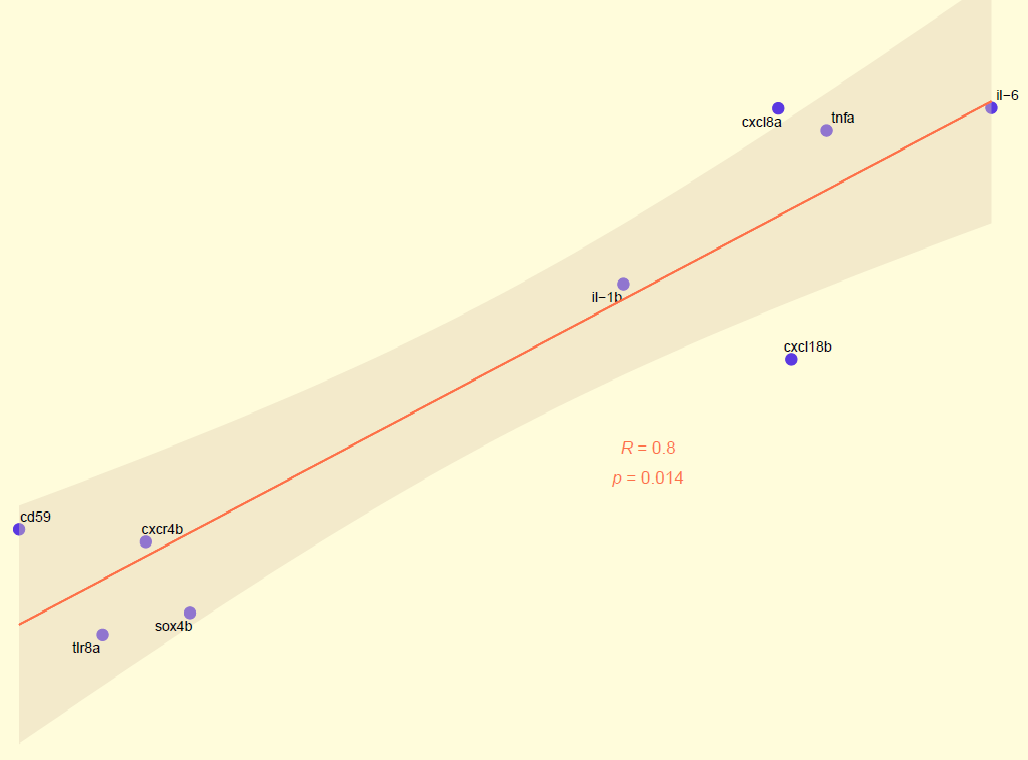
yes, it seems to be a good representation but i need to use spearman correlation and plot the correlation line between the differents points, see attached picture.
If you need plots just like the one you showed in your last post, why did you ask what the best visualization would be in your first post?
The cor() function I used can return the spearman correlation. See the help section for ?cor to learn how to do that.
The plot with the fitted line can be made by adding geom_smooth(method = "lm") to my previous code.
no, it was just a suggestion, I saw this graph on a website and I thought that with the correlation line you could better see the distances of the points from the line.