Hello!
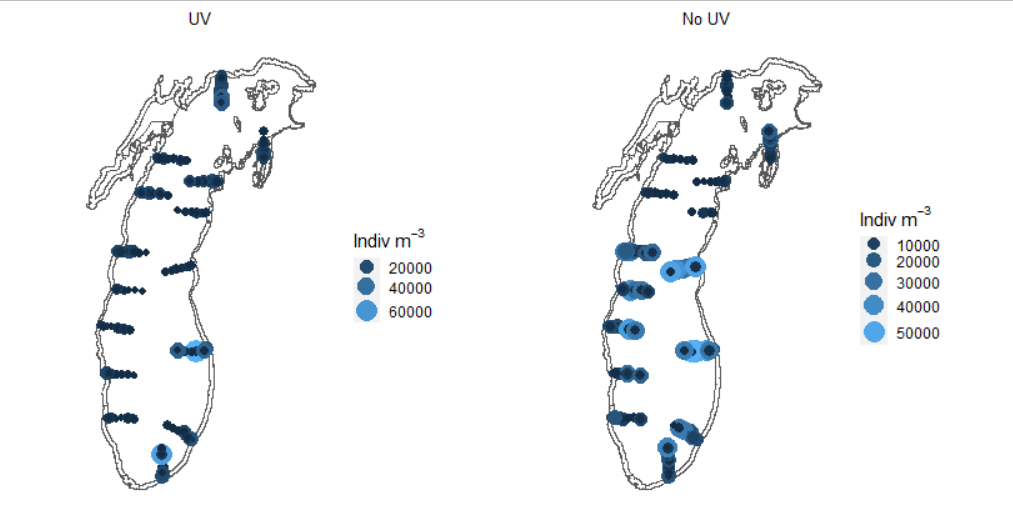
I have two separate plots with different mins and maxes (for Indiv m-3) that I want to set to be the same min and max so that the legend and plot aesthetics are the same. For example:
I want the scale for each plot to go from 10000 to 60000 . Is there a way to do this?
Thanks so much for any help!
FJCC
January 18, 2023, 10:55pm
2
What plotting package are you using? If it is based on ggplot, you may be able to set the limits argument of scale_color_gradient to control color scale.
Yes, I was looking into that, however, I'm not sure what would be the xlim and what would be the ylim, given that it's a GIS plot.
Here is the code I have currently. Where would I set the limits for my continuous data?
p1 <- all %>%
  filter(DEPTH_CLASS == "UV") %>%
  ggplot() +
  geom_sf(data=lm, fill="white") + # Lake Michigan shapefile
  geom_sf(aes(size = Density, color=Density)) + # Density plots
  scale_color_gradientn(colors = c("#FFFFCC", "#FFEDA0", "#FED976", "#FEB24C", "#FD8D3C", "#FC4E2A", "#E31A1C", "#B10026")) + # Where do I go from here?
  theme(axis.text.x = element_blank(),  # remove x-axis text
        axis.text.y = element_blank(), # remove y-axis text
        axis.ticks = element_blank(),  # remove axis ticks
        axis.title.x = element_text(size=18), # remove x-axis labels
        axis.title.y = element_text(size=18), # remove y-axis labels
        panel.background = element_blank(),
        panel.grid.major = element_blank(),  #remove major-grid labels
        panel.grid.minor = element_blank(),  #remove minor-grid labels
        plot.background = element_blank(),
        legend.key.size = unit(0.25, 'cm')) +
  guides(color='legend', size='legend') +
  labs(color = bquote('Indiv'~m^-3),
       size = bquote('Indiv'~m^-3)) +
  ggtitle("UV") +
  theme(plot.title = element_text(size = 10,
                                  hjust = 0.5))
It looks like I can create categorical variables based on my data and then set them manually, using the code below:
data1 <- data %>%
  mutate(Dens_CAT = case_when(Density>0 & Density<10000 ~ "10000",
                              Density>10000 & Density<20000 ~ "20000",
                              Density>20000 & Density<30000 ~ "30000",
                              Density>30000 & Density<40000 ~ "40000",
                              Density>40000 & Density<50000 ~ "50000",
                              Density>50000 & Density<60000 ~ "60000",
                              Density>60000 & Density<70000 ~ "70000",
                              Density>70000 & Density<80000 ~ "80000"))
It's not the quickest option if I want to do this for multiple plots but it does work. If anyone has a better method, please let me know!
system
February 9, 2023, 3:48pm
5
This topic was automatically closed 21 days after the last reply. New replies are no longer allowed.