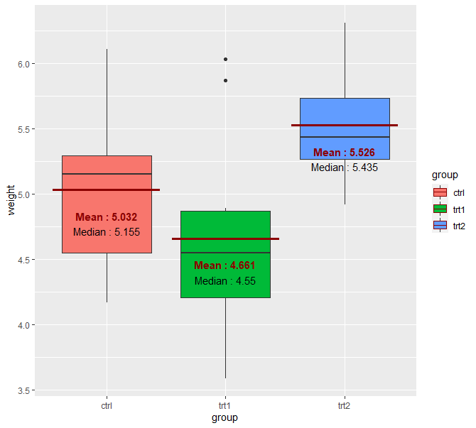
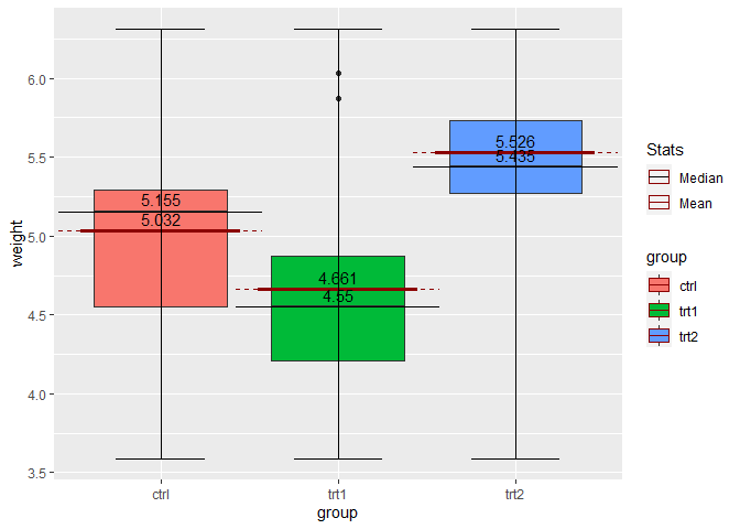
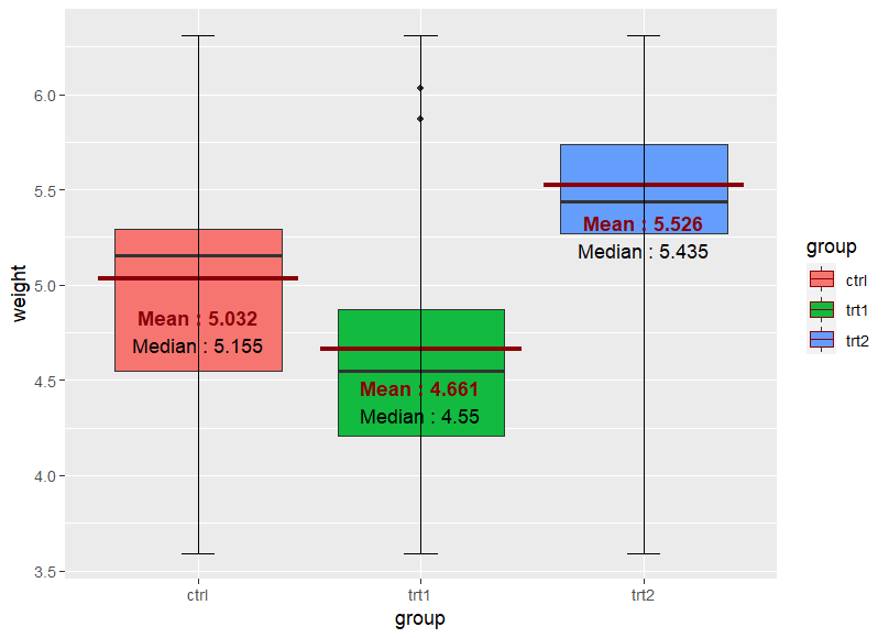
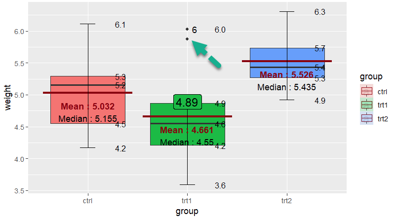
Mean and median in one boxplot

Hi,
I need to place medians and means on one boxplot and annotate it:

means <- aggregate(weight ~  group, PlantGrowth, mean)

medians <- aggregate(weight ~  group, PlantGrowth, median)

PlantGrowth |>
       summarize(ymin = quantile(weight, 0),
            lower = quantile(weight, 0.25),
            median = median(weight),
            mean = mean(weight),
            upper = quantile(weight, 0.75),
            ymax = quantile(weight, 1)) %>%
  ggplot(aes(x=group, y=weight, fill=group)) + geom_boxplot(stat = 'identity', aes(ymin = ymin, lower = lower, middle = mean, upper = upper,
                   ymax = ymax)) +
  stat_summary(fun=mean, colour="darkred", geom="line",
               shape=18, size=3, show.legend=FALSE) +
  geom_text(data = means, aes(label = weight, y = weight + 0.08))+
  geom_text(data = medians, aes(label = weight, y = weight + 0.08))

but it throws an error:

Error in FUN(X[[i]], ...) : object 'group' not found

What do I do wrong ?

you summarised over PlantGrowth without applying any group, and collapsed it to a single result.
Did you intend a grouped analysis? if so the first step towards that would be

PlantGrowth |> group_by(group) |> 
    summarize(ymin = quantile(weight, 0),
              lower = quantile(weight, 0.25),
              median = median(weight),
              mean = mean(weight),
              upper = quantile(weight, 0.75),
              ymax = quantile(weight, 1))

Ah, thank you, but still errors:

PlantGrowth |> group_by(group) |> 
    summarize(ymin = quantile(weight, 0),
              lower = quantile(weight, 0.25),
              median = median(weight),
              mean = mean(weight),
              upper = quantile(weight, 0.75),
              ymax = quantile(weight, 1))+
  ggplot(aes(x=group, y=weight, fill=group)) + geom_boxplot(stat = 'identity', aes(ymin = ymin, lower = lower, middle = mean, upper = upper,
                   ymax = ymax)) +
  stat_summary(fun=mean, colour="darkred", geom="line",
               shape=18, size=3, show.legend=FALSE) +
  geom_text(data = means, aes(label = weight, y = weight + 0.08))+
  geom_text(data = medians, aes(label = weight, y = weight + 0.08))

the immediate issue is your having used a + between the data creation step summarise and the start of ggplot commands. for sure ggplot commands are chained together with + but not before the first ggplot() call.
after that you may need to rethink your intent vis y=weight as your summarise has not preserved weight but made various aggregations of it.
I generally advise against chaining data transformations into a ggplot call for anything non trivial.
make a dataset , or sets, and load the explicitly into ggplot2 as needed. At least thats my preference, I find it easier to debug.

I just simply want to make a boxplot of weight according to group with medians and means on it, I might overcomplicated it a bit.
Starting over:

ggplot(data=PlantGrowth, aes(x=group, y=weight, fill=group)) + geom_boxplot() +
  stat_summary(fun=mean, colour="darkred", geom="line",
               shape=18, size=3, show.legend=FALSE) +
  geom_text(data = means, aes(label = weight, y = weight + 0.08))+
  geom_text(data = medians, aes(label = weight, y = weight + 0.08))

I am almost there but how to add a lines for means ?
Something like in here:
https://stackoverflow.com/questions/69444091/mean-and-median-boxplot-legend-for-geom-boxplot-in-the-ggplot2-function

I think "crossbar" is the way to go.

ggplot(data=PlantGrowth, aes(x=group, y=weight, fill=group)) +
  geom_boxplot() +
stat_summary(fun=mean, color="darkred",geom="crossbar", show.legend=FALSE)  +
  geom_text(data = means, aes(label = weight, y = weight + 0.08))+
  geom_text(data = medians, aes(label = weight, y = weight + 0.08))

Never heard of "crossbar" before, thank you very much. One more question, how to annotate it that people know which is median and which is mean ?
Could be on boxplots or in the legend.

Perhaps this sort of idea


smry_text <- PlantGrowth |> 
  group_by(group) |> 
  summarise(across(.cols=weight,
                   .fns = list(mean=mean,median=median))) |> 
  mutate(mean_text = paste0("Mean : ",weight_mean),
         median_text = paste0("\n\nMedian : ",weight_median))

ggplot(data=PlantGrowth, aes(x=group, y=weight, fill=group)) +
  geom_boxplot() +
  stat_summary(fun=mean, color="darkred",geom="crossbar", show.legend=TRUE)  +
  geom_text(data = smry_text, aes(label = median_text,
                                   y=weight_mean),
             ,nudge_y = -.2) +
  geom_text(data = smry_text, aes(label = mean_text,
                                   y=weight_mean),
             ,nudge_y = -.2,color="darkred" , fontface = "bold")

1 Like

Thank you very much indeed, exactly what I wanted and very elegant solution.
In the meantime I have tried this:

``` r
library(tidyverse)
data(PlantGrowth)

means <- aggregate(weight ~  group, PlantGrowth, mean)

medians <- aggregate(weight ~  group, PlantGrowth, median)


ggplot(data=PlantGrowth, aes(x=group, y=weight, fill=group)) +
  geom_boxplot() +
stat_summary(fun=mean, color="darkred",geom="crossbar", show.legend=TRUE)  +
  geom_text(data = means, aes(label = weight, y = weight + 0.08))+
  geom_text(data = medians, aes(label = weight, y = weight + 0.08))+
  geom_errorbar(aes(ymin=min(weight),ymax=max(weight)), linetype = 1, width = 0.5)+
  stat_summary(
    fun = mean, geom = "errorbar", aes(ymax = ..y.., ymin = ..y.., color = "Mean"),
    width = 1.15, linetype = "dashed"
  ) +
  stat_summary(
    fun = median, geom = "errorbar", aes(ymax = ..y.., ymin = ..y.., color = "Median"),
    width = 1.15, linetype = "solid"
  )+
  scale_colour_manual("Stats", values = c(Median = "black", Mean = "darkred"))

Created on 2022-09-27 with reprex v2.0.2

I have one question if I may, how to tweak my legend, I mean make boxes a bit bigger under Stats title, lines inside rectangles a bit more visible, etc. I would be grateful for a hint where to start. Thank you.

you can change appearance via ggplot2's theme heres a brief guide to resize the legend
How to Change Legend Size in ggplot2 (With Examples) (statology.org)

Hi,
when I want to add horizontal whiskers (to Nir's code) by means of geom_errorbar something is wrong as all 3 whiskers are the same long which is not corresponding with the data. I think this is because of this line of code:

# geom_errorbar(aes(ymin=min(weight),ymax=max(weight)), linetype = 1, width = 0.15)

smry_text <- PlantGrowth |>
  group_by(group) |>
  summarise(across(.cols=weight,
                   .fns = list(mean=mean,median=median))) |>
  mutate(mean_text = paste0("Mean : ",weight_mean),
         median_text = paste0("\n\nMedian : ",weight_median))

ggplot(data=PlantGrowth, aes(x=group, y=weight, fill=group)) +
  geom_boxplot() +
  stat_summary(fun=mean, color="darkred",geom="crossbar", show.legend=TRUE)  +
  geom_errorbar(aes(ymin=min(weight),ymax=max(weight)), linetype = 1, width = 0.15)+
  geom_text(data = smry_text, aes(label = median_text,
                                   y=weight_mean),
             ,nudge_y = -.2) +
  geom_text(data = smry_text, aes(label = mean_text,
                                   y=weight_mean),
             ,nudge_y = -.2,color="darkred" , fontface = "bold")

How should I change it in order to be correct, please ?

In the meantime I have managed to do this, but still can't label that second outlier pointed by arrow, please help:

This thread is considered solved.
Perhaps start a new thread with a new reprex if you would like further support with it.

This topic was automatically closed 7 days after the last reply. New replies are no longer allowed.

If you have a query related to it or one of the replies, start a new topic and refer back with a link.