My RStudio code doesn't have colors

I'm studying R in university at the moment and I'm following my professor's R cheatsheet and codes to replicate using my own database.
But when I wanna replicate this following code, it loads, but uncolored... while the plot it's supposed to be filled with a variety of colors

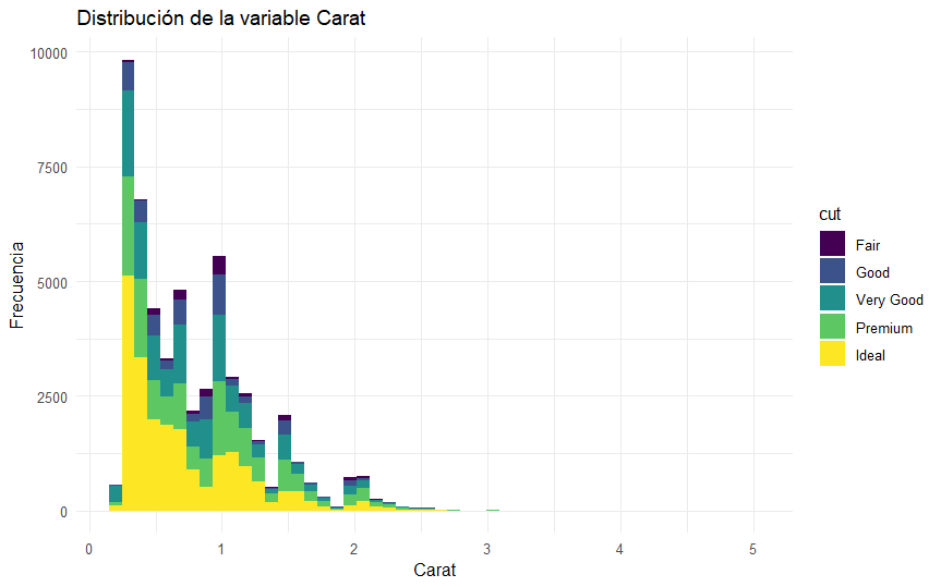
This is the code I need to replicate:

ggplot(diamonds) +
 geom_histogram(bins = 50, aes(x = carat, fill = cut)) +
 xlab("Carat") +
 ylab("Frecuencia") +
 ggtitle("Distribución de la variable Carat") +
 theme_minimal()

This is the outcome of the previous code:

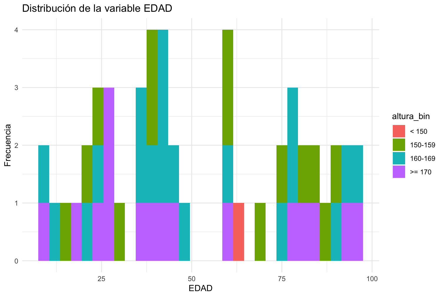
And this is my version:

ggplot(baseDeDatos2) +
  geom_histogram(bins = 50, aes(x = EDAD, fill = ALTURA)) +
  xlab("EDAD") +
  ylab("Frecuencia") +
  ggtitle("Distribución de la variable EDAD") +
  theme_minimal()

And my outcome is uncolored: I can't post more than 1 photo since I'm a new user... but my outcome is the plot in gray colors.

Could someone tell me why is my outcome uncolored..? Thank you

1 Like

Please post some of your data by posting the output of

dput(head(baseDeDatos2,30))

You can adjust the value of 30 to whatever makes sense for your data.

1 Like

this is the outcome, I only put 1 to show, because my database has 50 registers and it looks really messy to read here

> dput(head(baseDeDatos2,1))
structure(list(ID = "0-01", NOMBRE = "Pedro", EDAD = 26, TELEFONO = 123456, 
    MAIL = "Pedro20@gmail.com", ALTURA = 175, PESO = 56), row.names = c(NA, 
-1L), class = c("tbl_df", "tbl", "data.frame"))

It's a database with 50 registers of Name, age, telephone, mail, height and weight

I can't reproduce your plot with one row. Since your plot only uses the columns EDAD and ALTURA, you can simplify the dput output with

dput(baseDeDatos2[,c("EDAD","ALTURA")])

> dput(baseDeDatos2[,c("EDAD","ALTURA")])
structure(list(EDAD = c(26, 28, 35, 20, 10, 78, 82, 42, 17, 92, 
40, 78, 43, 10, 78, 97, 83, 81, 41, 44, 40, 95, 37, 22, 41, 47, 
60, 13, 60, 61, 28, 91, 24, 31, 87, 44, 14, 76, 92, 91, 35, 61, 
38, 83, 75, 24, 38, 70, 63, 23), ALTURA = c(175, 185, 172, 162, 
168, 161, 158, 172, 185, 192, 171, 168, 166, 189, 175, 166, 174, 
171, 169, 173, 168, 171, 165, 157, 162, 165, 155, 161, 159, 176, 
182, 158, 162, 152, 159, 161, 155, 156, 162, 165, 163, 166, 155, 
151, 164, 152, 151, 152, 141, 191)), row.names = c(NA, -50L), class = c("tbl_df", 
"tbl", "data.frame"))

Is this what you suggest me to reply? I'm sorry, I'm a newbie who's struggling...

Yes, your latest dput() output is exactly what I needed.
The reason you do not get any color is that within each bin of EDAD there are several values of ALTURA and there is no way to choose a color. The original plot from your professor does show the color because each bar is sub divided into the the values of cut and cut only has 5 categorical values. In your data, ALTURA is a continuous variable.
Would it make more sense to plot ALTURA vs EDAD in a scatter plot?

ggplot(baseDeDatos2, aes(EDAD, ALTURA)) + geom_point()

Thank you, I think my doubt is solved, I didn't know why my plot didn't have a similar outcome.
Where can I get to know more about subdivision of bars and cut? I really like R and I barely know the basics

Yes I've previously made a scatter plot and it looks like that

You might find the first three chapters of this book to be useful.

https://r4ds.had.co.nz/

Thank you FJCC, have a good day

1 Like

You could use discrete categories, for example:

a %>% 
  mutate(altura_bin = case_when(ALTURA < 150 ~ "< 150",
                                ALTURA >= 150 & ALTURA < 160 ~ "150-159",
                                ALTURA >= 160 & ALTURA < 170 ~ "160-169",
                                ALTURA >= 170 ~ ">= 170"),
         altura_bin = factor(altura_bin, levels = c("< 150", "150-159", "160-169", ">= 170"))) %>% 
  ggplot(aes(x = EDAD, fill = altura_bin)) +
  geom_histogram() +
  labs(x = "EDAD",
       y = "Frecuencia",
       title = "Distribución de la variable EDAD") +
  theme_minimal()

1 Like

Thank you Flm, where did you learn so much about R? I'm reading books online but I don't find very detailed info about certain topics. I want to learn which kind of plots to apply to certain dataframes, how to know when, when not to...

I attended a university course at the beginning of the year, then I experimented with using it on a daily basis. I suggest you follow Riffomonas Project on youtube, it can be inspiring.

Nice. I'm in Uni studying to be a technician in programming, and we see a variety of things. Now we're studying R, but my professor didn't teach us enough, he just gave us a lot of exercises and 2 Pdf's. Those are well explained, but I need more info, my codes are messy and full of errors sometimes...

I just subscribed to Riffomona's Project as you recommended, so far his content looks good. I really like R, the plotting part specially

This topic was automatically closed 7 days after the last reply. New replies are no longer allowed.

If you have a query related to it or one of the replies, start a new topic and refer back with a link.