Hi,
I am trying to plot the following 6 variables data
dput(Y)
structure(list(V1 = c(0.8263, 0.1386, -0.376, -0.0684, 0.5643,
0.1276, 0.0257, 0.3815, 1.4247, -0.133, -0.4169, 3.0466, 0.8293,
0.2589, 0.5945, 0.2023, 1.57, 0.0134, 0.0981, 0.2812, 1.1433,
-0.4632, 0.0685, 0.0101, 0.4559, -0.3216, -0.2476, 0.0552, -0.3607,
-0.1412, -0.3212, 0.6951, -0.1936, -0.4584, 2.5416, 0.7404, -0.1675
), V2 = c(-0.6618, -0.6464, -0.5534, -0.1492, 0.2245, -0.0679,
-0.2658, -0.3195, 0.0282, -0.4121, -0.5863, 0.8856, -0.3998,
-0.073, -0.4459, -0.1616, -0.2192, -0.4324, -0.673, -0.4034,
-0.5398, -0.6924, -0.3419, -0.5225, -0.1651, -0.6396, -0.5161,
-0.2302, -0.6123, -0.3085, -0.4731, 0.0431, -0.3138, -0.5531,
-0.1815, -0.1749, -0.5987), V3 = c(2.1997, 0.1546, -0.1599, -0.1246,
1.1796, 1.8251, 0.0164, 0.3074, 0.5305, -0.1883, -0.3265, 0.0336,
0.7356, -0.0734, -0.2122, -0.1063, 1.5369, 0.0022, 0.1047, -0.0216,
1.0293, -0.1741, 0.077, 0.3916, 0.2093, -0.466, -0.1961, -0.0081,
-0.3164, -0.058, -0.1723, 0.4766, -0.0963, -0.1292, -0.0034,
0.5834, -0.2371), V4 = c(0.4079, 0.0781, -0.4358, -0.135, 1.9835,
0.0056, -0.0081, 0.6894, 1.4247, -0.1204, 0.1398, 0.4211, 9e-04,
0.1341, -0.2498, -0.3025, 0.1596, -0.1822, 0.0974, 0.1221, 0.5564,
-0.4632, 0.636, -0.2251, 0.2004, -0.3216, -0.5112, 0.1019, -0.3035,
-0.1412, -0.2084, 0.3788, -0.2201, -0.5185, -0.005, 0.1988, -0.1827
), V5 = c(0.8263, -0.1411, -0.208, -0.0684, 0.5643, 0.5701, 0.0257,
0.5882, 1.2059, -0.133, -0.4169, 0.4211, 0.8293, 0.2589, 0.5945,
0.2023, 1.57, 0.0134, 0.1654, 0.2812, 1.1433, -0.4632, 0.0769,
-0.1691, 0.2147, -0.3216, -0.2476, 0.1019, -0.4079, -0.1412,
-0.2085, 0.6951, -0.2195, -0.4584, 2.5416, 0.767, -0.1675), V6 = c(0.8482,
0.0921, -0.3376, -0.1931, 0.9697, 0.6683, 0.0356, 0.3377, 0.9135,
-0.2668, -0.2232, 1.6649, 0.4309, -0.0531, -0.1137, -0.0799,
0.527, -0.0141, 0.1662, 0.1098, 0.2531, -0.3935, 0.4463, -0.0922,
0.3338, -0.5435, -0.2768, 0.164, -0.4159, -0.0271, -0.2826, 0.6626,
-0.2229, -0.4016, 0.1986, 0.21, -0.3602)), class = "data.frame", row.names = c(NA,
-37L)).
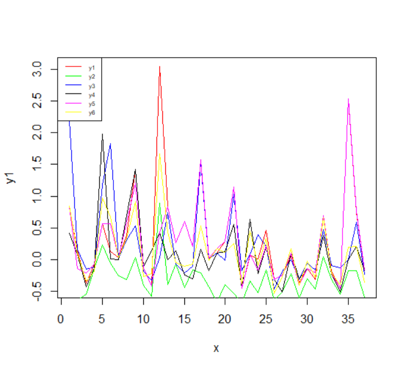
my x axiom is time . I want to compare the 6 variables where each one represent different colour to distinguish between them. I tried to plot it by
plot(x,y1,type="l",col="red")
lines(x,y1col="green")
lines(x,y2,col="blue")
lines(x,y3,col="black")
lines(x,y4,col="magenta")
lines(x,y5,col="yellow")
lines(x,y6,col="magenta")
legend("topleft", legend=c("y1", "ty2","y3",'y4','y5','y6'),
       col=c("red",'green', "blue","black","magenta","yellow"), lty = 1:1, cex=0.5)
however the graph presenting was very boring. Is there better way to improve my graph
Thanks in advance