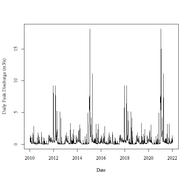
When I plot each of these time series, the time series does not appear to reflect my data, and is following a cyclic pattern (i.e., the section of the time plot from 2012 to 2013 is identical to the section of the time plot from 2018 to 2019, the section of the time plot from 2013 to 2014 is identical to the section of the time plot from 2019 to 2020).
I have plotted the same data is excel using a line graph, and the data and the plot looks like it is correct. Why am I unable to produce these plots in R?
I tried looking at the raw data to ensure that this cyclic pattern isn't actually present in the time series, and plotted the data in Excel to see if I got a similar plot. The excel plot appears correct, and very different from my results in R.
Frequency = 184 because the data collected for each year spans from May 1 through October 31 (184 days). Every 184 days is essentially another cycle. What do you mean by a reprex? I am new to R.
A reprex (see the FAQ is a minimum reproducible example. This is simple enough that it's not strictly necessary, but I need to understand whether Discharge records anything for the off-season—either NA or 0.
The frequency should have no effect other than changing the scaling of the x-axis.
# example data
data("varve",package = "astsa")
plot(varve)
The above data has been read into R using the read.csv() command and I named the object PrecipDischarge.dat, as reflected in the code from my previous post. I am not sure why the data is plotting the way that it is. The data is not perfectly cyclical as the plot suggests. Any ideas why it is plotting is a cyclical fashion and not representing the true data?
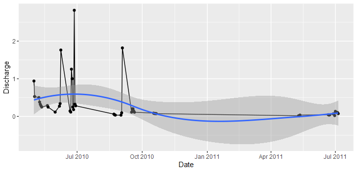
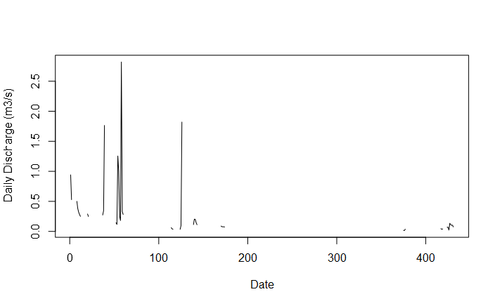
These data have frequent gaps. I expected that there would be daily observations during the 184 day period, and I can't reproduce your plot, although I have similar.
What's happening is that ts() is taking the 52 observations and recycling them to make 2,214 to fill out the start and end dates provided.
Ok, thank you. Do you know if there is any way of avoiding the ts() recycling the observations. I want to produce a single time series from 2010 to 2022, that only includes the months of May through October of each year. For example, after October 31, 2010, I want the time series to skip to May 1, 2011, after October 31, 2011, I want the time series to skip to May 1, 2012...after October 31, 2021, I want the time series to skip to May 1, 2022.
Is there any way of reproducing my data and essentially cutting the months of November through April out of the dataset?
Hi everyone, I am just wondering if there is any way of producing a time series that contains frequent gaps. Since I am dealing with rainfall and streamflow data, I want to cut out the winter months and deal with summer (May through October) months only.
When I did so, the time series is taking the first 52 observations and repeating them over and over. Is there any way of creating a time series that goes from May through October of one year, then skips to May through October of the next year, without recycling previous data to fill the gaps in the start and end dates of the time series?
Consider plotting each season separately and combining for display purposes with {patchwork} Give the frequency as 365 and start as c(year,5) and it will not try to plot Jan-Apr and Dec.
starting up top with your issue;
where your time is unevenely sampled, plotting with ggplot where you have a true date field on the axis, will simply place the points in the correct locations, i.e. doesnt rely like conventional ts/plot.ts on a rigid sampling regime. i.e.
what about conventional ts/plot.ts ; well you could pad your vector so as it has explicit missing entries, and is therefore sampled in a regular way at least as far as ts/plot.ts is concerned.
# date range
(dr <- range(some_data$Date))
full_seq <- seq(
  from = min(dr),
  to = max(dr),
  by = 1L
)

(vec_info <- enframe(full_seq,
  value = "Date"
) |>
  left_join(some_data) |>
  select(
    Date,
    Discharge
  ) |> deframe()
)

discharge.ts <- ts(vec_info, frequency = 1)
plot.ts(discharge.ts, xlab = "Date", ylab = "Daily Discharge (m3/s)")
obviously this isnt beautiful given the sheer volume of absent data, but you could come up with ways of filling the gaps, such as line fittings / smoothing functions and the like.
Hi Brant
I am seeing your issue and its exactly the same issue I am experiencing with my time series data. How have you managed to overcome missing months for the five-year period. I have a similar surveillance system that collects data only from May to October every year. It would be interesting to understand how you proceeded.
I misapprehended the original question by implicitly assuming that the problem was only that November-April data was missing. If I now understand correctly. Not only is the data collected only during the May-October season but is is also collected only on days with precipitation and the following day.
It is possible to impute missing data but not when such a huge proportion is missing. It's also possible to use methods to deal with irregular time series, but it is doubtful they will be of use in the cases where the regularities are separately by very long intervals. Here, it just doesn't rain all the time and there's nothing to be done about that.
Let's step back and ask why we do time series analysis on regular and more of less complete data in the first place.
To begin, suppose we did have complete data of precipitation and discharge and we are interested in the increase of discharge in day 3 over day 1, given the precipitation in day 2. So, more rain, more flow, make sense. But how much? The natural instinct is ordinary least squares regression, which is often unreasonably effective. But only if we are careful to observe its limitations. What will probably bite first is violation of the assumption of normality of the residuals. Fortunately, there is the arsenal of time series algorithms with varying degrees of effectiveness dealing with autocorrelation.
That's the visible part of the iceberg. Below the surface is the possibility that one or more processes generating the variation is unknown and analyzing the variation may provide some insight into those processes. But wait. We have a really quite good well-tried model of riparian processes: Discharge is proportional to watershed precipitation plus down gradient groundwater inflow net of aquifer recharge less soil moisture replenishment less evapo-transpiration less water supply withdrawal plus wastewater discharge. Plus, of course, random variation.
But wait again. There are few watersheds for which we as hydrologists are so fortunate as to possess hard data on all these factors.
Enter Reverend Bayes. We may not know the relative contributions of the hidden processes to the resulting discharge but we can estimate Bayesian priors and calculate posteriors. There are several methods, including
Bayesian Model Averaging (BMA) with multiple prior structures: This approach is used for rainfall-runoff modeling and combines different prior structures to improve prediction accuracy1.
Hybrid Bayesian Watershed Modeling: This model assesses interannual variability in nitrogen sourcing and retention in watersheds, providing insights into the environmental impact of nitrogen pollution2.
Hierarchical Bayesian Model: This model accounts for spatial and temporal structures in discharge and concentration data, allowing for the detection of the effects of stormwater control measures on watershed discharge3.
Data Transformation in Bayesian Inference: This approach evaluates the effects of data transformations on Bayesian inference of watershed discharge, aiming to improve the understanding of hydrological behavior4.
Bayesian and Physics-Informed Machine Learning Models: These models are used for streamflow simulation in data-scarce basins, addressing the challenges of data quality and availability in rural watersheds5. 6 .